


Someone posted a link in a comment last week, and I’d been meaning to take a closer look it. It’s from the Washington Post’s Wonkblog: Do you live in beer country or wine country? These maps will tell you.

I love the idea that there’s a Wonkblog, but it has taken liberties in analyzing its data in the past, and this one seems to continue that trend. Still, there is some interesting information here. But the map of where both wineries and breweries are located is somewhat misleading, because it covers over the one with fewer, even if there are a lot of both kinds there, which is the case.
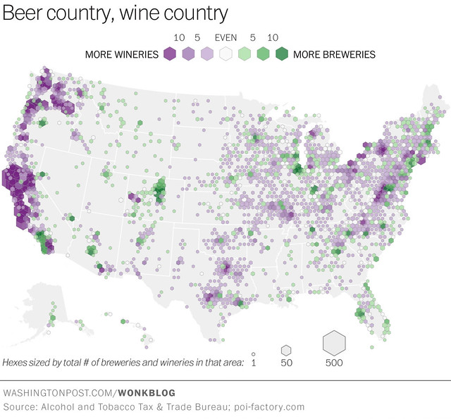

More revealing, I think, is comparing the two individual maps, grape color is wine, hop green is beer. What becomes clear from looking at the two separately that’s lost in the map with both is that fermentation takes place, whether beer or wine, in higher concentrations in roughly the SAME locations nationwide.
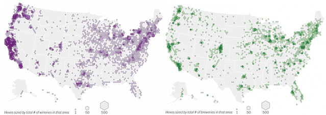
With very few exceptions, areas that have heavy concentrations of wineries also have a lot of breweries, too. That can’t be a coincidence, can it? To me, that leads to the inescapable conclusion that there is no wine country or beer country, but instead pockets of fermentation, or fields of fermentation. I would not be surprised to learn that there is also a lot of cheese-making going on in the exact same areas, too. Fermentation, it seems, follows fermentation. But that makes sense, intuitively.

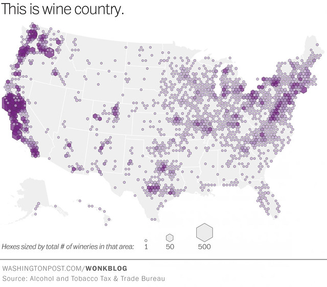
And here is beer wine individually, so you can see them in more detail closer up.


Also, curiously the Pacific Northwest is ignored in their analysis. In the text, they state that “beermaking dominates in the Denver region, and along the Southern California coast. Tucson may be wine country, but brewers rule in Phoenix. Brewers are strongly represented along the coast of Lake Michigan, and in most of Florida. Brewing is big in East coast cities too.” But three of the biggest, and darkest, green areas are the San Francisco Bay Area, Portland, Oregon and Seattle, all three with bigger concentrations of breweries than any other areas mentioned, with the exception of Denver and San Diego, which look roughly equal. So why the did? Beats me.
Wonkblog concludes with a chart showing trends in the numbers of new wineries and breweries, at least from 1998 through 2012. Was there really no data yet for 2014, or even 2013? And why did they use U.S. Census data for this chart, rather than where they got the other datasets for the maps? Also, I remember sower growth in the early 2000s, but the chart shows negative growth in the number of breweries from 2001 to 2010. Can that be correct? Or does that have something to do with it being Census data? Curious.
