


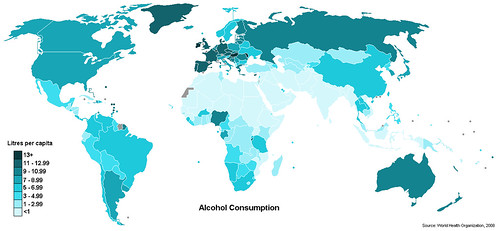
Today’s infographic is a map of the world showing alcohol consumption by country, based on information from the UN’s World Health Organization from 2008. The map is broken down by “litres per capita” and despite on the shouting by U.S. prohibitionists, America is somewhere in the middle. The map comes from an article on Geo Currents that takes a closer look at the global consumption of alcohol.

Click here to see the map full size.
