

![]()
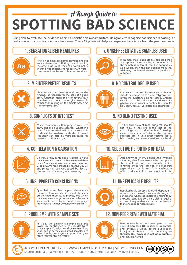
Longtime readers of the Bulletin know that I’m constantly examining and finding fault with questionable studies used by the modern prohibitionist groups using them to promote their agenda. I’m often amazed at some of the studies that make it into peer-reviewed journals. Apparently I’m not the only one. A British chemistry teacher, Andy Brunning, in his spare time, writes a great blog entitled “Compound Interest,” in which he “aims to take a closer look at the chemical compounds we come across on a day-to-day basis.” He created A Rough Guide to Spotting Bad Science, inspired by scientific research he looked at “which drew questionable conclusions from their results.” It “looks at the different factors that can contribute towards ‘bad’ science.”

The vast majority of people will get their science news from online news site articles, and rarely delve into the research that the article is based on. Personally, I think it’s therefore important that people are capable of spotting bad scientific methods, or realising when articles are being economical with the conclusions drawn from research, and that’s what this graphic aims to do. Note that this is not a comprehensive overview, nor is it implied that the presence of one of the points noted automatically means that the research should be disregarded. This is merely intended to provide a rough guide to things to be alert to when either reading science articles or evaluating research.
It’s nice to see an overview of a dozen of the more common ways in which studies are misused and the results are misrepresented. Sad to say, I see these all the time, so much so that I’ve started to question the way journals operate and how they select and accept articles. There are so many journals nowadays that they either are desperate for content and thus have lower standards than they used to, or the journals themselves have an agenda they’re promoting instead of simply providing a forum for progress in science. But this should give you a good start at figuring out why the next story you see about a study doesn’t seem to make any sense.
