


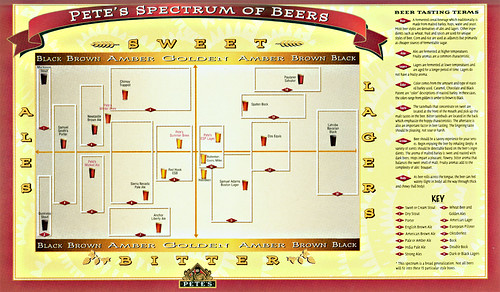
Today’s infographic is one of three similar charts that Pete Slosberg created for Pete’s Wicked Ales. It shows popular beer styles (remember this was the later 80s) and where they fell on an x/y axis spectrum. It was one of the first great educational tools for explaining the variation in different beers, something that most people didn’t know anything about back then.

