


This is not a beer post, but we gotta eat, too. Tom Philpott, at Grist, details an interesting interactive chart created by Andrea Jezovit at Civil Eats.

Using USDA data for “average daily calories available per capita, adjusted for spoilage and waste,” it tracks our eating habits since 1970, separating our foodstuffs into basic categories: grains, dairy, vegetables, fruits, proteins (“meat, eggs, and nuts”), added sugars, and added fats.
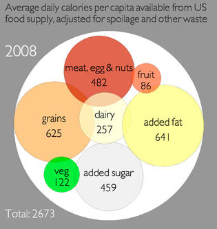

Both Philpott’s The American diet in one chart, with lots of fats and sugars and Jezovit’s Where Do Americans Get Their Calories? are worth a read. Be sure to check out the interactive version of the chart which graphically shows how the mix of calories we eat has changed over the last 40 years.