

![]()
Today’s infographic is an interactive one called The Hopometer, which is subtitled “Visualising beer strength and bitterness.” It was created by Peter G in London, whose blog Paint by Numbers is used for “focusing on [his] experiments with data visualisation predominantly using Tableau Software.” That’s why you really need to look at it on his page.

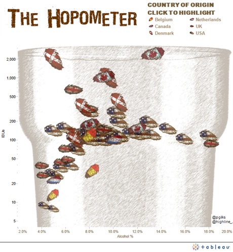
Click here to see the interactive original version of the Hopometer.
