

![]()
This is somewhat interesting, though it was little to do with beer. The CDC released the results of an analysis of the “most distinctive cause of death for each state and the District of Columbia, 2001–2010.” I never realized this, but it makes sense. The CDC uses a standardized List of 113 Selected Causes of Death, based on the International Classification of Diseases, 10th Revision. This is to help the data collected be more useful, and allows comparisons to be drawn if the data is not affected by local bias or custom. Then the data used was “age-adjusted state-specific death rate for each cause of death relative to the national age-adjusted death rate for each cause of death, equivalent to a location quotient.”

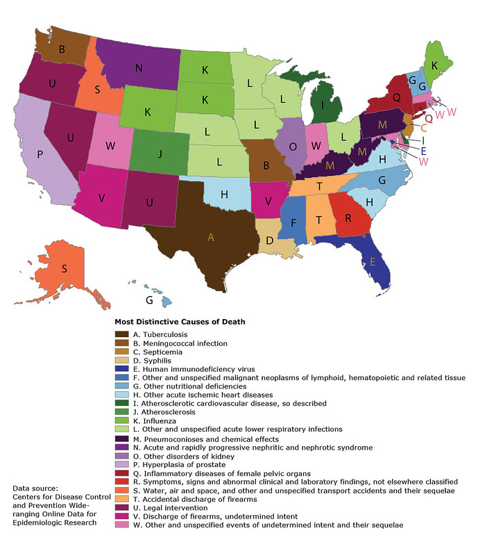
The analysis that went into creating the map was done by Francis Boscoe, who’s a researcher at the New York State Cancer Registry. Here’s the main findings, from the CDC website:

The resulting map depicts a variety of distinctive causes of death based on a wide range of number of deaths, from 15,000 deaths from HIV in Florida to 679 deaths from tuberculosis in Texas to 22 deaths from syphilis in Louisiana. The largest number of deaths mapped were the 37,292 deaths in Michigan from “atherosclerotic cardiovascular disease, so described”; the fewest, the 11 deaths in Montana from “acute and rapidly progressive nephritic and nephrotic syndrome.” The state-specific percentage of total deaths mapped ranged from 1.8% (Delaware; atherosclerotic cardiovascular disease, so described) to 0.0005% (Illinois, other disorders of kidney).
Some of the findings make intuitive sense (influenza in some northern states, pneumoconioses in coal-mining states, air and water accidents in Alaska and Idaho), while the explanations for others are less immediately apparent (septicemia in New Jersey, deaths by legal intervention in 3 Western states). The highly variable use of codes beginning with “other” between states is also apparent. For example, Oklahoma accounted for 24% of the deaths attributable to “other acute ischemic heart diseases” in the country despite having only slightly more than 1% of the population, resulting in a standardized mortality rate ratio of 19.4 for this cause of death, the highest on the map. The highest standardized mortality rate ratio after Oklahoma was 12.4 for pneumoconioses in West Virginia.
A limitation of this map is that it depicts only 1 distinctive cause of death for each state. All of these were significantly higher than the national rate, but there were many others also significantly higher than the national rate that were not mapped. The map is also predisposed to showing rare causes of death — for 22 of the states, the total number of deaths mapped was under 100. Using broader cause-of-death categories or requiring a higher threshold for the number of deaths would result in a different map. These limitations are characteristic of maps generally and are why these maps are best regarded as snapshots and not comprehensive statistical summaries.
Notice that despite prohibitionists claiming that alcohol is the “3rd-Leading Preventable Cause Of Death,” it’s actually not even on the list. It’s not even on the list of 113, apart from the more specific “Alcoholic Liver Disease.” Also, cancer isn’t among any of the top cause for any individual state, which is surprising given that it’s usually listed as the number two cause overall. Some of the stranger ones include Oregon and Nevada, whose leading cause is “legal intervention.” Then there’s Alabama and Tennessee with “accidental discharge of firearms,” while in Arizona and Arkansas it’s “discharge of firearms, undetermined intent.” Is anyone else bothered by the fact that in four states you’re most likely to die by being shot, whatever the reason?