


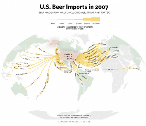
Today’s infographic is entitled U.S. Beer Imports in 2007 and was created by Matthew Bambach for, I believe, a newspaper article about beer imports. But I like how it neatly shows the flow of the beer from different places into America.

Click here to see the map full size.
