


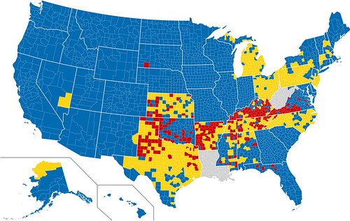
Today’s infographic is a map of every U.S. county, showing post-prohibition, which ones are wet (blue), which ones are dry (red) and which are mixed (yellow). Apparently gray is for ones where they didn’t have good information. Wikipedia has a list of dry counties by state, with a list of each state.

