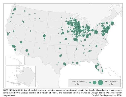
Today’s infographic is part three of three, created by Floating Sheep in 2010, using data collected in 2008. It’s from a post entitled the Beer Belly of America. The third map shows a more normalized version of yesterday’s map, showing the “relative mentions of bars in the Google Maps directory,” which was accomplished using the average number of bar mentions.

