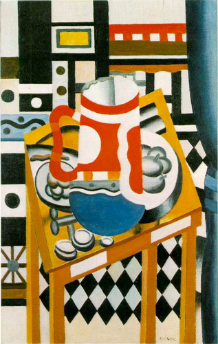
Today’s work of art (& beer) is decidedly more modern, with bold colors and an abstract vision. Still Life With A Beer Mug, by the French artist Fernand Léger, was painted around 1921. Léger is generally considered a cubist painter, like Pablo Picasso, who’s probably the most famous cubist. He was born in France and was originally trained as an architect. During World War I he served in the military and was gassed during the Battle of Verdun, which greatly effected his later art, which would include this work.
The painting, Still Life With A Beer Mug, is at the Tate Museum in London, and there’s a transcript describing every aspect of the painting, but there’s also a shorter summary there.
This vibrant, bold oil painting has a strong visual impact, largely because it is painted using predominantly black, white and the three primary colours – red, yellow and blue. Dominating the centre of the painting is an overly large German style beer mug with a handle seen in profile on the left. It dwarfs the small, square table on which it sits. The table has exaggeratedly long thin legs that disappear off the bottom of the canvas and it stands on a black and white chequered floor. Surrounding the beer mug are what appear to be two plates of fruit, some small pots of butter and an object that could be a cork-screw. The objects in this painting are quite hard to read, because Léger has radically simplified their forms, reducing them to simple shapes. He has also used several different viewpoints at once and filled every inch of the canvas with a riot of highly coloured, contrasting geometric patterns. Some of these seem to correspond to surfaces in the painting, like the chequered floor, but most seem to be used simply for bold decorative effect. Finally, running down the right hand side of the canvas is a blue curtain tied back half way down its length.

Here is Waldemar Januszczak’s take on Still Life With A Beer Mug, from Techniques of the Great Masters of Art
“In Still Life with a Beer Mug,…the shaded modelling of the curtain, objects on the table and the interior view of the mug contrasts with the flatly painted geometric shapes and the patterned rendering of other forms. This illustrates Leger’s preoccupation with plastic contrasts, which he described as follows in 1923: ‘I group contrary values together: flat surfaces opposed to modelled surfaces; volumetric figures opposed to the flat facades of houses . . .; pure flat tones opposed to grey, modulated tones, or the reverse’. Leger did not want simply to copy a manufactured object, but felt that its clean, precise beauty should be accepted as a challenging starting point which would, if necessary, be distorted to achieve the final desired result.
Leger found his source material in what he described as ‘the lower-class environment, with its aspects of crudeness and harshness, of tragedy and comedy, always hyperactive’. Leger’s work can thus be seen as a response to a view of the world as being in flux and opposition on which, through its being rendered in art, order is imposed through the methodical preparation and execution of the work. The canvas of Still Life with a Beer Mug was divided into 24 squares, some of which can still be seen on the canvas. Leger’s rather aggressive statements about his work should not obscure the fact that Still Life with a Beer Mug is an outstanding example of sensitive and subtle handling of the oil painting medium. Leger took vast pains to achieve exactly the result he wanted. In this work slight adjustments were made in the final paint layer even after the work had been photographed at the Galerie Simon in Paris.
“Still Life with a Beer Mug shows an extremely subtle handling of oils. The strong color contrasts show a range of carefully worked tomes. The black tones are played against white. The warm colors, vermilion, cadmium orange and yellow, are played against the cool tints and shades of Prussian blue, and these intense areas are relieved by the delicate interaction of almost creamy washes of pale lemon yellow and pale blue-green in the diamond pattern below the table. The picture retains the fine but emphatic canvas pattern which shows through the ground. Indeed, the ground itself makes up much of the white background.”
For more about Fernand Léger, Wikipedia is a good place to start. There are also tons of links at the ArtCyclopedia.
