
![]()
Heineken announced at the beginning of December that next year they’ll be launching redesigned bottles and cans along with a big reduction in the number of sizes they’ll be selling worldwide. The packaging redesign is cosmetic, but the package size reduction is more worrying.
According to the press release, “[t]he restyling aims to streamline the visual identity and make the brand even more consistent and recognizable in all 170 markets worldwide where Heineken can be enjoyed. The new bottle will come in five different volume sizes and will be available in Western Europe at the beginning of 2011 and across the rest of the world by 2012.”
While I realize that packaging, brand identity, etc. are very important, I still can’t help but laugh at some of the language and the way in which the new packaging design is framed. For example, check out this description:
The new bottle, replacing the XLN (extra long neck) and Heineken shortneck packaging, is introduced in two versions: embossed and standard. The new design features a unique curved embossment on the neck and back, which not only looks good, but also adds a pleasing to-the-touch feel, whilst a distinctive embossed mark acts as a stamp of quality and authenticity. Additionally, the new shape makes it look proud while enhancing the premium positioning of the bottle.
Yes, nothing says quality like a “pleasing to-the-touch feel” except perhaps the actual taste of the beer. How “proud” the new bottle looks. Huh? The “embossments,” made by using “strategically placed indents and tactile ink” somehow add “to the overall drinking experience.” Hilarious. Nothing makes me enjoy my beer more than having little raised spots on my bottle to hold on to. Of course, I always pour my beer into a glass, but I’m weird that way. No worries, a newly redesigned glass “features an embossed curve on the side, adding a pleasant feeling when held.” So they got us glass-drinkers covered, too. Whew.
But all this attention paid to their “revolutionary tactile ink” just cracks me up, and is indicative of why the big brewers are stagnating. They continue to focus on marketing and ignore what’s really important: how their beer tastes. Undoubtedly, marketing is going to keep them huge for a long time to come, but slowly it is having an effect. So this “revolutionary ink, created by a series of small raised dots on the surface of the can, gives the consumer a better feeling in the hand, enhanced grip and allows the brand to appear more refreshing and recognizable.” Nothing like an “enhanced grip” to make the beer “appear more refreshing.” I’m certainly interested in how that process works. How exactly does my grip on the beer bottle give the beer inside “the power to restore freshness, vitality, energy, etc.,” which is the definition of refreshing. That’s some pretty impressive osmosis.
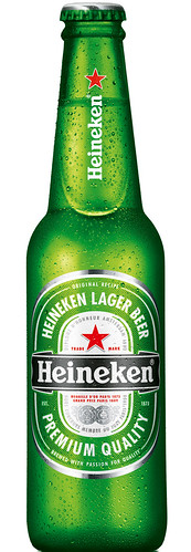
The new “magic” embossed Heineken bottle.
But snarkiness aside, the real news is that Heineken will be reducing the number of package sizes they offer worldwide “from fifteen to five bottles sizes.” I understand any company’s reasons for reducing the number of items they sell, to a point at least. As they concede, it’s being done to achieve “greater efficiencies in the supply chain.” And it may not mean anything, but then again I can see at least one possible scenario that could play out. If Heineken cuts two-thirds of its package sizes, it’s not too hard to imagine the other international beer companies doing likewise. With the vast majority of glass manufacturer sales going to just a few companies, most likely they’d simply discontinue making the package sizes that Heineken and the others abandon. That would make those other ten bottles sizes unavailable for smaller breweries, too, or at least prohibitively expensive. Maybe that’s a stretch, but at a minimum I think it at least bears watching.
The changes will start early next year, first in Western Europe, and then the rest of the world over the balance of the year.
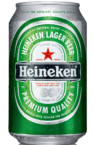
The new can with “tactile ink.”
Please tell me this new design is not going to have a negative impact on that quality skunky flavor we’ve all come to identify with the Heineken name. Sorry, sorry, but, come on, you knew SOMEONE was going to go there!
perhaps the bottle should be shaped like a cabbage or some corn to match the flavour profile of the beer and further enhance the drinking experience?
Looks like Heineken turfed their barrel can as well. It’s pretty cool — although it costs a fortune to produce.
They had to do something from a profitability standpoint. Barrel cans. Completely different cans for their light beer. Various sizes of bottles. All this stuff was increasing incremental volume — yet the costs were so high I’m pretty sure they were only breaking even on some of their SKUs. That’s why their profitability was fairly poor compared to some of their peers.
Will be interesting to see if some of their consumers stick with the brand once the packaging is standardized. Lose the unique packaging — and this product’s a premium priced commodity — which is why they went to great lengths to describe their lumpy inks, etc.
Man, I acually loved the keg can, too bad its going by the wayside. It makes complete sense though, 15 bottle sizes is a LOT when the really only need probably two or three, I am suprized they are keeping it at 5.
On a side note, if you have not read “Beer Blast” by Philip Van Muincing, I found it to be a facinating read about how heieneken was marketed in the US.
A repeat of the thinking that gave us the reusable WoBo would be nice.
BikerAggie, apparently the US market is going to get unique treatment. There will be a longneck sold worldwide that will not be offered here — so maybe the keg can will remain.