![]()
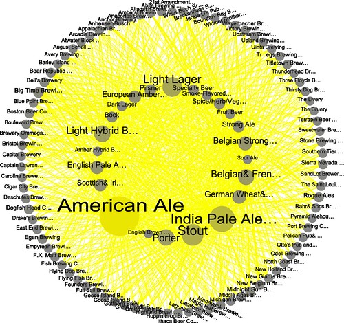
Today’s infographic is pretty cool. It was created as design exercise, by Kris Erickson on his blog, EricksonData. It’s what he refers to as a Gephi Viz, this time with beer data. He used the bottled beers listed in the BreweryDB, “and filtered out many of the smaller US brewers (according to number of beers entered into BreweryDB).”

Click here to see the circle full size.
