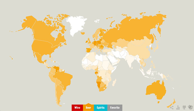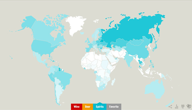
Here’s a cool interactive map created by Ghost in the Data. Using data from the World Health Organization, the map shows “How much — and which — alcohol is drunk in the world during a week?” As the instructions explain: “Move over countries to learn it, or use the buttons to show the top wine, beer and spirits drinkers or each country’s favorite drink.” The first three maps show each alcohol type with darkest countries drinking more and lighter one drinking less that of that particular type. Check it out at Wine, Beer or Spirits?
Beer

Wine

Spirits

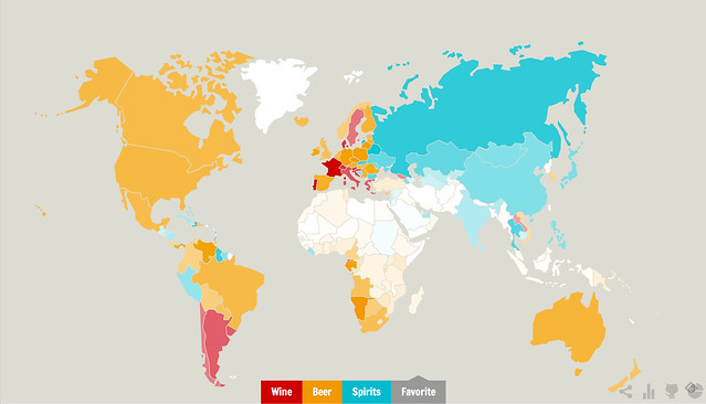
This map, called “Favorite,” shows each country by which of the alcohol types is the most popular there, and its intensity shows how popular it is relative to the other types.
Favorites by Type

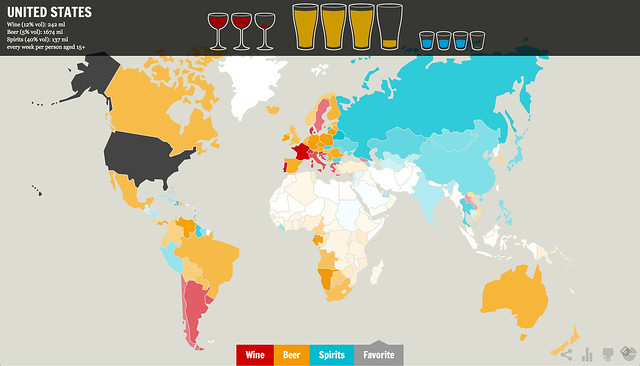
If you move your mouse over each nation, you can see the breakdown for the alcohol types. I seem to recall that the WHO data also has an “other” category for native drinks that aren’t one of the big three so I’m not sure how they addressed that, whether including them as the one they most closely resembled or if they simply ignored them.
The profile for the United States

