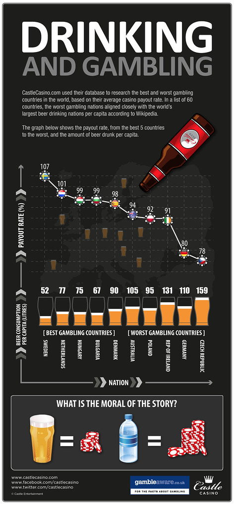
Today’s infographic is a little bit suspect. It’s comparing the best and worst payout rates from various countries based on data from the online Castle Casino, who also is responsible for the infographic itself, Drinking Hampers Gameplay. That conclusion comes taking the payout rates and matching them with the average beer consumption per person figures for the same nations. Unfortunately, there’s absolutely no correlation between the two. There’s no data to support that the countries that drink more per capita were doing their drinking while they were gambling. So the “moral of the story” is utterly meaningless.

Click here to see the infographic full size.

USA didn’t even make the list, & casinos are everywhere, which certainly isn’t the case abroad. Agree w/Jay that this one’s total BS.