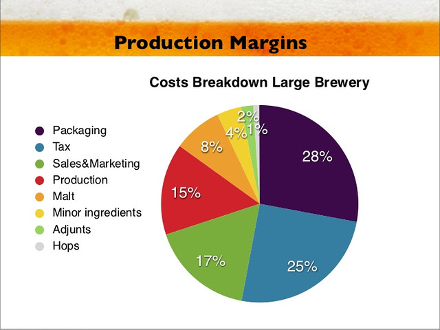
Today’s infographic is titled “Production Margins,” and it’s a pie chart showing the Cost Breakdowns for a Large Breweries. It was created for a Powerpoint presentation on the Beer Industry by Christian Adeler and Jon Bjornstad in 2011. Not surprisingly, the raw materials to make the beer is the lowest percentage, while packaging and taxes eat up over half of the costs alone.

