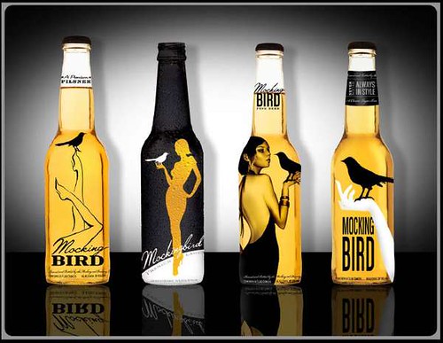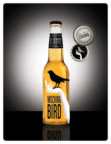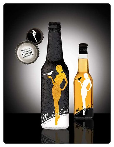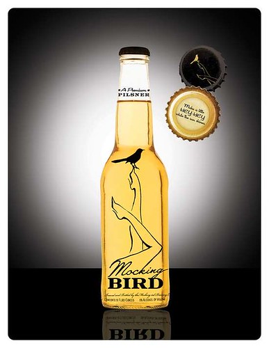
Sam Wiley, a Brooklyn-based designer and advertising artist who’s done work for Anheuser-Busch, was asked to create packaging for a brand to be called “Mocking Bird Lager” and “Mockingbird Pilsner.” I don’t know if these were done for ABI – she doesn’t say — and as far as I know, no one has launched this line of beer, so it’s anybody’s guess, but it’s a great looking design. I don’t like clear glass because it’s not good for the beer, but from a purely design point-of-view she used the clear glass and the gold of the liquid to nice effect. I like that they don’t look like typical beer bottle designs and I think as the market gets more crowded, any brand’s ability to stand out on the shelf will become increasingly important.


“Bird” is the English equivalent of American “chick”, so I could see some subtle sarcasm in those designs (which are excellent!) if the artist were so inclined – & I wonder if the whole thing wasn’t a put-on from the git-go.