![]()
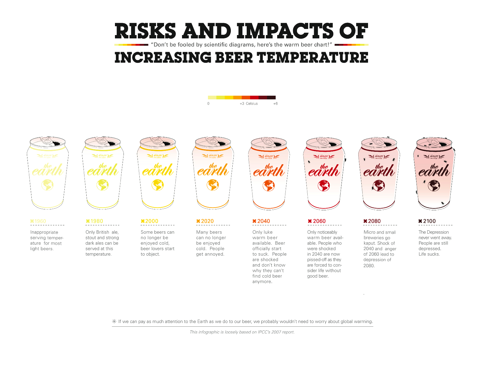
This is fairly clever. A blog dedicated to chronicling the science surrounding climate change, Real Climate, posted a chart comparing the chronology of climate change from 1960 through the year 2100. It was originally created by Artist As Citizen, which is described as “a collaborative, student-driven blend of art and journalism. The infographic is called Risks and Impacts of Increasing Beer Temperature.

You can view the full size version of the image here.
I’m not sure about that tagline. “If we can pay as much attention to the Earth as we do to our beer, we probably wouldn’t need to worry about global warming.” I’m pretty sure we can do both fairly easily. And it’s not as if beer drinking is what’s distracting us from addressing global warming.
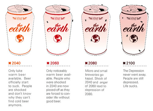
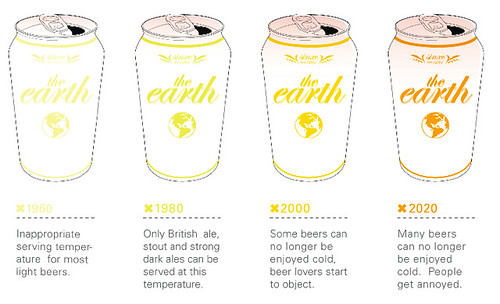
Still it’s interesting to see climate change described in terms of the serving temperature of beer. Below are the 8 stages of global warming split in two so they can bee seen a little larger, and consequently so the text is more readable, too.
1960—2020
2040—2100