
![]()
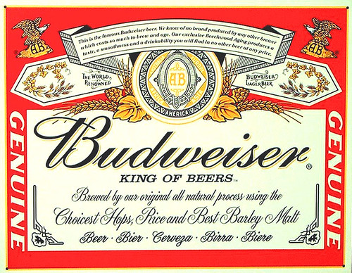
Below is, as far as I know, the most recent label for Budweiser, updated in 2000. We all know that labels change over time, sometimes dramatically, but usually more subtly with just small tweaks from time to time. But even small changes over a long period of time become dramatic in the long view. So this is a fascinating peak into those changes.
Etiquette Systems, a label manufacturer, has an online gallery showing what they call the Evolution of America’s Most Famous Beer Label. It shows a dozen different versions of the Budweiser label, from the first 1876 version up to the 2000 latest one, with all of the changes in between.
Too bad they perpetuate that erroneous Franklin quote.
That is cool to watch the evolution – thanks for the link.
Of course their perception of a bottle being the superior package for “the full beer-drinking experience” is a little flawed…
“While canned beer is of course acceptable, especially in a pinch, it’s the bottled kind that really provides one with the full beer-drinking experience — particular the bottled kind that comes in the 12-ounce longneck. Not only do you get to enjoy the taste and aroma of a full-bodied ale, there’s also the opportunity to examine, pick at, and experiment with the label.”
-JW
A-B had a “retro” campaign for Budweiser a few years ago — including reproductions of their old beer can designs. The solid gold one from the 30’s, then a few versions from the 50’s and 60’s.
What’s interesting is the first Budweiser cans looked nothing like their bottle labels — but then evolved to the point where they were quite similar.
Thanks for the link. For the record, I hated the design which came out in 1990. Too modern — and not nearly sophisticated enough. The 2000 version was a huge step back in the right direction.