

Today’s infographic is an interactive one, meaning if you’re Feeling Thirsty, you should visit the interactive infographic. It was created at Stanford University, using the Stanford Network Analysis Platform (SNAP), which put more than 1.5 million Beer Advocate reviews into a dataset to create the infographic. I’m not sure why they used color (light, medium and dark) as one of the ways to slice the data, but otherwise it’s pretty interesting to see. Below are a couple of examples, but you really need to look at it on the original website.
Here, for example is what Westvleteran 8 look like:

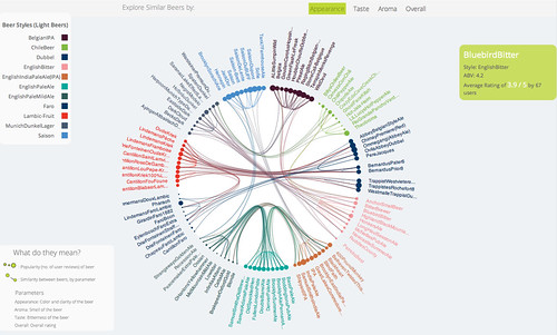
And here’s Coniston’s Blue Bitter
Also, be sure to check out the About the Data graphs at the bottom.