The Physics Buzz Blog, part of Physics Central, had an interesting tutorial on pressure, using the science of brewing to illustrate how pressure works in the The Physics of Beer. They start with the keg, but also discuss the nitrogen widget used in Guinness widget cans.
Archives for January 6, 2013
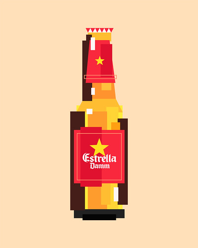
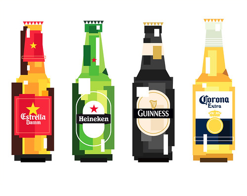
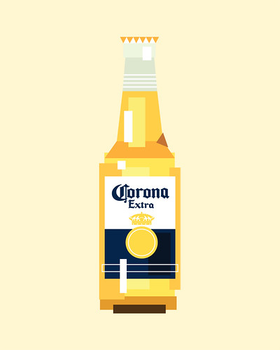
Pixelated Beer

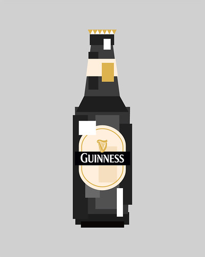
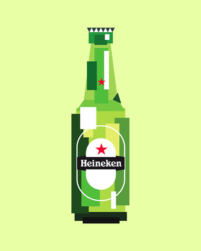
If you’re as old as me, you probably remember when video games had very limited graphics and most were pixelated, only roughly approximating what the characters and backgrounds in the games looked like. I remember getting an Atari 2600 right after high school and playing it a lot while I was in the Army, when we had long blocks of time to kill. Worse still, the very first videogame I played was — believe it or not — Pong, in a stand alone cabinet that was inside Shea Stadium, when my step-grandparents took me to see the Mets play sometime in the early-to-mid-1970s. It must have been after 1972, since that’s when Pong debuted. I was Orioles fan back then — Brooks Robinson was my guy — so I don’t know why we went to see the Mets. Anyway, pixelation seems to be hot again these days in design, some kind of retro nostalgia no doubt. An artist in Spain, Iñaki Soria Izquierdo, did a series of designs of well-know beer bottles using a pixelated style. He appears to go by just his middle name professionally — Soria — and at his site, in his portfolio, is what he calls IcoBeer. I assume because he’s in Spain, the designs are all for well-known international brands, because it would be great to see his treatment of some American brands.
His website includes only the following description:
Pruebas gráficas de representación iconográfica de objetos (Estrella Damm / Heineken / Corona Extra / Guinness) a partir de estructuras y formas geométricas básicas.
Which Google translates as:
Graphic evidence of iconographic representation of objects (Estrella Damm / Heineken / Corona Extra / Guinness) from basic geometric shapes and structures.
But they remind me of those early videogame designs, with just simple square and rectangular shapes, and very few curves, to give the impression of the bottles and labels. Anyway, I think they’re pretty cool. Here are the four designs Soria did:
Corona
Guinness
Heineken
Estrella Dam