![]()
On January 1, 1876, the first trademark was registered in Great Britain. The story is usually told along these lines, with this from campaign, an advertising and media website, where this is part of a series on the British History of Advertising:
On the last night of 1875, an employee of the Bass Brewery was standing at the head of a queue and facing the prospect of a chilly start to the new year.
His reward was not to be the pick of the bargains at the January sales but something far more significant. Indeed, he was to be present at a moment of history in the evolution of brands in Britain.
On 1 January 1876, the new Trade Marks Registration Act was coming into effect and the staffer had been told to queue overnight outside the registrar’s office to be the first to take advantage of it.
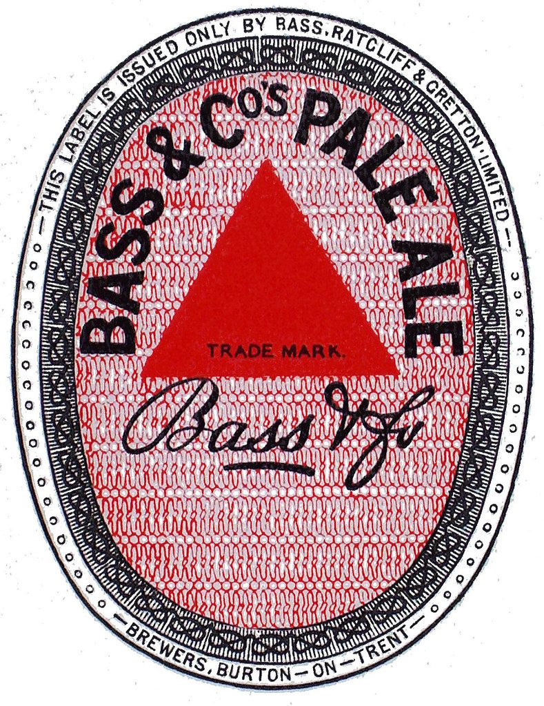
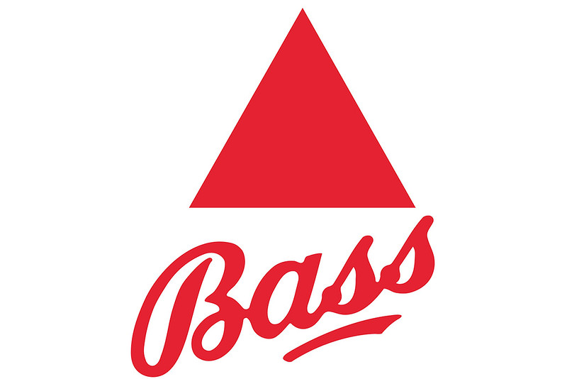
As a result, the distinctive Bass red triangle logo is now Britain’s oldest trademark – an instantly recognisable symbol of the brand and long integral to its advertising.
It probably didn’t happen that way. There’s no evidence that it did, but nobody ever let the facts get on the way of a good story. However it happened, Bass did register trademark No. 1.
This account from 2013 is from the Derbyshire Life and Countryside:
So it’s curiously apt that Trade Mark No. 1 was granted right on Derbyshire’s doorstep to Burton-on-Trent brewers Bass. It officially registered the Red Triangle which adorned their extremely popular India Pale Ale. For good measure Bass also bagged Trade Mark No. 2 – the Red Diamond symbolising Burton ales, brown beers and stouts.
Legend has it that a Bass employee spent New Year’s Eve ‘queuing’ overnight outside the Registration Office so that he could be first in line when doors opened the next morning. While the story has never been verified – they may have applied by post – Bass certainly got in first. As such their Red Triangle assumed an iconic place in the history of international brand awareness.
Why they selected a red triangle remains unclear. Some say it was an age-old shipping mark. But an 1880 edition of the Derbyshire Times offered a more romantic notion: ‘A biographer playfully suggested the Bass family descended from the ancient classical deity Bassareus to whom libations were routinely offered. Bass thereafter fixed upon the notion of adopting an ancient and powerful symbol as their mark. They settled upon Egypt’s “Great Pyramid” drenched in a burning sun. The Red Triangle was thus conceived.’
That’s wonderfully seductive but almost certainly entirely fanciful. ‘Good stories’ aside, the Red Triangle and appended Bass signature came to distinguish the company’s most cherished product. The signature also made it the world’s first ‘script logo’ – a device since adopted by Coca-Cola and countless others. These signed ‘logos’ (from the Greek logos for ‘word’) were thought to carry extra weight in fully authenticating the product. That concept of ‘branding’ merchandise was an ancient one. Blacksmiths who made swords in the Roman Empire are considered among the first users of trademarks. Others followed suit to indelibly identify their goods. This naturally led to fraudulent imitation. But centuries elapsed before the first trade mark legislation was introduced – by a 1266 Act of Parliament all bakers were required to use a distinctive mark for the bread they sold.
Disputes continued to arise but not until the late 19th century did comprehensive modern trade mark laws emerge. France was first to fully address the issue in their Manufacture and Goods Mark Act of 1857. By then Bass were already the leading supplier of beer to the overseas market, while at home their products were an absolute watchword for quality. Indeed the very word ‘Bass’ was almost a generic term for ‘beer’ itself – the poet Tennyson when visiting the Great Exhibition of 1851 asked ‘can one get a decent bottle of Bass here?’
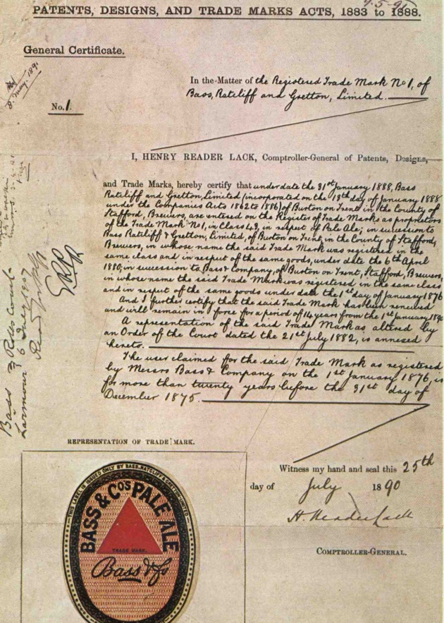
Below is a “1890s renewal contract of the Red Triangle trade mark shows the historic first registration date 1st January 1876.” This renewal document was signed July 25, 1890, so that’s why I’m posting this today (in case you were wondering). It’s quite interesting to see.
It has certainly been a successful logo, and was almost from the beginning. Check out this testimonial by James Hogg from his 1884 book, “Fortunes Made in Business:”
It is no extravagant assertion to say that throughout the world there is no name more familiar than that of Bass. A household word amongst Englishmen, it is one of the first words in the vocabulary of foreigners whose knowledge of the English language is of the most rudimentary description. There is no geometrical figure so well known as the vermilion triangle which is the Bass trademark. It is as familiar to the eye as Her Majesty’s visage on the postage stamps. It would indeed be a difficult task to say in what part of the earth that vivid triangle does not gladden the heart of man.