For nearly a year now, every Sunday I’ve been exploring the intersection of the world of art with beer in my Beer In Art series. In searching for more art to showcase, I keep coming upon wondrous examples of advertising illustration. So far, I’ve been reluctant to use them because there’s plenty of fine art involving beer to keep my Sunday’s busy for quite some time. So instead, I figured I’d start featuring advertising art with beer as a separate series. Every Thursday I’ll highlight a beer ad, usually one from the past, that has some impressive artwork associated with it.
To begin, there can be no better choice than the Beer Belongs series that the United States Brewers Foundation (USBF) did from 1945-1956. The bulk of the series, known as the Home Life in America series, ran from 1946-1956 and included 120 numbered ads. In addition, there were several more unnumbered ads that both preceded the Home Life series and were run after its conclusion. They were so popular, even Mad Magazine did a spoof of the ads. You’ve probably seen them at flea markets and antique shows. I have several of them framed in my hallway. About a year ago, I became curious about how many ads were produced and tried to learn about their history. Unfortunately, there wasn’t much out there and after trolling auction sites and the internet for a good six months, off and on, I put together a complete list of all the ads. I collected graphic versions of all the ads with the help of the Beer Institute and got a taste of their origins and history by reading the minutes of meetings by the USBF and looking at old trade publications and books that mention the ad campaign.
That led to an article about this popular ad campaign in this month’s All About Beer magazine (the November 2009 issue, beginning at page 44). Obviously, All About Beer couldn’t run all of the ads, so I’ve put them into a Flickr gallery so you can view all 120 of them, possibly for the very first time anywhere. That’s at the bottom of this post. You can also see the rest of them (the ones that came before and after, along with the spoofs) at my Beer Belongs … Enjoy It! page. There, you can also read some more about the ads and find out a little bit more of their history, though I’d also encourage you to pick up the article in this month’s All About Beer, too, to get the full picture.

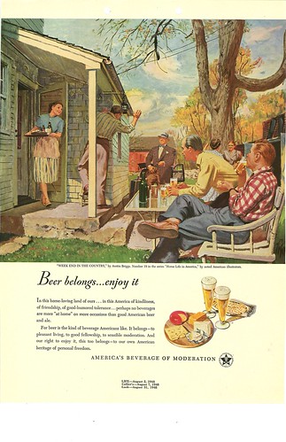
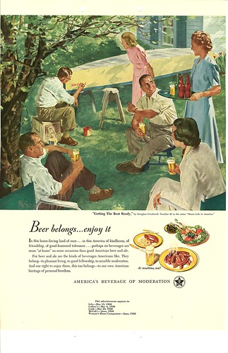
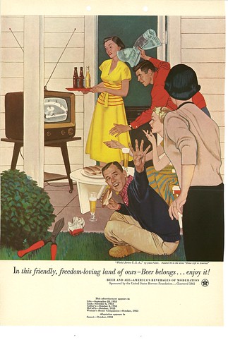
Here are three representative examples from the Home Life in America series:

#19 in the Home Life in America series. Week End in the Country, by Austin Briggs, 1948.

#42 in the Home Life in America series. Getting the Boat Ready, by Douglass Crockwell, 1950

#86 in the Home Life in America series. World Series U.S.A., by John Falter, 1953.
You can see all 120 of the Home Life in America series in the gallery below. This Flickr gallery is best viewed in full screen. To view it that way, after clicking on the arrow in the center to start the slideshow, click on the button on the bottom right with the four arrows pointing outward on it, to see the photos in glorious full screen. Once in full screen slideshow mode, click on “Show Info” to identify each ad’s title, artist and the year it ran.

Great job Jay, thanks for getting these all in one place. I have several hanging on my walls too, and always wondered how many and what they all looked like.
I love these pieces, too, but mainly because the ergonomics are so weird. Look at how tiny that stool is in the middle of #42. And why do the number of beers on the tray never seem to make up a full service of the empty glasses?
Hey Jay, just read your article in All About Beer yesterday. Thanks for posting up the extra pictures. Very cool!
Jay, thanks for assembling all of these in one place. I was a ways down the road with the auction and internet searches trying to do what you have done, when I found your site.
I do have a question that perhaps someone out there might be able to answer. You have listed two #2 in the Series, “Family Musicale” and “Moving Day”. A couple of weeks ago, I picked up a “Family Musicale” that says it is #1 in the series. Apparently it went both ways as #1 and #2. I was just curious to know if anyone might know how that happened? Perhaps it was just some start up smoothing out that they were doing as they went to print.
Thanks
Rob