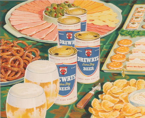
Today’s work of art was originally advertising art, illustration really, but it’s so good it deserves to be considered fine art. Paul Wehr was an artist/illustrator from Indiana who lived from 1914-1973. This piece, for Drewrys Beer of South Bend, Indiana was done in the 1950s. Drewrys was actually a Canadian brand, but for most of its history was brewed in Indiana. That’s why you can see a Canadian Mountie in the logo. I love hyperrealists — artists like Richard Estes and Ralph Goings — and Wehr’s work reminds me of theirs. Though arguably not quite as photo-realistic, it does seem to presage that art movement and the detail is amazing. I’d love to see how the final ad looked, but alas all I could fine was the artwork Wehr did, a beautiful looking picnic laid out with Drewry beer cans in the center.

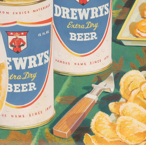
In the detailed look below, you can even see the salt on the potato chips. Yum, I’m hungry.

You can also read more about Drewry’s cans at Rusty Cans.

I AM TO TRYING IDENTIFY THE FONT THAT WAS USE ON THE LABELS, THE BLOCK FONT “DREWRY”…CAN YOU HELP?
CAN’T SEEM TO MATCH IT EXACTLY!
THANK YOU