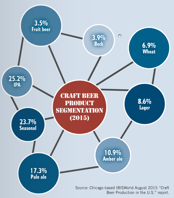
It was the best of charts, it was the worst of charts. So begins every great story. This made me laugh like the Dickens this morning, as fellow beer writer Bryan Roth tweeted a chart showing “Craft Production in the U.S.” apparently as of August 2015.

The data comes from IBISWorld, a company that identifies themselves as “one of the world’s leading publishers of business intelligence, specializing in Industry research and Procurement research.” Their website shows that they have offices in Los Angeles, New York, Melbourne, London and Beijing, although the chart claims they’re “Chicago-based.” The report is entitled “Craft Beer Production in the US: Market Research Report,” and was published in August of this year. If you want to buy yourself a copy, it costs between $925 and $1,595, depending on which purchase option you choose.
Hopefully, the chart was not created by IBISWorld, because besides mis-identifying where the company is located, as Roth points out, “the graphic designer who created alternating sized circles not dependent on their % share is bad at their job.” It’s a terrible chart, on so many levels. First, why use “stencil” as the font for the title in the red center circle? Why are the outer circles different shades of blue, for no apparent rhyme or reason. There’s no discernible pattern to that decision. Bock is the lightest color, at 3.9%, followed by Amber Ale at 10.9%, so you might be tempted to think the color is dependent on market share, lighter for lower and darker for higher percentages. But no, fruit beer is the lowest, at 3.5%, and is medium blue, while Lager, at only 8.6%, is the darkest blue on the chart.
Why are the black lines not emanating from the center of the middle? Instead, it looks like one of the webs from the 1980s video game “Tempest.” They all meet in an outer ring, too, except for Bock and Wheat Beer, which are curiously left hanging. But most egregious, the size of the circles are not even close to being proportional to the percentages expressed in them. The sizes appear to be nothing more than random, just like the color choices. So at first glance, it makes no sense and is, at best, confusing. At worst, it looks like it was designed by a five-year old, and frankly that may be overly insulting to toddlers.
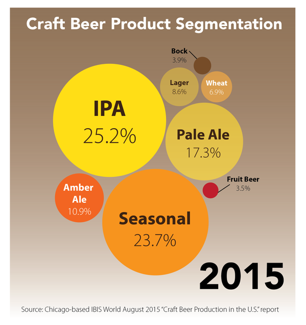
Carla Jean Lauter, better known by her nom nom de plume, The Beer Babe, was similarly bothered by the chart, but decided to do something about it. She “fixed” it, making the bubbles proportional to their market share so the chart is easier to read and better represents the reality it’s trying to convey. She also chose the colors of the bubbles to be representative of the beer color of each style, even choosing pumpkin color for seasonal. As Lauter tweeted when she posted her version of the chart, “I feel better now.” Weirdly, so do I. It’s so much better.


Thanks for sharing this, Jay. I was waiting in a boring airport terminal when I saw the original graphic – editing it became a way to pass time before my flight. Someone had to right those data visualization wrongs. Cheers!