

My friend and colleague Rick Lyke has the good fortune to have a son-in-law who’s a graphic designer and really, really good at creating graphs or infographics, which is essentially a chart that tell a story. For the second year in a row, Rick has persuaded his son-in-law, Mike Wirth, to create an awesome infographic of various GABF medal statistics for his Lyke2Drink blog. Since he introduced this back in August, about a month before this year’s GABF, hopefully he won’t mind my sharing it. I’ve parsed some of the most interesting mini-charts within the infographic and displayed them below.
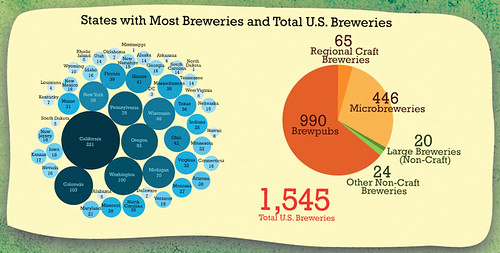
These charts show the number of breweries by state and the total number by type or size of brewery.
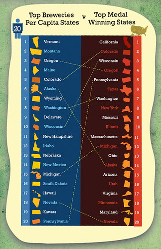
This is a chart of states with the most per capita breweries vs. the states that have won the most cumulative medals since they began awarding medals through 2008.
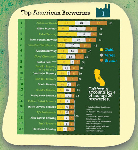
This is a chart of the breweries that have won the most cumulative medals since they began awarding medals through 2008.
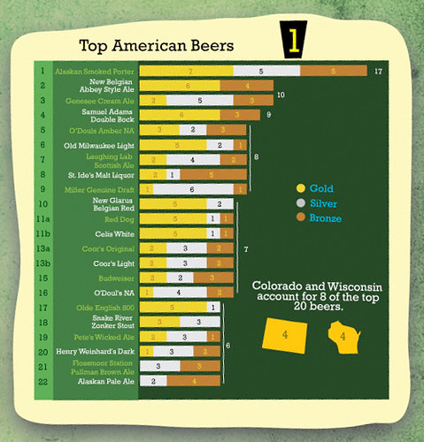
This is a chart of the individual beers that have won the most cumulative medals since they began awarding medals through 2008.
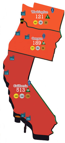
Lastly, here is a detail of the west coast and the medals won by breweries in California, Oregon and Washington.
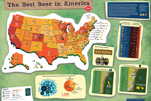
This is the entire infographic, show smaller of course, but click here to see it full size or see it at Mike Wirth’s website or with Rick Lyke’s original analysis.