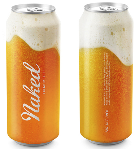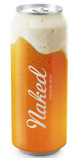
This is an interesting design, generic beer cans, made to look as if they were essentially clear and showing the contents inside, albeit in an idealized way. They were created by Timur Salikhov, a designer from St. Petersburg, Russia.

He starts with the premise “Why hide what good beer looks like?”

And then he designed the cans to appear as if they were a freshly poured glass of beer. It’s fun concept and apparently he’d like to sell the idea to a brewery. I think the only unfortunate aspect of his design is that without additional branding on the package, it may look too generic. BUt it sure looks like a beer I’d like to open.


Nice concept. Reminds me of an Acme can from the 40’s that was pretty much the same thing.
You could tint the artwork to reflect the product inside the can, too. Lighter for lager. Darker for stout, etc.