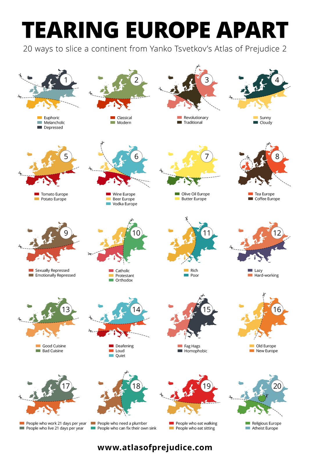
I love maps, I does, and especially the more interesting graphic ones that go beyond just showing you point a, b and so on, especially the kind often referred to as pictorial maps. So I was excited to find out about this collection, called The Atlas of Prejudice, by Yanko Tsvetkov, a Bulgarian graphic designer living in Spain. From what I can gather, it’s an amazing, sometimes hilarious, collection of maps and charts showing how different groups view themselves and the world around them. He’s recently published a second volume of the atlas, and in promoting the new volume put out this clever poster of 20 ways of “Tearing Europe Apart,” as an example of the kinds of charts to be found in Atlas 2.

Click here to see this chart full size.
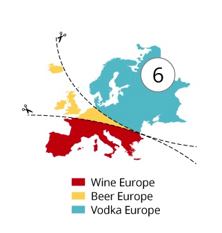
Number 6, in the second row, shows how Europe can be divide into beer, wine or vodka loving/preferring regions.

Take a look at that yellow sliver of a triangle in continental Europe. I suspect that the whole project is meant to be more thought-provoking and/or funny as opposed to being a completely accurate rendering of data, more using stereotypes or the author’s (and perhaps many other people’s) sense of these differences that are highlighted by the charts. But still, the slice of beer seems a bit too small to me, cutting through Belgium, obviously, the Netherlands, but only a portion of Germany, Austria and the Czech Republic, and also ignoring most of the Balkans and many far eastern European nations. I had always thought that those areas heavily favored beer, but maybe that’s outdated or was simply wrong. So I ask my Europeans friends and colleagues. Does that look right? Is vodka more popular than beer in most of those areas shown in in blue?
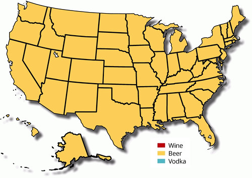
I don’t think he did a similar chart for the U.S. But I think it would look something like this:


I certainly like your map, however, last week, the Washington Post put together a map of parts of the country with more breweries or more wineries. I found it quite interesting how many wineries we have across states that I’ve never associated with wine…
Interesting maps, too, but those reflect the number of breweries and wineries, not consumption. Given that beer enjoys a roughly 49% marketshare of all alcohol in the U.S., I think it’s safe to say we’re a beer-drinking nation. It’s certainly possible that wine or vodka could be outselling beer in one or more states, but I’ve never seen any evidence of that.