

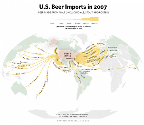
Today’s infographic is entitled U.S. Beer Imports in 2007 and was created by Matthew Bambach for, I believe, a newspaper article about beer imports. But I like how it neatly shows the flow of the beer from different places into America.
Click here to see the map full size.
Wow, this seems to show more coming across from the Netherlands than Belgium and the UK. Really interesting, I wouldn’t have thought that based on how often I see Belgian and UK beers…
Remember that a lot of Heineken reaches our shores.
Wow. We really do drink a lot of Heineken and Amstel. An amazing amount.
… not to mention Corona & Dos Equis