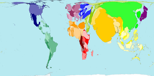
Today’s infographic is a type of map known as a cartogram, which takes a standard map and distorts the land masses based on a particular data point. It was created by World Mapper, a website that’s done close to 700 cartograms showing a variety of data in this way.
Here’s the standard map, showing each country based on their land mass. Actually, a Mercator projection is the one most of us are familiar with, but that map distorts the size of land which shows the round Earth as a flat map that’s drawn as if you took the globe apart and laid it down, making the land closest to the North and South poles look much bigger than they are in reality. The standard map for World Mapper is known as a Gall–Peters projection , which shows the land masses much closer to their actual size.

Click here to see the map full size.
What a cartogram does is take their standard map and distort the land masses of nations on purpose, to show the differences in the data more clearly by how much it’s been distorted from the original. For example, here’s the same map, but distorted to show the world by population.

Click here to see the map full size.
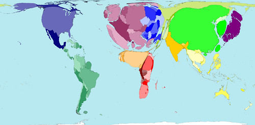
So here’s the same map again, but this time distorted to show absolute alcohol consumption, based on data from 2001.

Click here to see the map full size.
Here’s some more information on the alcohol consumption map.
The average Western European drinks over a third more alcohol than the average person living in any other region. The lowest alcohol consumption per person is found in Southern Asia, where on average people drink less than a third of the average consumption elsewhere.
In some territories there is practically no alcohol consumption. Many Middle Eastern and Northern African territories are not visible on the map for that reason. In contrast, China, the United States and the Russian Federation have the largest areas on the map, because the most alcohol is consumed there by large populations.
If you’re curious about the debate surrounding different map projections, take a peak at the Gall-Peters – Mercator projection Debate, a closer look at the Gall-Peters projection at the Power of Cartography, and a good overview of different projections at One world, many faces: A brief look at map projections.
