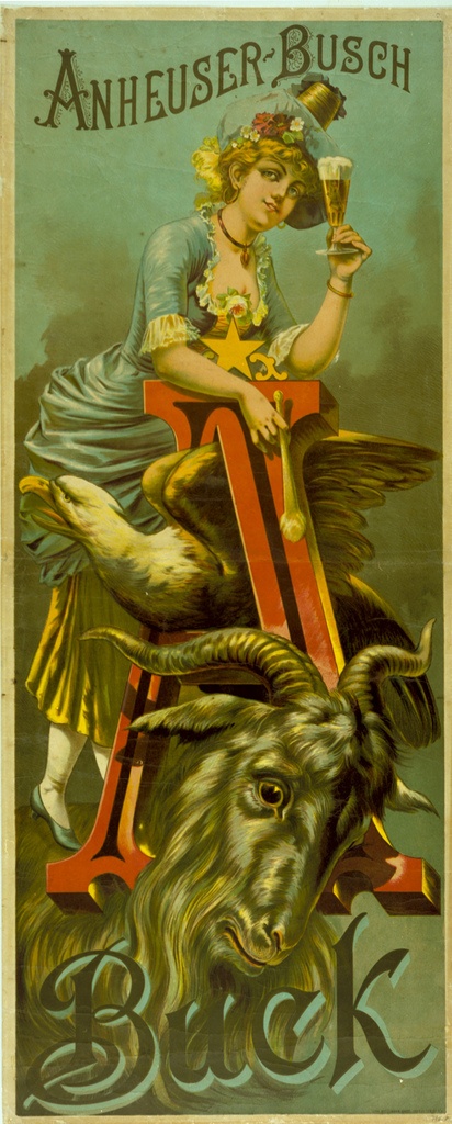
Tuesday’s ad is for Anheuser-Busch Buck, from 1885. By “buck,” one presumes they mean bock and used a slightly alternate spelling. The lithograph was created by the Wittemann Brothers, Adolph and Herman, of New York. It’s odd poster, with the eagle and goat, or buck, looking almost garish or frightening, especially juxtaposed with the 1880s equivalent of a supermodel.


Interesting – the only possible explanations (assuming a typo) are that:
1. Whoever submitted the bottom line in writing forgot to close the “o” in bock (so it looked like a “u”) or, if done verbally;
2. The artist misheard “bock” as “buck” from a mumbly/mush-mouthed German.
For sure nobody proofed it, so if anyone can reference “Bock” actually being called “Buck”, please post back!