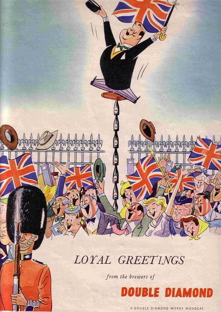
Wednesday’s ad is for the UK brand Double Diamond, which was originally owned by Allsop, but is now part of the Carlsberg dynasty. The ad’s tagline, “Loyal Greetings from the brewers of Double Diamond,” and shows their cartoon mascot propping himself up, high into the air, on beer bottles so that he can better see the passing parade. As for when the ad is from, the bottom offers a clue. The phrase found there, “A Double Diamond Works Wonders,” was used during the 1970s. I assume there was some sort of royal ta-do going on.
Beer In Ads #777: Go First Class With Pizza & Beer
Tuesday’s ad is for Miller High Life, from the early 1960s, part of their “Go First Class” series. The ad seems to be saying that pizza and beer are the path to being high class. Now, I’m a great lover of pizza, and there are few pairings so obviously perfect together than beer and pizza. I could eat pizza almost every meal if you let me, and there are amazing gourmet pies all over the place these days. But in the 1960s? I certainly don’t remember pizza being thought of as “high class” until very recently. Also, I have to say. That is not the most appetizing pizza I’ve ever laid eyes on.
Beer In Ads #776: Chicken In The Basket
Monday’s ad is for Pabst, from 1954, part of their “What’ll You Have” series. The ad features a glass of Pabst paired with “Chicken in the Basket.” That’s some shiny-looking chicken. One interesting thing about the ad copy is I’m used to beer being “paired” with food, but here they say this. “Teamed with any food, distinctive Pabst Blue Ribbon makes meal-time an extra pleasure.” That’s an interesting way of putting it. One’s not paired with the other, but instead the two teamed up together.
Pixelated Beer
If you’re as old as me, you probably remember when video games had very limited graphics and most were pixelated, only roughly approximating what the characters and backgrounds in the games looked like. I remember getting an Atari 2600 right after high school and playing it a lot while I was in the Army, when we had long blocks of time to kill. Worse still, the very first videogame I played was — believe it or not — Pong, in a stand alone cabinet that was inside Shea Stadium, when my step-grandparents took me to see the Mets play sometime in the early-to-mid-1970s. It must have been after 1972, since that’s when Pong debuted. I was Orioles fan back then — Brooks Robinson was my guy — so I don’t know why we went to see the Mets. Anyway, pixelation seems to be hot again these days in design, some kind of retro nostalgia no doubt. An artist in Spain, Iñaki Soria Izquierdo, did a series of designs of well-know beer bottles using a pixelated style. He appears to go by just his middle name professionally — Soria — and at his site, in his portfolio, is what he calls IcoBeer. I assume because he’s in Spain, the designs are all for well-known international brands, because it would be great to see his treatment of some American brands.
His website includes only the following description:
Pruebas gráficas de representación iconográfica de objetos (Estrella Damm / Heineken / Corona Extra / Guinness) a partir de estructuras y formas geométricas básicas.
Which Google translates as:
Graphic evidence of iconographic representation of objects (Estrella Damm / Heineken / Corona Extra / Guinness) from basic geometric shapes and structures.
But they remind me of those early videogame designs, with just simple square and rectangular shapes, and very few curves, to give the impression of the bottles and labels. Anyway, I think they’re pretty cool. Here are the four designs Soria did:
Corona
Guinness
Heineken
Estrella Dam
Beer In Ads #775: New Schlitz Label
Beer In Ads #774: Argentina Here We Come
Thursday’s ad is for the Scottish brand Younger’s Tartan Special, from 1978, when, presumably the beer started to be imported to Argentina. I love the idea of a giant plaid boat, flying the Scottish flag. For some reason this ad reminded me of a scene in the Herman Raucher novel, “Summer of ’42,” where the main character, Hermie, is trying to buy a box of condoms and is thinking as he’s looking over the different packages that whatever color the box happens to be is also the same color as the condom itself. He sees a plaid box and thinks to himself, something along the lines of, “plaid, that’s enough to send a young girl screaming into the night!” It’s funny what sticks in your head. But the idea of a ginormous plaid boat would be quite a sight coming over the horizon.
Beer In Ads #773: Beer — The Healthful Refresher
Wednesday’s ad is for the Barley and Malt Institue, located in Chicago, Illinois. They remind me a bit of the Beer Belongs series by the U.S. Brewers Foundation, with a beautiful illustration with a ribbon of text and information at the bottom of the ad. What a great tagline: “Beer — The Healthful Refresher brewed with the Goodness of Malt.” The text goes on. “Invigorating! That’s the word for wholesome, refreshing, beer or ale brewed with Barley Malt.”
Beer In Ads #772: Americans Are Going To Eat Better .. Feel Better .. Look Better
Tuesday’s ad, the first for 2013, is for Budweiser, from 1945, when World War 2 was at its end and optimism was running high. This one is also quite remarkable, and te text-heavy ad argues that the laboratories of Anheuser-Busch during the war have done great thinks to combat that other scourge of the age; malnutrition. The message is clear. Do your duty and drink Bud, so they can continue their nutritional research. Thank you A-B.
Beer In Art Reboot
Once upon a time — okay, a couple of years ago — each Sunday I posted a work of art featuring beer or some aspect of brewing in my Beer in Art series. Sunday got increasingly busy with the family and it was taking a long time to research each artwork, so I quietly migrated the project to a Tumblr blog, also named Beer in Art. It’s been going strong ever since, and every day, not weekly, I post a new work of beer-themed art. The trade-off is that there isn’t as much information about each piece, but the advantage is more art, seven times as much to be exact. There’s nearly two year’s worth of daily art already there in the archives, stretching back to February 2011, when I made the switch.
For example, today’s work is by Robin Casey, a California artist, and is appropriately titled “Ring in the New Year … with Beer!” The art runs the gambit from old, traditional works to modern, abstract takes, along with artistic advertising and illustration, clever doodles and t-shirt art, amateur and professional works, from all over the globe, using paint, sculpture and a digital paintbrush; really anything that uses beer or beer’s ingredients as, or in, a work of art. Check it out every day, around Noon, for a new Beer in Art masterpiece.
Beer In Ads #771: To Help A Child’s Dream Come True
Monday’s ad is also for Budweiser, again from 1942. This one is quite remarkable, and uses corn syrup and the love of candy by children to make its case. Here’s the thinking. “To the great candy industry of America, corn syrup is a necessary ingredient. Used in other foods as well as candy, it contributes much to the energy and nutrition of the nation.” Thus, A-B’s “Corn Products Division” is as wonderful as their beer business. So drink Bud and “Help a Child’s Dream Cone True.”