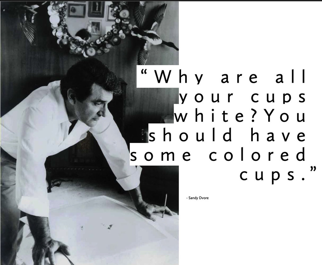
Today is the birthday of Sandy Dvore (August 28, 1934-November 20, 2020). He was a prolific American artist, graphic designer, and title designer. This short biography from his Wikipedia page gives the highlights:
Around 1962, he met Hollywood publicist Guy McElwaine playing baseball, who represented Natalie Wood, Warren Beatty, Judy Garland and Tony Bennett and needed ads created. Through this connection, Dvore became well known for designing back cover art for Sammy Davis Jr. in Variety. Dvore then illustrated an ad for Judy Garland for Judy at Carnegie Hall which caught the attention of American theatrical agent and film producer Freddie Fields. The pair worked together for 13 years on numerous projects. Dvore would go on to illustrate hundreds of ads for stars like Frank Sinatra, Liza Minnelli, Natalie Wood, David Bowie, Mick Jagger, and Steve McQueen. His minimal but vibrant illustrated trade ads held the coveted back pages of The Hollywood Reporter and Variety for years.
Sandy Dvore is best known for his work in designing television title sequences, such as the walking partridges in The Partridge Family, and the brush-stroke logo and paintings from the long-running soap opera The Young and the Restless. His film title credits include the 1976 film Lipstick and the 1972 Blaxploitation thriller Blacula. He also designed the opening credits for selected seasons of the nighttime soap opera Knots Landing.
Dvore’s work in graphic design won him an Emmy Award in 1987 for Carol, Carl, Whoopi and Robin.
But as memorable as that work is, that’s not why I’m sharing his birthday here, as you might expect. He also worked on a more beer-related project. Robert Leo Hulseman, whose father founded the Solo Cup Company. In the 1970s, Hulseman hired Dvore to design a new plastic cup for the company. Here’s the story, from the now-defunct design blog Design-Ago:
One rainy day in early 1970’s Los Angeles…
Leo Hulesman, founder of the Solo cup company, stopped by the studio of Hollywood designer Sandy Dvore.
“I heard you’re the best commercial artist around.” Said Hulesman.
This was true. Dvore was the hottest designer in Hollywood. His work appeared everywhere from billboards to trade ads and most famously, every week in the Hollywood Reporter and Variety publications. At the time, these were the most important pieces of the Hollywood community. EVERYONE looked to these weekly magazines to see what their peers were doing.
Hulesman was looking for a design for his new venture, children’s records that would be a promotional giveaway on the Solo cup box. You see, Dora Hall, a singer who was also Mrs. Hulesman, had given up her career in Ziegfield Follies to raise their children. This was a chance for her to get back to performing again and do something her children could enjoy.
“I’m doing very well now” said Dvore. “I’ve got some major projects and I really don’t want to do small piece work. It would take up a lot of time.”
“What if I give you a retainer?” Said Hulesman.
“He was sharp”, Dvore thought.
At the time Dvore was doing big name television projects, The Partidge Family and The Waltons.
“I could send you a chunk of money…” “What kind of number are we talking?” Asked Hulseman.
“$17,500” stated Dvore.
“Why don’t we just make it a flat $25,000.” Replied Hulesman.
They shook hands and Hulesman smiled. He enjoyed the banter as he, like Dvore, was a self made man from Chicago.
“He liked that I could handle myself.” Dvore remembered. “We became friends and I enjoyed knowing him.”
Hulesman enjoyed sharing the success he had. He would pay for entire television specials for his wife Dora so she could have an opportunity perform.
When it’s time to change.
“The Solo company at the time had an old serif logo right out of a type book.” Dvore remembers.
Dvore looked at the two O’s in the SOLO logo and the idea came to him, simple as that.
He hadn’t been asked to create a new logo either. He just thought,“as a artist, we can do better.”
Hulesman had his feet propped up on Dvore’s desk when he showed him what he had come up with.
“We should change your logo, this should be the logo for your company.” Dvore slid the concept to Hulesman.
The negative space in the SOLO, O’s replaced with cups, along with a new san-serif type.
Hulesman looked at it and replied, “send it to the company.”
And, one short phone call later, it became the logo you still see everywhere today.
Sometimes, but not often, it IS that easy.
A relationship of trust formed between Dvore and Hulesman. Which is why Dvore felt comfortable proposing new ideas.
“Why are all your cups white? You should have some colored cups.”
With this idea Dvore took the colors from his recent Partridge Family art and applied the same blue, yellow and red to the cups.
And in another short phone call to the factory, the Solo cup company started producing color cups.
“I even used the same color numbers from the Partridge Family logo.” Recalls Dvore.
And so, once again, a simple yet smart idea, a phone call, and the rest is history, the red Solo cup was born.
Whoever would have thought a cup would be so famous?
It has inspired songs, drinking games, tattoo’s, merchandise and created plenty of hazy memories.
Why red became the go-to, and a cultural icon is anyone’s guess.
“It’s become the most well known and most seen thing I have ever done.” Dvore states today.
Every day, millions of people get their morning cup of coffee and before they take a sip there it is, the Solo cup logo.
Every night, people attend a party or have a game of beer pong and there it is again, the red Solo cup.