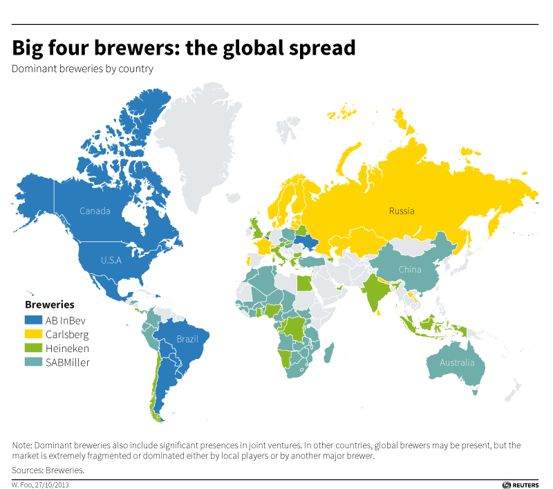
Looking for something else this morning, I found this map created by Reuters from 2013, showing the dominant beer company for each country, effectively showing “the global reach” of each of the four biggest companies at that time. This was created the last time rumors were circulating about an ABI takeover of SABMiller, in October of 2013.

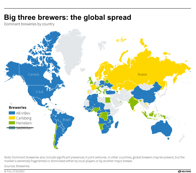
So I took the map and quickly replaced the teal of SABMiller with ABI blue to show what the global reach might look like post-buyout.

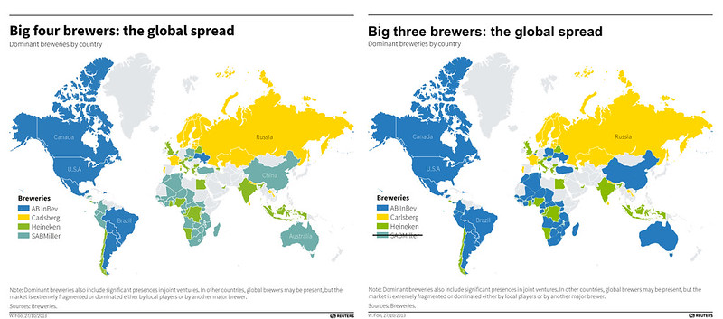
And here’s a side-by-side comparison. There will be a lot more blue.

