

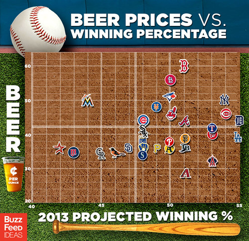
Today’s infographic is about baseball’s Beer Prices vs. Winning Percentage, a chart showing “the projected winning percentage of Major League Baseball teams this season, per Baseball Prospectus, compared to the price of beer at their stadiums,” which they got from an earlier infographic I posted.
Click here to see the poster full size.
That poster’s a joke – wrong on all counts. I’m a big baseball fan who’s been to most of the parks. There’s no way in hell that Fenway Park has higher beer prices than the new Yankee Stadium; SF & Oakland are far lower than they should be regarding beer prices. Further, the Dodgers & many other teams are misrated for winning % (excusable if the creator looked @ Vegas odds before the season started).