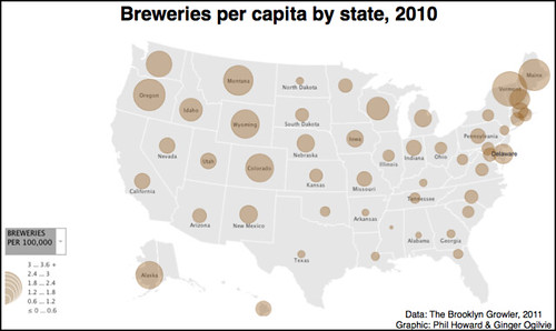
I recently stumbled upon this nice infographic showing Breweries Per Capita By State 2010 based on data compiled by the Brooklyn Growler. It was created by an assistant professor at Michigan State University, Phillip H. Howard, with help from a Ginger Ogilvie. The size of the circles neatly shows the relative number of breweries in each state, relative to its size, though knowing how populous each state is helps to make it more understandable.

You can see the map full size here.


