Today’s infographic was created by Gene Ullery-Smith for the Michigan men’s magazine NM3. You can also buy a copy of it on Cafe Press.
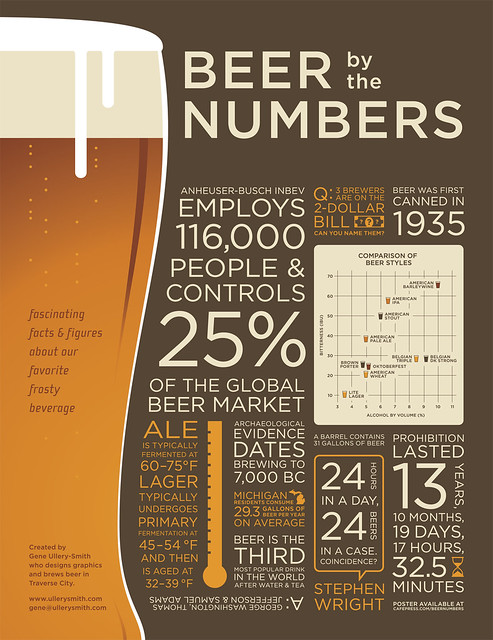
You can see a larger version of it here.

Today’s infographic was created by Gene Ullery-Smith for the Michigan men’s magazine NM3. You can also buy a copy of it on Cafe Press.
You can see a larger version of it here.

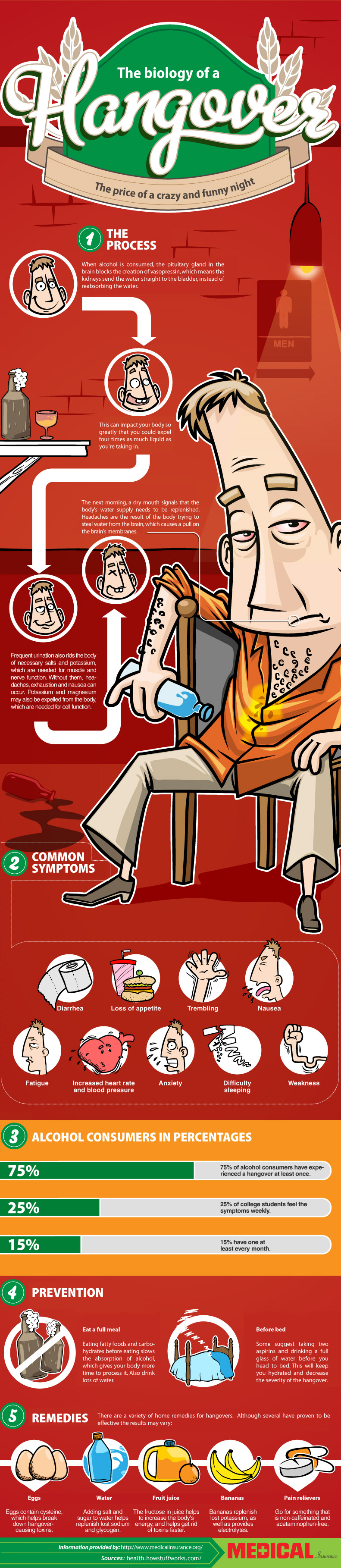
Today’s infographic tackles the morning after. In the Biology of a Hangover, it “goes over the course our bodies go through as it processes alcohol and how it leaves us with the dreaded hangover.”

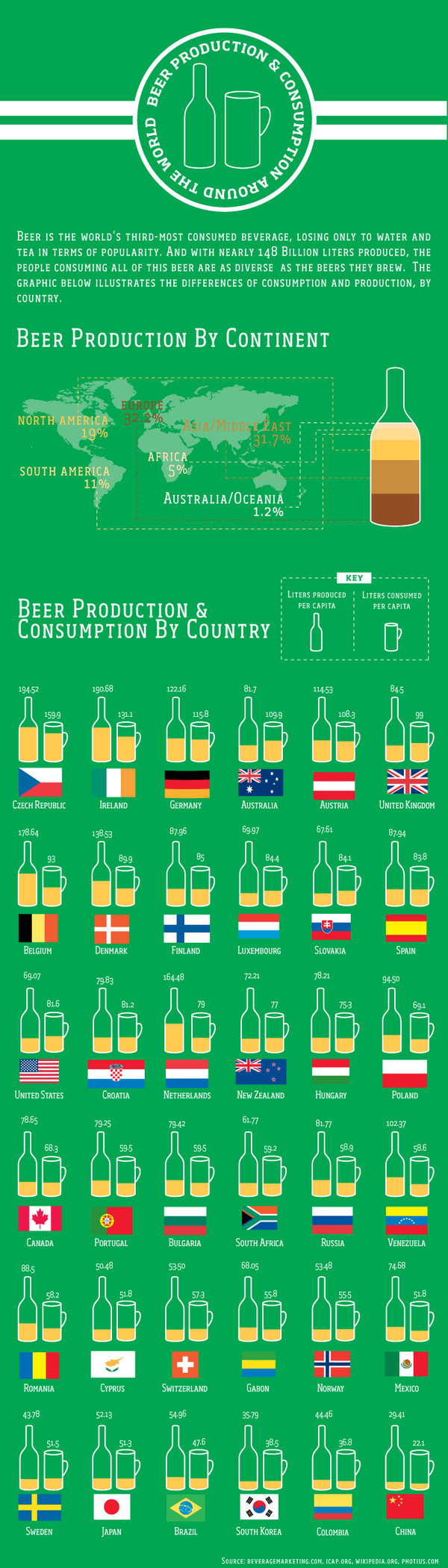
Today’s infographic shows how much people are drinking around the world, along with how much brewers are making to satisfy that demand. Global Beer Production and Consumption also shows distribution of alcohol by continent.

Today’s infographic is cheekily titled Beer Me Bro. It was created by Sarah Ostman, a student at Syracuse University, while she was an intern at Lab 42. Here’s her description of the project.
We took a look at a couple different topics surrounding men and beer advertising: how men are portrayed in ads, which factors influence their beer choice, and what types of ads they find most appealing. The most surprising stat? 57% of men said they don’t relate to male characters in beer ads. Check out the infographic below for the low-down on men in beer advertising.
You can see the infographic full size at Lab 42.

The Brewers Association just released the number of breweries in the U.S. as of the end of last year. As of December 31, 2012, there were 2,336, which represents an increase of 387 over the previous year, meaning just over one new brewery opened every single day. Just as staggering; the total number of breweries-in-planning stood at 1,254.
And here’s the breakdown:

Today’s infographic showcases the World’s Strongest & Strangest Beers, at least as of last year. Who knows what stronger or stranger beers have been released since then.
![]()
Today’s infographic tackles the Price of Beer Around the World. Djibouti has the highest priced beer while Panama has the cheapest.
![]()
Today’s infographic is a fairly narrow one, in terms of its scope. It tackles beer in Slovakia. And although Slovak Beer uses a limited color palette, it still manages to communicate the information quite elegantly. I’d like to see one of these for every country.

Today’s infographic is courtesy of Travel Insurance, and is entitled A Beer Tour of America. It’s geared toward the big boys and a few of the larger regionals, but if you were shopping for travel insurance, this would still be a far better way to spend your time.
You can see the chart full size at Travel Insurance.
![]()
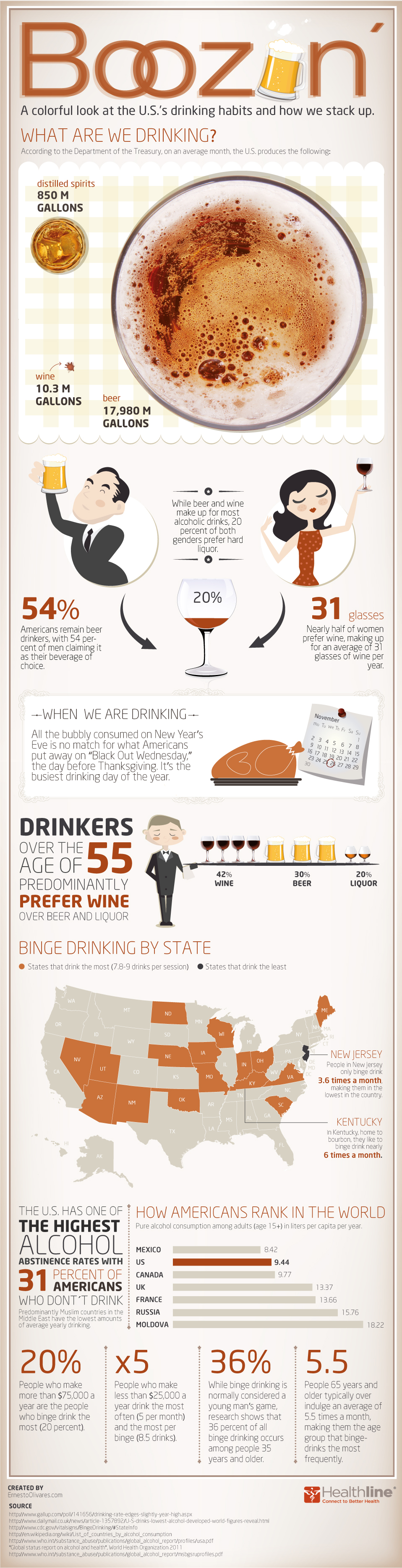
There seem to be so many of these colorful infographics around these days that I could post one almost every day and not run out for a while. So here’s today’s, Boozin’ A Colorful Look at the U.S.’s Drinking Habits and How We Stack Up. One curious figure I noticed, especially given the whining of the neo-prohibitionists. We have one of the highest teetotaler percentages, WTF? That’s disappointing. Another factoid that stood out was that the heaviest drinking day of the year was the day before Thanksgiving, what they referred to as “Black Out Wednesday” — do I hear a new holiday being created? That surprised me, though while they do list sources at the bottom of the chart, it’s not clear where that one came from. I would have thought Halloween, or one of the summer big picnic holidays.