

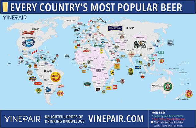
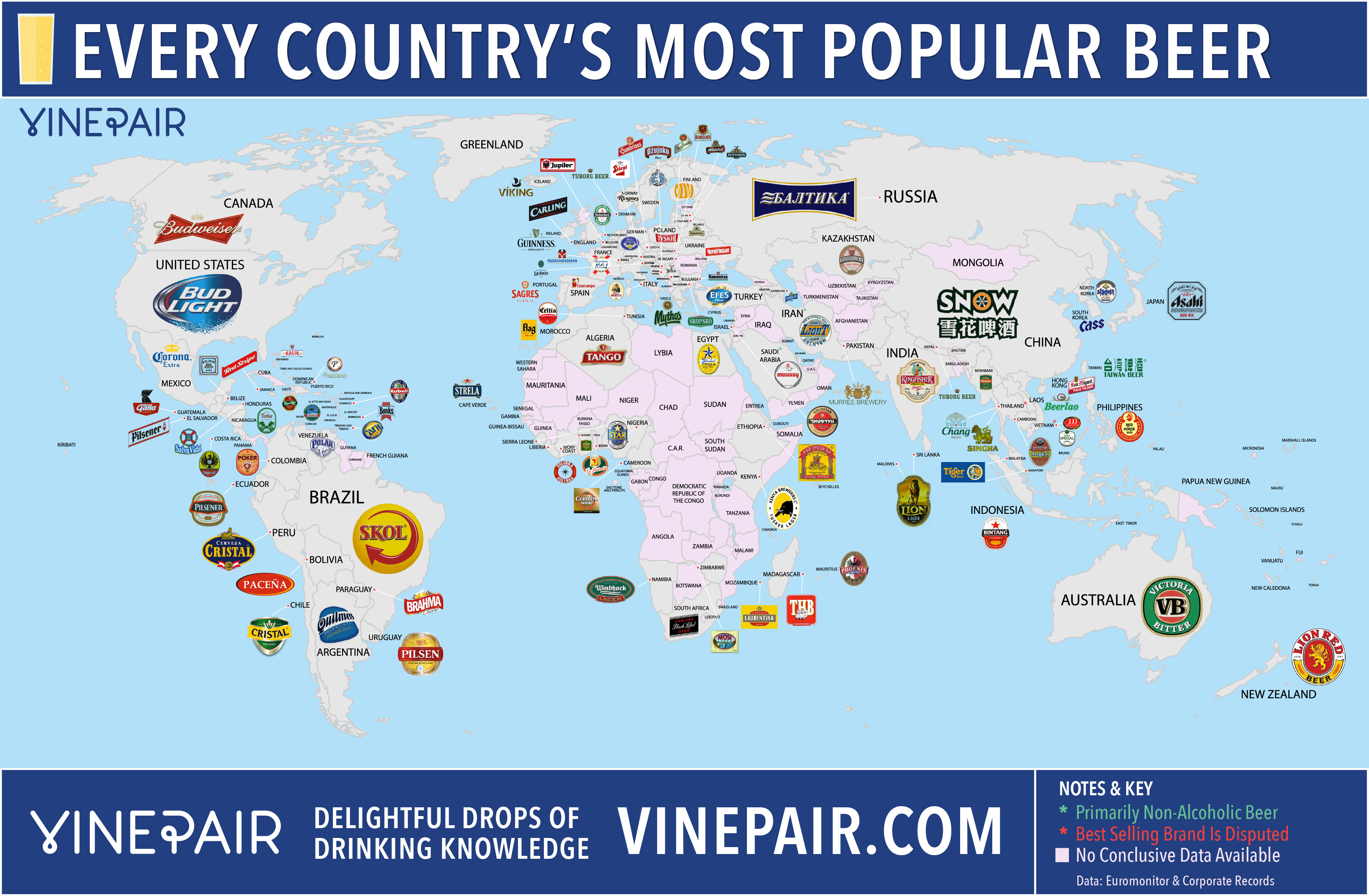
Here’s an interesting map. Vinepair has created a global chart of “The Most Popular Beer in Every Country,” based on “market share for each country” from “the most recent year available.” If they couldn’t find the data, or if there wasn’t a clear winner, they left them off the map, which is why there are some countries with no beer listed. That’s especially true in Africa and parts of Asia but, curiously, for Scotland, Wales, and Northern Ireland, too.
Top 10 Party States

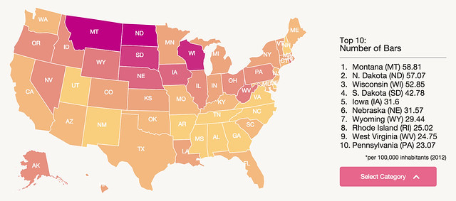
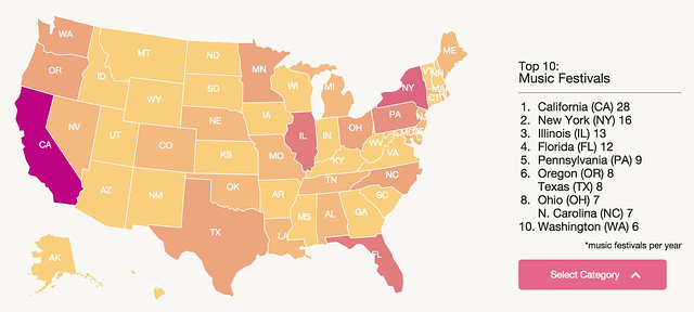
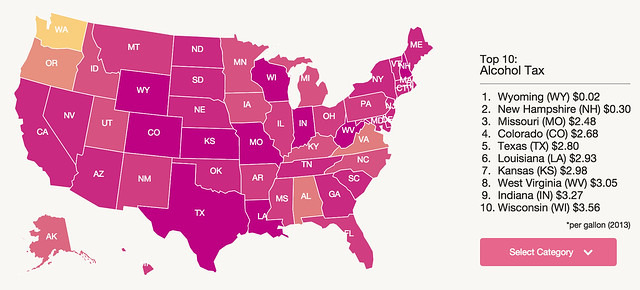
I got an e-mail this morning from Retale, a mobile app company, with an infographic showing the Top 10 Party States in the Country. To arrive at the list, they looked at a variety of factors including the number of bars, universities and colleges, music festivals, party stores, beer consumption, alcohol tax, hours opened, median age, the number of clubs and how popular the state is for tourism.
Obviously, these types of lists are highly subjective and tend to please no one, but it’s still fun to look at how the numbers shake out on all of the categories they used. Overall my home state of California tops the list, despite being number 1 in only two of the categories (music festivals and tourism). We have nearly double the breweries of our closest state, and a few wineries, too, so I’m okay with that.

How They Created This Ranking
According to Retale. “In determining what criteria to use for this list, we considered contributing factors to party culture, including events, alcohol consumption, venues, tourism, and youth culture. Our Top Ten Biggest Party States interactive visual was calculated based on an analysis of [the following] data.”
Alcohol consumption per capita
Number of nightclubs per capita
Number of music festivals in each state
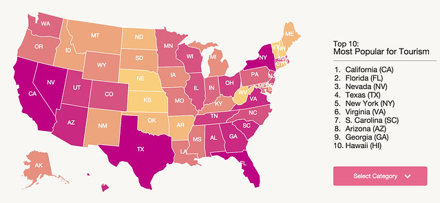
Most popular tourist destinations
Number of bars per capita
Population density
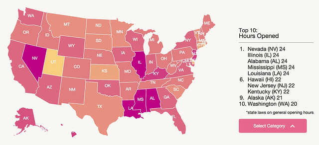
Last call: opening and closing hours
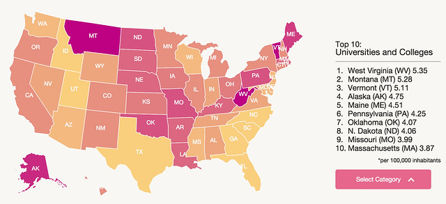
Number of universities and colleges per capita
Combined alcohol taxes (lower the better)
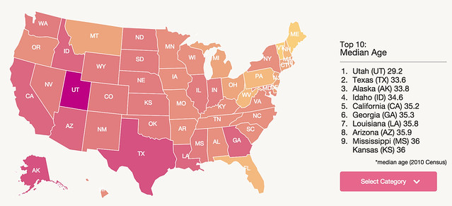
Median age (lower the better)
Here’s their write-up for California.
1. California (CA)

California is known worldwide for its pristine beaches, enviable year-round weather, HWY 1, and Hollywood. The state is also the #1 ranking party destination in the U.S. There is a reason why our favorite pop and rap artists rave about the California party scene, with its thriving nightlife, underground techno, and midnight street shindigs. California has the highest number of festivals, the second highest number of bars by state (over 3,000), and the most universities and nightclubs relative to population.
With diverse demographics, an expanding youth culture, and innovation in tech and the arts, California has been an epicenter of art and social movement since the 60s. Rivaling party cities in California include L.A., San Francisco, San Diego, Sacramento, and Long Beach.
Individual Statistics


You can see the interactive map online at Retale. Moving the cursor and hovering it over each state reveals the answers for each datapoint.

Craft Beer Share Reaches 10%
![]()
The preliminary numbers for 2014 are out, and the news is fairly spectacular, especially if you remember Kim Jordan’s keynote speech in New Orleans predicting and challenging the industry to set 10 percent share of the market as an attainable goal. The Brewers Association today revealed that craft beer’s share of market finally blew past 10% and is now 11% of the total beer market, by volume.
From the press release:
In 2014, craft brewers produced 22.2 million barrels, and saw an 18 percent rise in volume2 and a 22 percent increase in retail dollar value3. Retail dollar value was estimated at $19.6 billion representing 19.3 percent market share.
“With the total beer market up only 0.5 percent in 2014, craft brewers are key in keeping the overall industry innovative and growing. This steady growth shows that craft brewing is part of a profound shift in American beer culture—a shift that will help craft brewers achieve their ambitious goal of 20 percent market share by 2020,” said Bart Watson, chief economist, Brewers Association. “Small and independent brewers are deepening their connection to local beer lovers while continuing to create excitement and attract even more appreciators.”
But wait, there’s more.
Additionally, the number of operating breweries in the U.S. in 2014 grew 19 percent, totaling 3,464 breweries, with 3,418 considered craft broken down as follows: 1,871 microbreweries, 1,412 brewpubs and 135 regional craft breweries. Throughout the year, there were 615 new brewery openings and only 46 closings.
Combined with already existing and established breweries and brew pubs, craft brewers provided 115,469 jobs, an increase of almost 5,000 from the previous year.
“These small businesses are one of the bright spots in both our economy and culture. Craft brewers are serving their local communities, brewing up jobs and boosting tourism,” added Watson. “Craft brewers are creating high quality, differentiated beers; new brewers that match this standard will be welcomed in the market with open arms.”

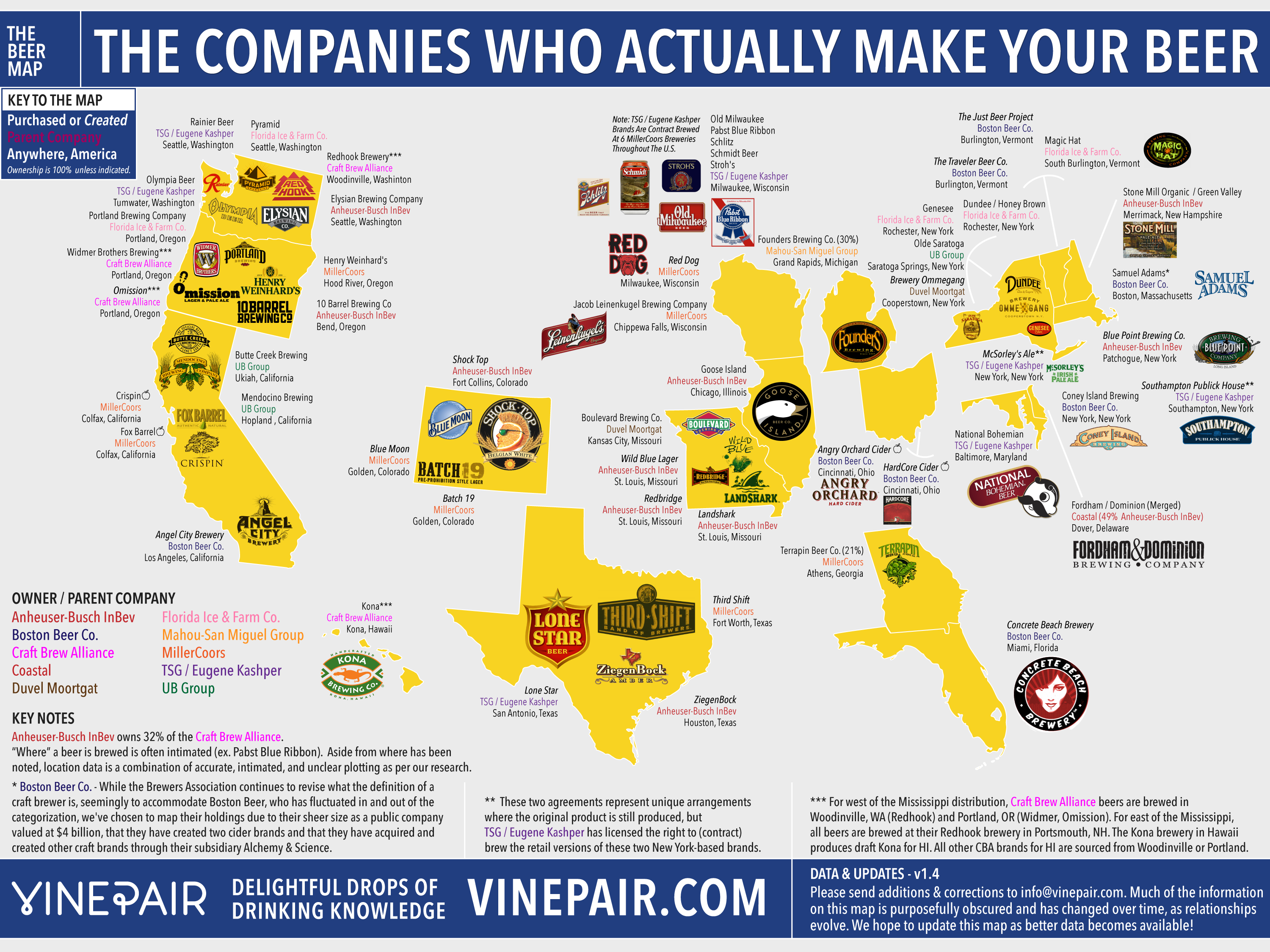
The (Big) Companies Who Actually Make Your Beer

Here’s yet another look at the changing landscape of brewery ownerships, this time from Vinepair, and while they primarily write about wine, they also must tacitly accept the well-trodden wisdom that “it takes a lot of beer to make great wine,” since they do occasionally tackle beer. Last week, the posted their “Map: The Companies Who Actually Make Your Beer.” It’s restricted to ten of the largest companies who own multiple breweries and, to their credit, it’s been updated four times so far, meaning they’re doing their best to get it right, which given its complexity, not to mention who often it’s changing, is no easy task.

Where Is Beer Country & Wine Country?
Someone posted a link in a comment last week, and I’d been meaning to take a closer look it. It’s from the Washington Post’s Wonkblog: Do you live in beer country or wine country? These maps will tell you.
I love the idea that there’s a Wonkblog, but it has taken liberties in analyzing its data in the past, and this one seems to continue that trend. Still, there is some interesting information here. But the map of where both wineries and breweries are located is somewhat misleading, because it covers over the one with fewer, even if there are a lot of both kinds there, which is the case.
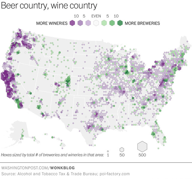
More revealing, I think, is comparing the two individual maps, grape color is wine, hop green is beer. What becomes clear from looking at the two separately that’s lost in the map with both is that fermentation takes place, whether beer or wine, in higher concentrations in roughly the SAME locations nationwide.
With very few exceptions, areas that have heavy concentrations of wineries also have a lot of breweries, too. That can’t be a coincidence, can it? To me, that leads to the inescapable conclusion that there is no wine country or beer country, but instead pockets of fermentation, or fields of fermentation. I would not be surprised to learn that there is also a lot of cheese-making going on in the exact same areas, too. Fermentation, it seems, follows fermentation. But that makes sense, intuitively.
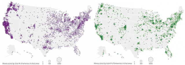
And here is beer wine individually, so you can see them in more detail closer up.
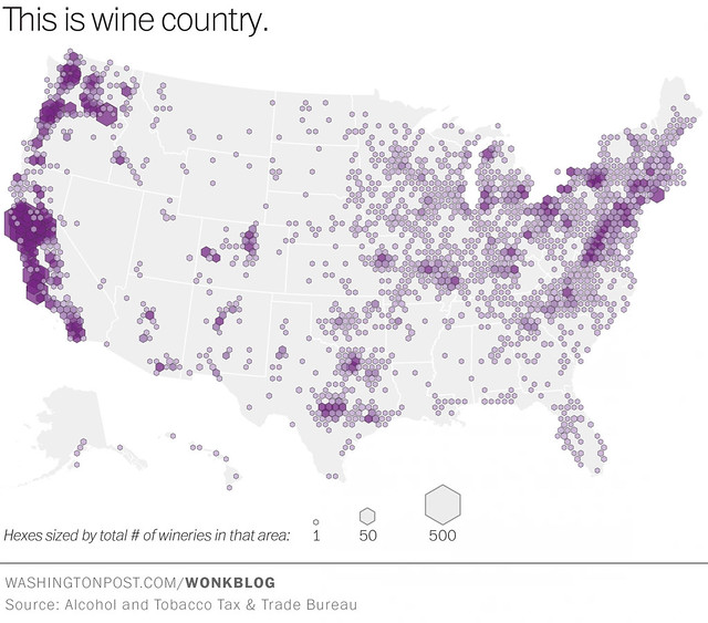

Also, curiously the Pacific Northwest is ignored in their analysis. In the text, they state that “beermaking dominates in the Denver region, and along the Southern California coast. Tucson may be wine country, but brewers rule in Phoenix. Brewers are strongly represented along the coast of Lake Michigan, and in most of Florida. Brewing is big in East coast cities too.” But three of the biggest, and darkest, green areas are the San Francisco Bay Area, Portland, Oregon and Seattle, all three with bigger concentrations of breweries than any other areas mentioned, with the exception of Denver and San Diego, which look roughly equal. So why the did? Beats me.
Wonkblog concludes with a chart showing trends in the numbers of new wineries and breweries, at least from 1998 through 2012. Was there really no data yet for 2014, or even 2013? And why did they use U.S. Census data for this chart, rather than where they got the other datasets for the maps? Also, I remember sower growth in the early 2000s, but the chart shows negative growth in the number of breweries from 2001 to 2010. Can that be correct? Or does that have something to do with it being Census data? Curious.

The Three Europes: Beer, Wine & Vodka

I love maps, I does, and especially the more interesting graphic ones that go beyond just showing you point a, b and so on, especially the kind often referred to as pictorial maps. So I was excited to find out about this collection, called The Atlas of Prejudice, by Yanko Tsvetkov, a Bulgarian graphic designer living in Spain. From what I can gather, it’s an amazing, sometimes hilarious, collection of maps and charts showing how different groups view themselves and the world around them. He’s recently published a second volume of the atlas, and in promoting the new volume put out this clever poster of 20 ways of “Tearing Europe Apart,” as an example of the kinds of charts to be found in Atlas 2.
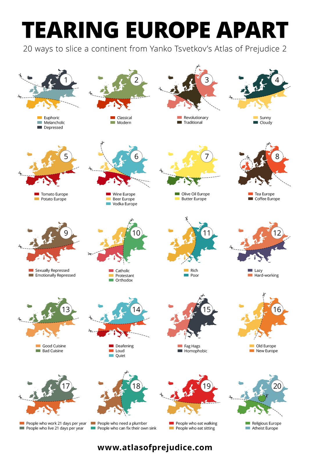
Click here to see this chart full size.
Number 6, in the second row, shows how Europe can be divide into beer, wine or vodka loving/preferring regions.
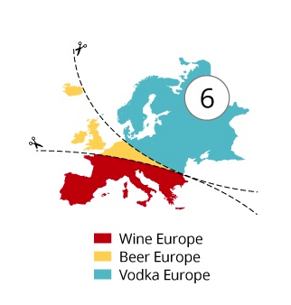
Take a look at that yellow sliver of a triangle in continental Europe. I suspect that the whole project is meant to be more thought-provoking and/or funny as opposed to being a completely accurate rendering of data, more using stereotypes or the author’s (and perhaps many other people’s) sense of these differences that are highlighted by the charts. But still, the slice of beer seems a bit too small to me, cutting through Belgium, obviously, the Netherlands, but only a portion of Germany, Austria and the Czech Republic, and also ignoring most of the Balkans and many far eastern European nations. I had always thought that those areas heavily favored beer, but maybe that’s outdated or was simply wrong. So I ask my Europeans friends and colleagues. Does that look right? Is vodka more popular than beer in most of those areas shown in in blue?
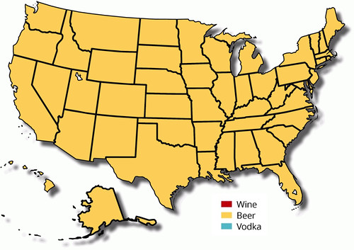
I don’t think he did a similar chart for the U.S. But I think it would look something like this:
The Rise Of Cancer

This has very little to do with beer, but it is related. In covering beer and health over the years, and especially the attacks by prohibitionists, I’ve read more studies, scientific journals and policy papers than you can shake a stick at. What causes different kinds of cancers is something that I’ve ended up following far more than I ever expected to focus on in any way. My mother died of breast cancer, and apparently it runs in my family, on my mother’s side, so perhaps I was predisposed to pay closer attention to cancer.
One thing I’ve noticed about all of the studies purporting to show what causes cancer, or what increases the risk of getting it, or similar conclusions, is that they’re rarely cut and dry. You hardly ever find that all studies agree or come to the same conclusion about anything. That’s one of the reasons that they have to be read so carefully, because their results are very much effected by the methodology, assumptions made, how whatever they examined or studied was collected, the biases and prejudices that were contained in either the questions asked or on the part of the people conducting it, and on and on. In short, the variables are nearly endless and frequently, if not always, have a lot to do with the results themselves. Even who funded a study can influence its results. Statistics and the studies that create them can be used to say just about anything and are used by organizations on every side of every issue to promote their view, both good and bad. This is detailed quite well in the classic book How to Lie with Statistics, but even more forcefully in the later expose Trust Us We’re Experts: How Industry Manipulates Science and Gambles with Your Future.
You can read one hundred studies about a particular kind of cancer and find that they all conclude something different, and sometimes have even contradictory findings. It’s rare that they all agree because the way they’re conducted is so different, and the parameters, geography and demographics are different, too. Similar ones may start to more closely agree over time, and patterns may emerge, and that’s where the real progress happens. Meta-studies examine multiple studies to see how, and if, patterns can be gleaned.
Drinking beer obviously affects our health, and has both positive and negative risks and consequences depending on how one drinks, how often and how much. Meta-studies have shown that people who drink moderately tend to live longer than both total abstainers and people who drink too much, but surprisingly even those who abuse alcohol will probably live longer than teetotalers. But that’s overall. For different types of cancer, drinking may either increase or decrease the risk of various kinds, making figuring out what to do a tricky, difficult and ultimately personal decision.
Something that’s always bothered me as I’ve been reading the findings of so many studies over the years is that they’re confusing, contradictory and often make little sense. It should make sense, shouldn’t it? But it doesn’t. Two people can live in exactly the same way, eating and drinking the same things and one will live to be 100 and the other drops dead at 50. Why? Even with something as obvious as smoking, who gets lung cancer and at what age will vary widely. I’ve always felt like there must be something more to who’s susceptible to cancer than what we’ve thought.
The new issue of Time Magazine (the January 19, 2015 issue) has an article that may shed some light on this dilemma. In Most Cancers Aren’t Your Fault, a new study seems to suggest that “Random DNA changes are usually to blame,” as opposed to the usual causes, or possibly in combination with those typical risks. Here’s the big finding in nutshell.
Now, in an eye-opening study published in Science, researchers report that the majority of cancer types are the result of pure chance, the product of random genetic mutations that occur when stem cells–which keep the body chugging along, replacing older cells as they die off–make mistakes copying the cells’ DNA.
That seems huge, a sea change in our understanding of how cancer works. “About 65% of cancers are the result of these DNA mistakes made by stem cells.” While that seems crazy, it might make better sense in explaining why some people get certain cancers and why others do not. For all our dogmatic insistence about what’s healthy and what’s not, it may turn out that luck is the single biggest factor. In the Abstract of the study, as reported in Science, Variation in cancer risk among tissues can be explained by the number of stem cell divisions
Some tissue types give rise to human cancers millions of times more often than other tissue types. Although this has been recognized for more than a century, it has never been explained. Here, we show that the lifetime risk of cancers of many different types is strongly correlated (0.81) with the total number of divisions of the normal self-renewing cells maintaining that tissue’s homeostasis. These results suggest that only a third of the variation in cancer risk among tissues is attributable to environmental factors or inherited predispositions. The majority is due to “bad luck,” that is, random mutations arising during DNA replication in normal, noncancerous stem cells. This is important not only for understanding the disease but also for designing strategies to limit the mortality it causes.
The Editor’s Summary makes it even clearer:
Why do some tissues give rise to cancer in humans a million times more frequently than others? Tomasetti and Vogelstein conclude that these differences can be explained by the number of stem cell divisions. By plotting the lifetime incidence of various cancers against the estimated number of normal stem cell divisions in the corresponding tissues over a lifetime, they found a strong correlation extending over five orders of magnitude. This suggests that random errors occurring during DNA replication in normal stem cells are a major contributing factor in cancer development. Remarkably, this “bad luck” component explains a far greater number of cancers than do hereditary and environmental factors.
As far as I can see, this goes a along way in explaining the seeming anomalies of why some smokers live to be 100 and others never make it past 50. The study, at least what limited amount of it I have access to, doesn’t go into which types are which, that is which types of cancers can be “attributable to environmental factors” or hereditary and which involve random chance.
But if fully two-thirds of all cancers are primarily subject to this roll of the dice, that seems to undermine a lot of walk-a-thons, colored ribbon awareness campaigns and careful abstaining as all for naught. Better to roll the dice and live your life to the fullest, enjoying all the pleasures you can.
Unsurprisingly, that’s not what the study’s authors are recommending. They’re quick to say that the “element of chance does not, however, mean you should stop wearing sunscreen or take up smoking.” One of the authors, Cristian Tomasetti points out that “while we may not be able to prevent all tumors, we can focus on early detection and taking advantage of lifesaving treatments like chemotherapy and radiation, among other things,” adding that “[w]e need to do everything we did before, but we want to do it even more than before.” I’m not entirely sure what he means by that, because it seems to contradict their own findings, but perhaps he’s just being cautious, or doesn’t want to take the blame if people go wild.
Medical studies like this one, and all scientific studies really, are supposed to be objective and free of bias, and indeed most are sold that way. Most people hear that a study found this or that and assume it was an impartial finding. But it’s been my experience that that’s rarely, if ever, the case. Bias seems to creep into every nook and cranny of science and medicine, just as it does in every other aspect of human existence. I want to believe that most scientists try to avoid such prejudices, but how many succeed is an open question in my mind. It’s not so much evil as being human. Isn’t the story of humanity simply the struggle between rationality and self-interest?
But speaking of evil, every time a new study (often funded by them) finds that drinking alcohol will turn you into a zombie, prohibitionists use it to push their agenda, and ignore every other study that says just the opposite, that moderate consumption will cure zombies, no need for decapitation. Their propaganda machine goes into full swing, insisting that one sip of beer and you’ll be undead. But this study (especially if follow-up studies confirm the findings), seems to support what I’ve frequently pointed out, that life is far more complicated than do this and that happens. Few things are all bad or all good. As cancer is apparently poised to become the number one cause of death in America (displacing heart disease at the top spot), it’s worth noting that we’ve come a long way since I lost my mother in 1982. If she was diagnosed today with breast cancer, the chances are much greater that she’d still be alive. But predicting whether or not she’d get cancer in the first place was more likely the result of bad luck than anything else. That’s what I’ve always believed and that won’t change no matter how many ribbons I wear. I often feel like the universe is laughing at us, so we might as well have a drink, or as the great Charles Bukowski once advised.
“We are here to drink beer. We are here to kill war. We are here to laugh at the odds and live our lives so well that Death will tremble to take us.”
Roll the dice. Pass the bottle. Repeat.
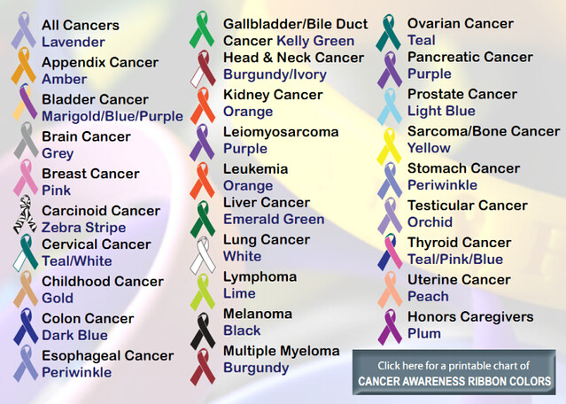
If you’re curious about all of the colored awareness ribbons, and what they mean, or what disease or condition they represent, here is the most comprehensive list I’ve ever seen. Scroll down about halfway through the post for the list.
Beer Giants Still Giant

The Wall Street Journal had a piece on the beer business entitled Beer Giants Cultivate Their Crafty Side which I can’t read in its entirety because I don’t have a subscription, but it did include a chart showing the current state of affairs in the beer industry.
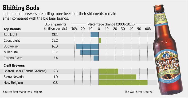
Shifting Suds. “Independent brewers are selling more beer,” but given this comes from the Wall Street Journal (which is all about BIG business) they can’t help but add “but their shipments remain small compared with the big beer brands.”
What the Wall Street Journal forgets to mention is that Anheuser-Busch was founded in 1852 and didn’t hit 1 million annual barrels until 1901, when they were 49 years old. Sierra Nevada took only 35 years (or less) to reach 1 million, and Boston Beer needed even less time, reaching their first million barrels 1996, meaning it took Samuel Adams 12 years.
Don’t Bet Dollars To Donuts Or Drinking

I think we can all agree that doughnuts are high in calories. I suspect few people would try to defend them as being a health food. Alcohol, on the other hand, is trickier. There are clear health benefits and, for some, health risks, too. But in order to paint alcohol as something worse than it is, prohibitionist groups feel no need to be truthful or avoid being misleading. To wit, today Alcohol Justice tweeted that “[t]here are the same amount of calories in a glass of wine as there are in a doughnut.”
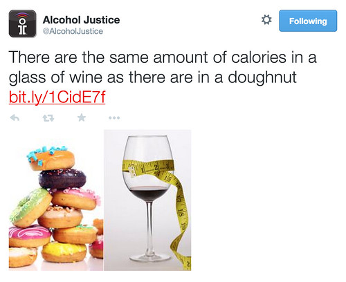
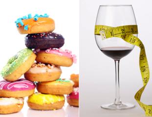
To ad insult to injury, the image they used to hammer home their point depicts not one doughnut, as the text is singular, but a pile of them, in fact eleven doughnuts are visible, though some just partially. And look at that glass of wine. Does that look like the standard 5 ounces? It sure doesn’t to me. That looks like a short pour, all in effort to deceive and mislead, as if just a tiny amount of wine is equal to nearly a dozen doughnuts.
The truth, of course, is different. A standard glass of red wine — 5 ounces — is around 125 calories, while a doughnut is 195 calories. That’s from doing a simple Google search for calories in a glass of red wine and calories in a doughnut. Not surprisingly, calories in doughnuts vary widely, and according to a list on Calorie Lab can range from around 100 to nearly 400, and apparently Krispy Kreme doughnuts are even higher, ranging from 200 to 400.
Alcohol Justice included a link with their tweet to a story at Redbrick, a student publication from the University of Birmingham in England. That’s also where they snagged the photo of the glass of wine. Who knows where the pile of doughnuts came from.
The article AJ is using for their own purposes, Should Alcohol Show Calories?, has its own share of inconsistencies, not that they’d matter to Alcohol Justice. Redbrick states that a “large glass of wine is about 200 calories, which is the same as a doughnut” but then, of course, it links to a British drinks calculator showing that a standard glass of wine is 175 ml, or less than 6 ounces. So to make their analogy of a doughnut and a glass of wine being equivalent they have to pour a larger glass than is considered the standard amount. Naturally, AJ ignores that and even tries their best to make it appear that drinking a small glass of wine is like eating almost a dozen doughnuts, at least that’s the visual message they’re sending.
I had hoped we’d see more honesty from the prohibitionists in 2015, but I guess that was a foolish hope on my part. I think I need a doughnut, or maybe a Sierra Nevada Pale Ale, which at 175 calories is still less than my glazed doughnut.
World’s Drunkest Countries
An online article today on Business Insider examines the World Health Organization’s most recent Global status report on alcohol and health 2014. Entitled Here Are The Drunkest Countries In The World, it gives the highlights of the WHO report. Unfortunately, in my experience WHO tends to lean on the side of prohibitionists in their approach to alcohol, highlighting primarily the bad aspects while ignoring the positive. As a result, WHO tends to be all doom and gloom about alcohol in the world. It’s a somewhat odd position. At any rate, they use the map below, showing per capita alcohol consumption by country, as of 2010 (but it’s the same data in the 2014 report).

See the chart full size.
One thing to notice is that despite the hue and cry from U.S.-based anti-alcohol groups, American consumption has been flat or down since its 1980 high point, and worldwide we’re pretty much in the middle of the consumption scale, not the lowest or the highest, as they’d have us believe. Canada drinks more than we do. So does Australia and most of Europe, especially Eastern Europe and Russia.
But even with WHO’s very conservative view of drinking alcohol, American patterns of risky drinking is even lower than average, squarely in the second-lowest category. For example, Mexico may drink less than Americans per capita, but still manages to drink in a more risky manner, and Canada and us are the same, despite out-drinking Americans. Likewise, Western Europe, which drinks more than most, engages in the least risky behavior, at least as WHO defines it.

See the chart full size.
So if we accept the way WHO comes up with that statistic — stated as by considering “the usual quantity of alcohol consumed per occasion, proportion of drinking events when drinkers get drunk, proportion of drinkers who drink daily or nearly daily, festive drinking, drinking with meals, and drinking in public places — then overall there’s a lot less risky drinking in the world than the first chart would have us believe. While per capita consumption seems to follow the expected bell curve, risky behavior does not, with far less dark spots. The riskiest countries are concentrated in just a few nations, and looks even larger than it really is because one of the countries is geographically very big. The countries in the second-riskiest tier looks to be less than ten nations, suggesting that a majority of places to do not engage in a great deal of risky drinking, which is frankly what I’d expect. Either way, I’m not sure hardly any deserve the title “drunkest countries.”