Tuesday’s ad is for the Frank Fehr Brewing Co., from 1950. The Louisville, Kentucky brewery is advertising their Fehr’s XL Beer for summer and also selling branded coolers for your picnics with this tagline. “Take Fehr’s along. It’s Good!”
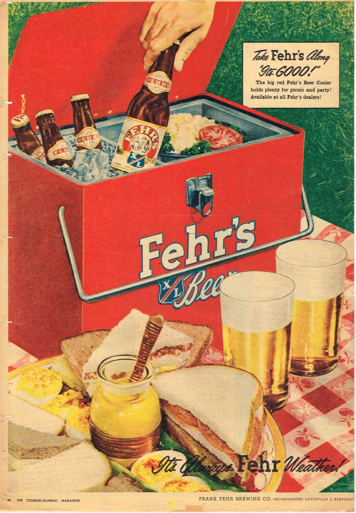

Tuesday’s ad is for the Frank Fehr Brewing Co., from 1950. The Louisville, Kentucky brewery is advertising their Fehr’s XL Beer for summer and also selling branded coolers for your picnics with this tagline. “Take Fehr’s along. It’s Good!”
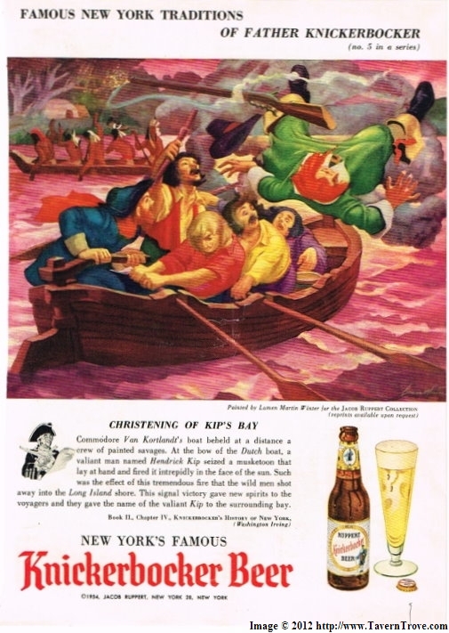
Monday’s ad is for Knickerbocker Beer, from 1954. This is number 5 in a series by the Jacob Ruppert Brewing Co. The fifth one shows the “Christening Of Kip’s Bay,” illustrated by Lumen Martin Winter. It depicts the story of an incident during the Revolutionary War, with text by author Washington Irving. “Kips Bay was an inlet of the East River running from what is now 32nd Street to 37th Street.” According to Wikipedia:
Kips Bay was the site of the Landing at Kip’s Bay (September 15, 1776), an episode of the American Revolutionary War and part of the New York and New Jersey campaign. About 4,000 British Army troops under General William Howe landed at Kips Bay on September 15, 1776, near what is now the foot of East 33rd Street. Howe’s forces defeated about 500 American militiamen commanded by Colonel William Douglas. The American forces immediately retreated and the British occupied New York City soon afterward.
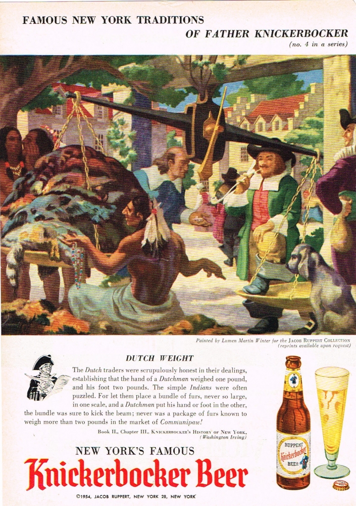
Sunday’s ad is for Knickerbocker Beer, from 1954. This is number 4 in a series by the Jacob Ruppert Brewing Co. The fourth one shows when “Dutch Weight,” illustrated by Lumen Martin Winter. It depicts a rather weird story of Native Americans being cheated by Dutch traders, with text by author Washington Irving.
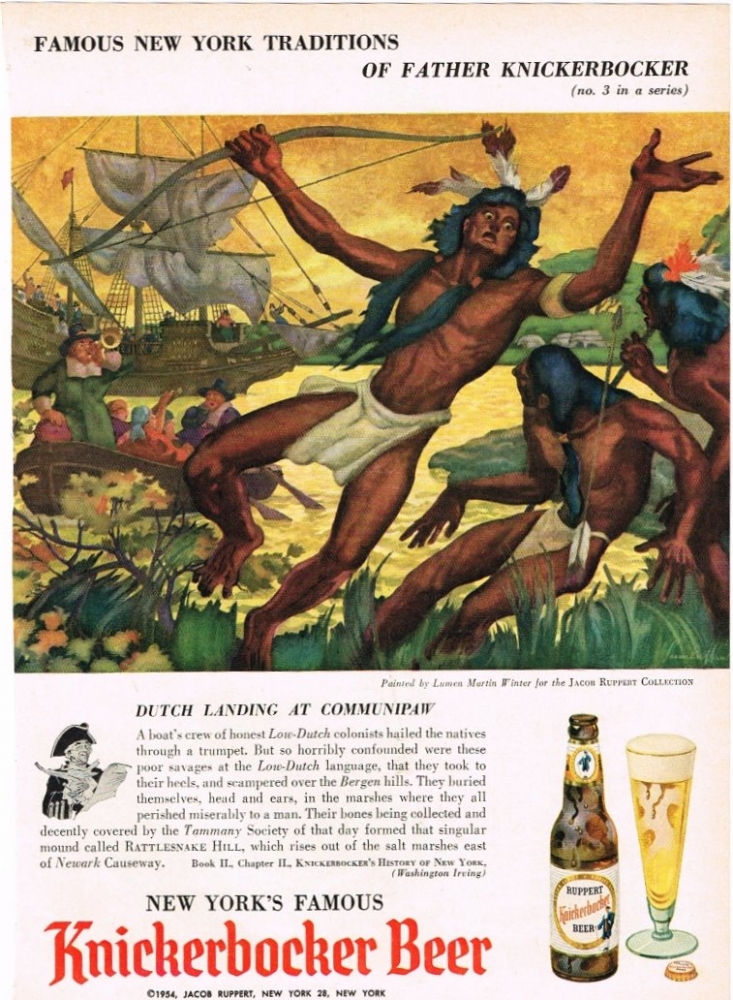
Saturday’s ad is for Knickerbocker Beer, from 1954. This is number 3 in a series by the Jacob Ruppert Brewing Co. The third one shows when “Dutch Landing at Communipaw,” illustrated by Lumen Martin Winter. It depicts a rather weird story of Native Americans committing suicide after hearing a trumpet, with text by author Washington Irving.

So this post will be chiefly for the literary, and especially poetry lovers, among you, a small subset of beer lovers who also enjoy art. Visual poetry is “a development of concrete poetry but with the characteristics of intermedia in which non-representational language and visual elements predominate. In other words, it was experimental or avant-garde poetry in which the arrangement of the text also was a part of the poem’s meaning, which was communicated both visually and through the text itself.
Two Mexican poets in the 1920s, José D. Frias and José María González de Mendoza were both expatriates living in France and became friends, later exchanging humorous letters between themselves and their literary friends. Today is Mendoza’s birthday, which is what reminded me of this.
In 1923, the pair wrote a letter from Paris to fellow poet Francisco Orozco Muñoz that included four visual poems. They were based on the work of French poet Guillaume Apollinaire, who a few years before wrote a book of visual poetry entitled Calligrammes: Poems of Peace and War 1913-1916. They also were influenced by Japanese Haiku, which had become popular at the time in their literary circles, as opposed to Apollinaire’s more cubist or l’esprit nouveau poetry.
Three of the visual poems were written by Frias and translated visually by Mendoza. But the fourth poem was done entirely by Mendoza, and it’s the one below. All four poems contain witty references to the fact that Muñoz was living in Brussels.
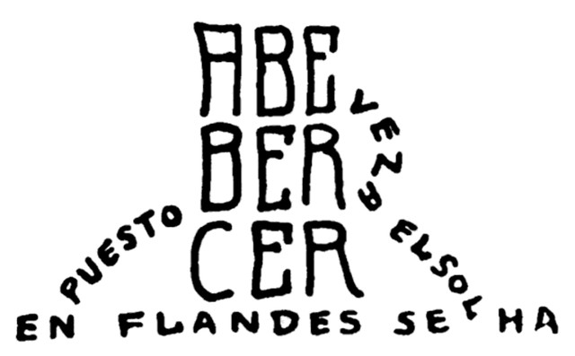
The text is in the shape of a mug of beer, sitting on a table, and reads, according to several books on visual poetry, “Let’s Have a Beer” followed by “The Sun Has Already Set in Flanders.”
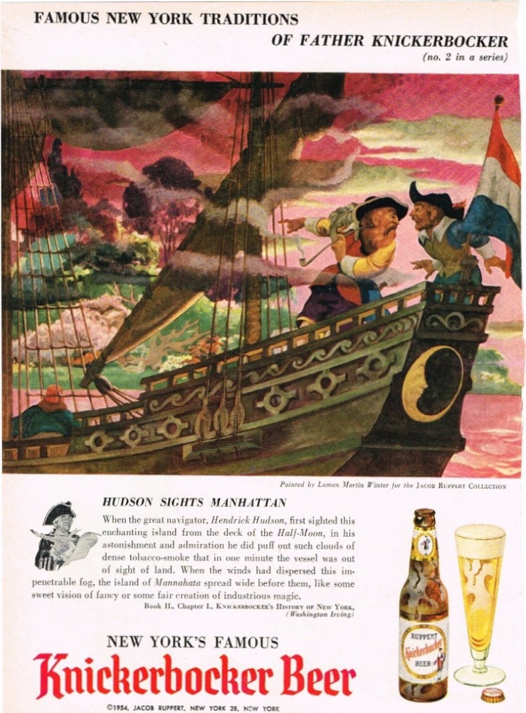
Friday’s ad is for Knickerbocker Beer, from 1954. This is number 2 in a series by the Jacob Ruppert Brewing Co. The second one shows when “Hudson Sights Manhattan,” illustrated by Lumen Martin Winter. It depicts a rather fanciful story of this event, with text by author Washington Irving.
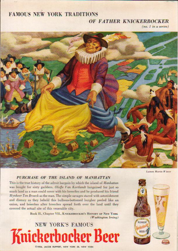
Thursday’s ad is for Knickerbocker Beer, from 1954. This is number 1 in a series by the Jacob Ruppert Brewing Co. The first one shows the “Purchase Of The Island Of Manhattan,” illustrated by Lumen Martin Winter. It depicts a rather fanciful origin story for the Purchase of the Island of Manhattan, as told in the text.
Wednesday’s ad is for Buckeye Sparkling Dry Beer, from 1961. Buckeye Brewing was in Toledo, Ohio. The ad shows three different size bottles of Buckeye Beer bowling. This is at a time when the TV show “Bowling for Dollars” was the highest rated sports show on television, so it makes sense. But the anthropomorphized bottles still look a little unsettling to me, though I can’t quite put my finger on exactly why.

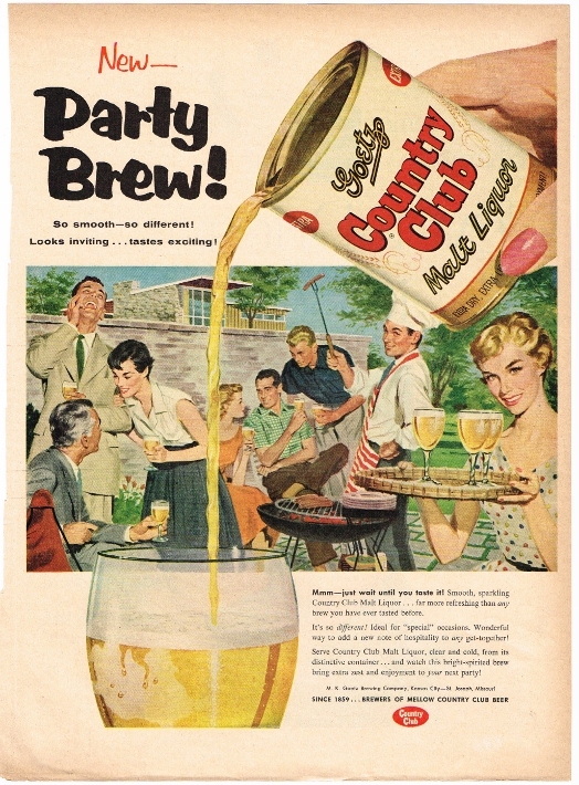
Tuesday’s ad is for Goetz Country Club Malt Liquor, from 1955. These ads are closer to when Country Club malt liquor debuted, and I found three ads that are very similar, with almost the same ad copy, but with different illustrations, but all sending the same message, that malt liquor is a “Party Brew.” “So smooth — so different! Looks inviting … tastes exciting!”
 >
>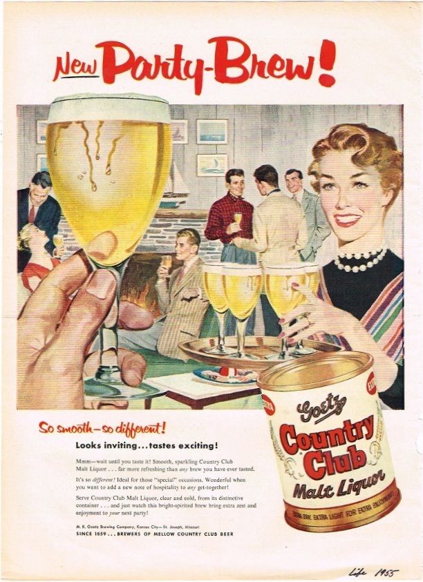
Whereas this one is inside, in what looks like a rec. room. The woman holding the beer looks like the same one from the first ad above.
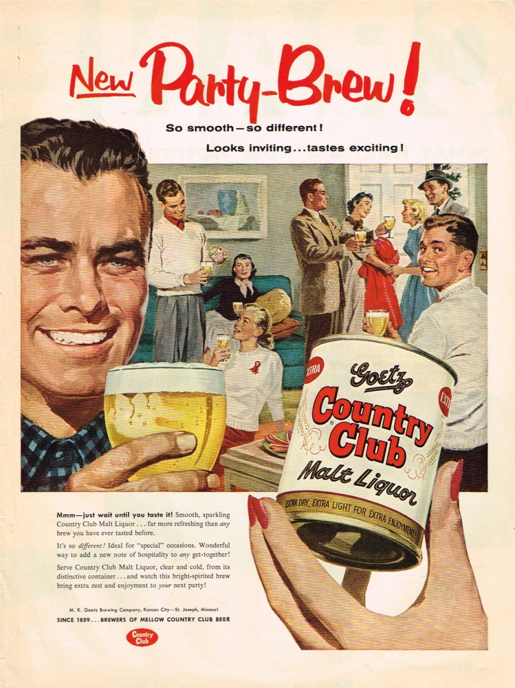
Thi last one looks like someone’s living room, or perhaps all those white sweaters means it’s a frat house or some other organization. Either way, there’s some real partying going on.
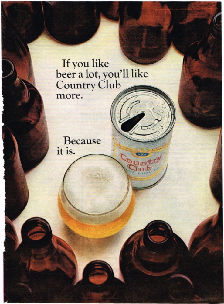
Monday’s ad is for Goetz Country Club Malt Liquor, from 1967. Goetz Brewing by this time had been bought by Pearl Brewing, and they were brewing the Country Club brand. The ad shows a can of Country Club next to a full glass of beer, er … I mean malt liquor. These are surrounded by a bunch of empty brown bottles, with the following ad copy: “If you like beer a lot, you’ll like Country Club more.” And why would that be the case, you may be wondering. Well, they do offer an answer. “Because it is.” It certainly is.