![]()
Today’s infographic shows Beer Consumption in the United States. It was created this year for Visual Toy Magazine, whatever that is.
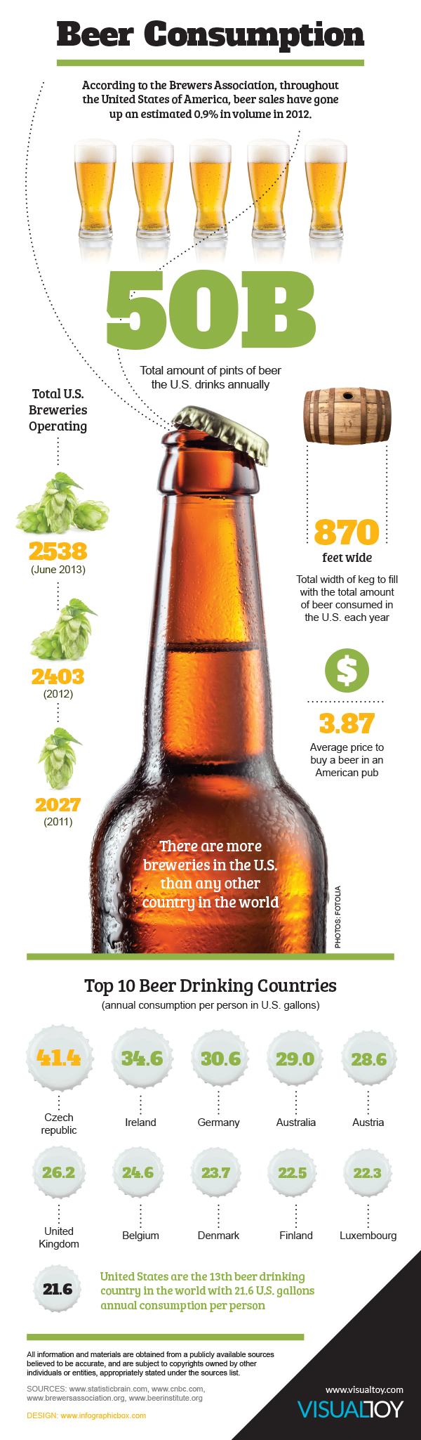
Click here to see the infographic full size.

![]()
Today’s infographic shows Beer Consumption in the United States. It was created this year for Visual Toy Magazine, whatever that is.
Click here to see the infographic full size.
![]()
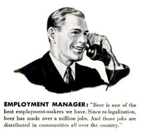
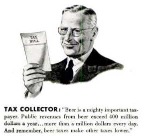
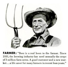
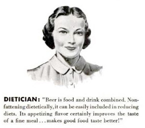
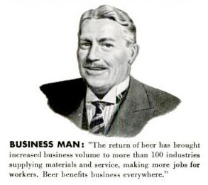
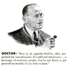
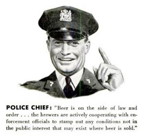
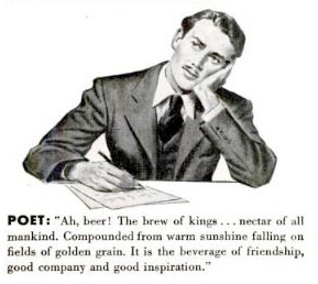
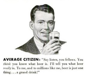
Today’s infographic is an oldie, but goodie, from 1940, in fact, when the United Breweries Industrial Foundation ran this in the January 15, 1940 issue of Life Magazine.
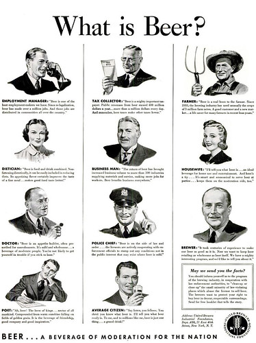
Below are close-ups of the eleven answers proffered to the question “what is beer?”


![]()
Today’s infographic comes from Next Generation Food, an EU website and shows you where you can buy the Top 10 Most Expensive Pints In The World, in British pounds. Topping the list, the United Arab Emirates. Though not part of the chart itself, the cheapest place for a pint is Panama, where 30p will get you a full glass of cerveza.
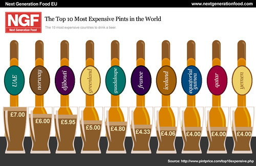
Click here to see the chart full size.

Today’s infographic, Blood Alcohol Content Effects At Different Levels, shows just that, moving from your first pint, at 0.000% BAC and proceeding to an untimely death at 0.410% BAC. It was created by Sober.com, a clearing house for treatment centers.
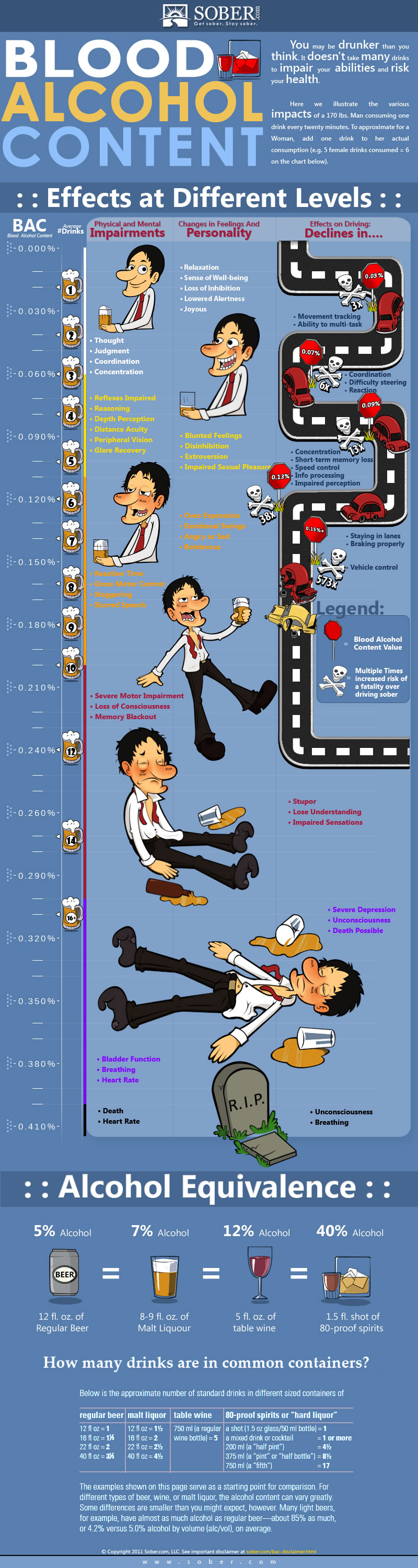
Click here to see the infographic full size.
![]()
Today’s infographic was created by About.com Health, showing a broad overview of a few facts about — no pun intended — beer. They probably should have gotten Bryce Eddings, who writes About.com’s beer website, to help, as he most likely could have improved it.
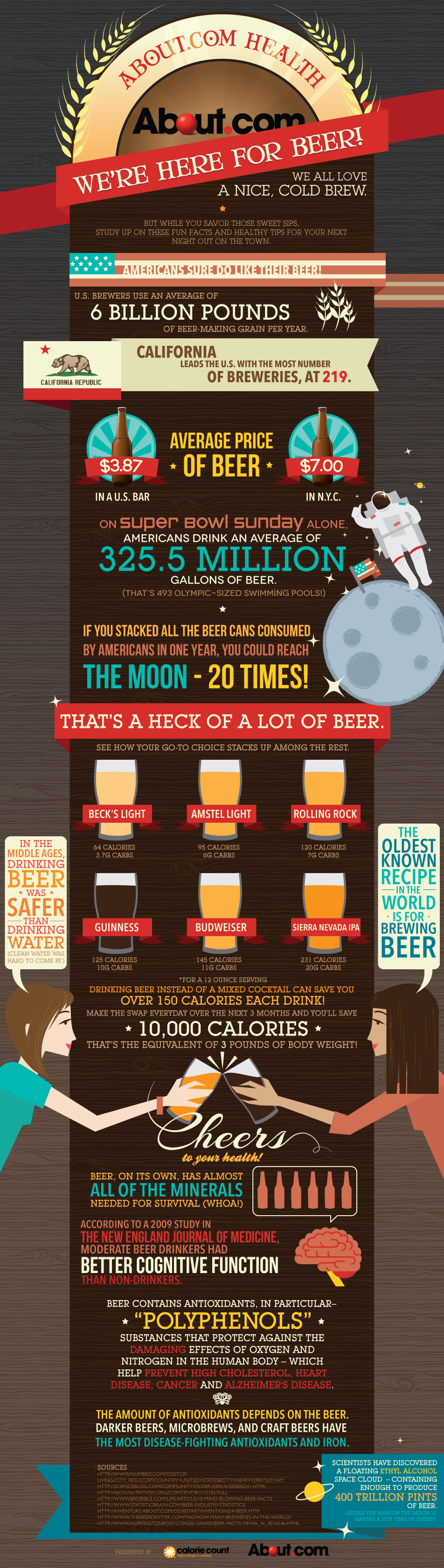
Click here to see the infographic full size.

Today’s bonus infographic is also from Thrillist, and is entitled Red, White and Food. Like the earlier beer map, this one shows the most iconic fast food restaurant associated with each state, with this stated goal. “This is an attempt to maximize the most noteworthy restaurant chain (with an emphasis on fast food where possible) associated with each state. Could mean it was founded there. Could mean it’s headquartered there. Could mean both.”
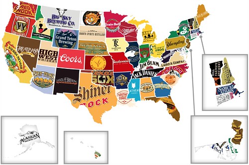
Today’s infographic is from Thrillist, and is entitled Red, White and Booze. The map shows the most iconic brand associated with each state, with the goal of “plotting the biggest/most high-profile liquor or beer companies from each of the 50. We know there are at least infinity amazing craft breweries in each of these states, but this map’s about the big boys, at least when there are big boys to be noted.”

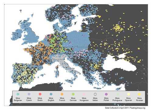
Today’s infographic graphs is similar to yesterday’s one showing “the relative prevalence of the word for beer in the world’s ten most spoken languages (by # of native speakers),” but instead shows the same metric for Europe. The map was also created by http://www.floatingsheep.org/2011/10/wherever-you-are-just-ask-for-beer.html”>Floating Sheep, and was a follow up to yesterdays.
Because simply mapping references to beer in the world’s most spoken languages yielded a relatively homogeneous result due to the significant number of references to “beer” and “ale” in English, we thought a more locally specific analysis would be appropriate. So we instead mapped references to beer in twelve languages spoken primarily in Europe that were not included in our earlier map. And while this map obviously doesn’t include all of the many languages spoken on the continent, these languages were chosen because of their relative prominence within a larger sample of languages.
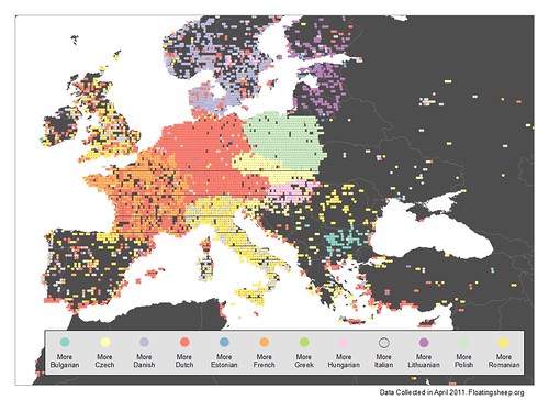
Click here to see the map full size.
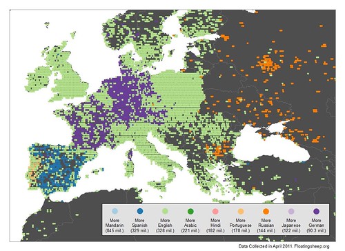
Despite the usefulness of this particular grouping, it remains useful to consider how some of the most spoken languages in the world stack up to these more country-specific languages, so in the map below we reintroduce references in English, as well as references in German, Portuguese, Russian and Spanish, to some of Europe’s more widely spoken tongues.
While this graphic complicates the picture provided by our first map — there continues to be a significant amount of content in the expected, native languages of each country — English remains prominent throughout Europe, especially in reference to beer.

Today’s infographic graphs out the “the relative prevalence of the word for beer in the world’s ten most spoken languages (by # of native speakers). However, because of the fact that there were no points at which the number of references in the world’s sixth most-spoken language, Bengali, were greater than references to each of the other nine languages, we have excluded Bengali in this particular case. So while we’re sad to see Bengali left off the map, the fact that a language with 181 million native speakers has so few references to “beer” is telling of either vast inequalities in the way Bengalis are represented within the geoweb, or perhaps just their general distaste for beer.” The map was created by Floating Sheep, one of my favorite websites.
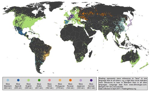
Click here to see the map full size.
“Zooming in to Europe only further accentuates the relative dominance of English among these languages, with significant portions of Portugal, Spain, and Germany even showing more references to beer than in their native languages. Interesting, however, that much of France is a mixture of English and German references, even in the much more southern portions of the country.”

