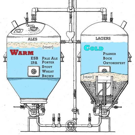
Today’s infographic is How Ales & Lagers are Fermented, and though I don’t know who created it, I found on Planet Beer. The illustration shows some of the basic differences in the brewing process between ales and lagers.
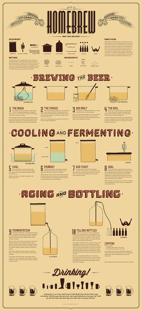
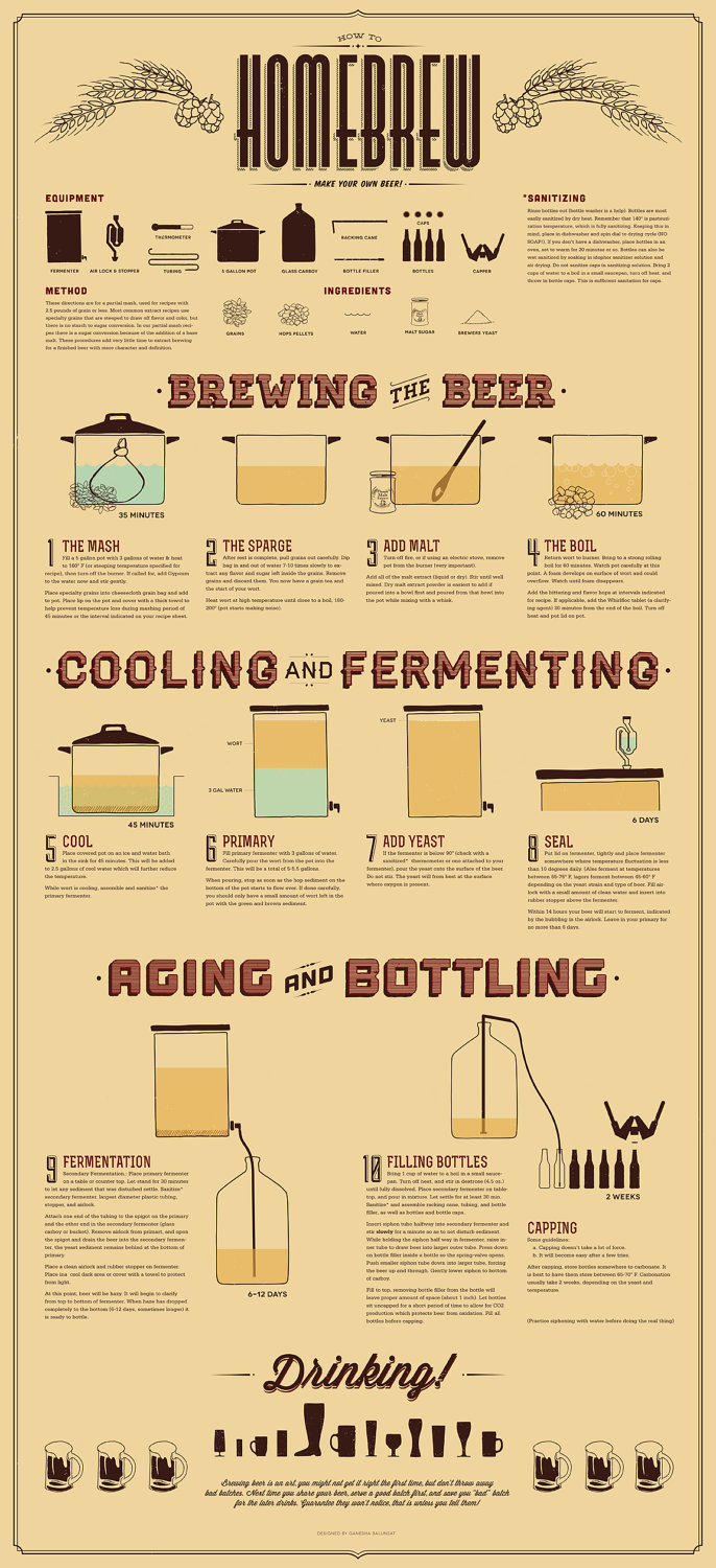
How To Homebrew

Gephi Dual Circle Beer Styles
![]()
Today’s infographic is pretty cool. It was created as design exercise, by Kris Erickson on his blog, EricksonData. It’s what he refers to as a Gephi Viz, this time with beer data. He used the bottled beers listed in the BreweryDB, “and filtered out many of the smaller US brewers (according to number of beers entered into BreweryDB).”
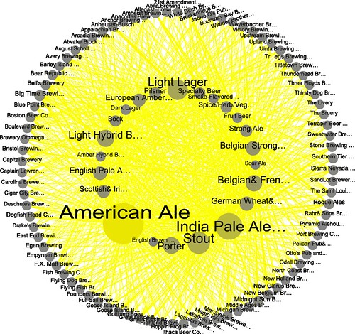
Click here to see the circle full size.
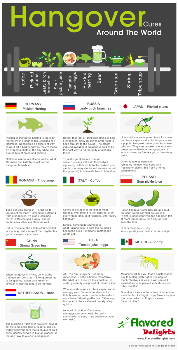
Hangover Cures Around The World

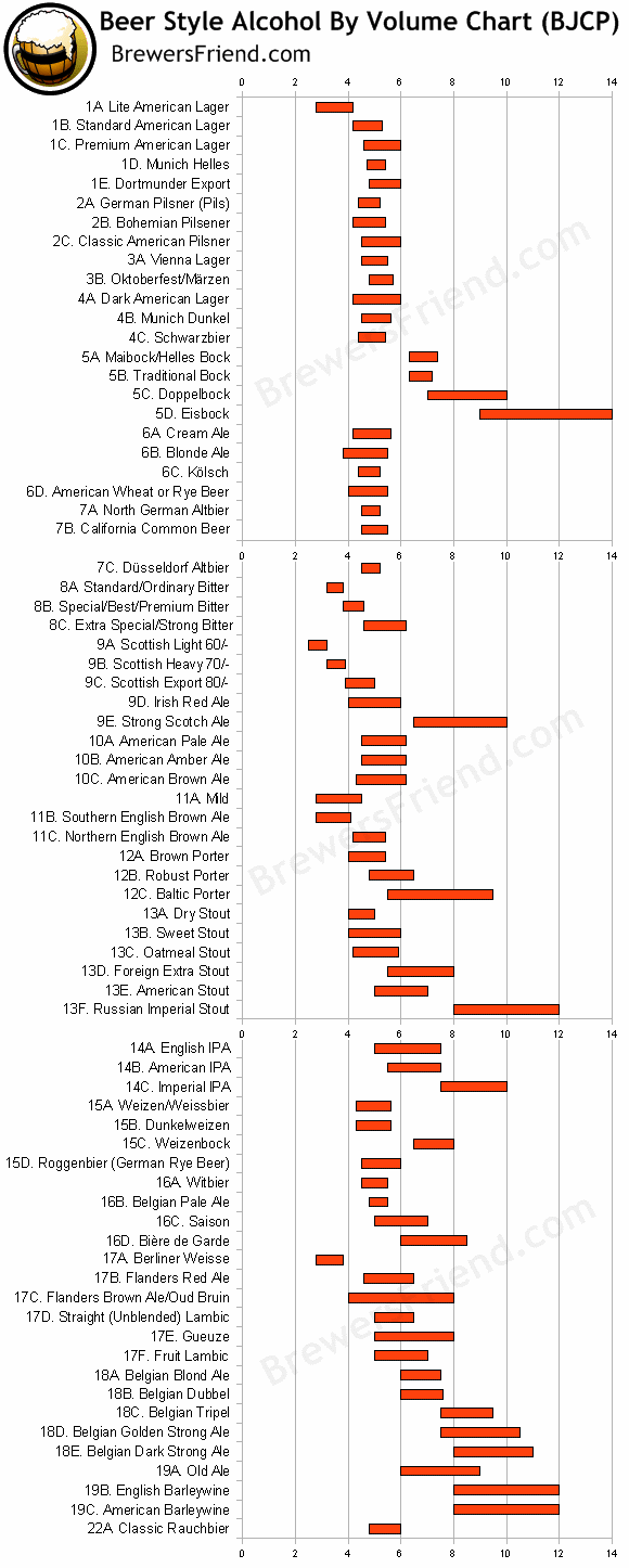
Beer Style Alcohol By Volume

Today’s infographic is another one from Brewer’s Friend, this one is all about Beer Style Alcohol By Volume, showing the BJCP styles with the range of a.b.v. for each.
Beer Family Tree

Today’s infographic comes from the Syracuse Pos-Sentinel, as a part of their Syracuse Beer Week coverage. It’s a Beer Family Tree and shows ales, lagers and hybrids at the top of the tree, and moves down from there, though the tree doesn’t have too many branches. Still, it’s a good starting point for a newspaper.
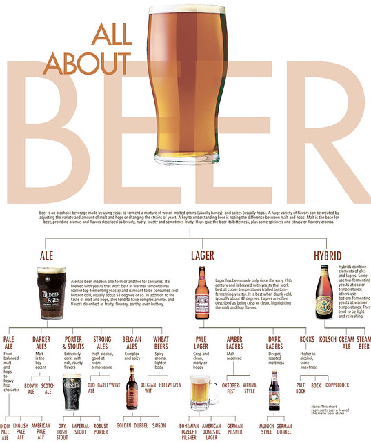
Click here to see the family tree full size.
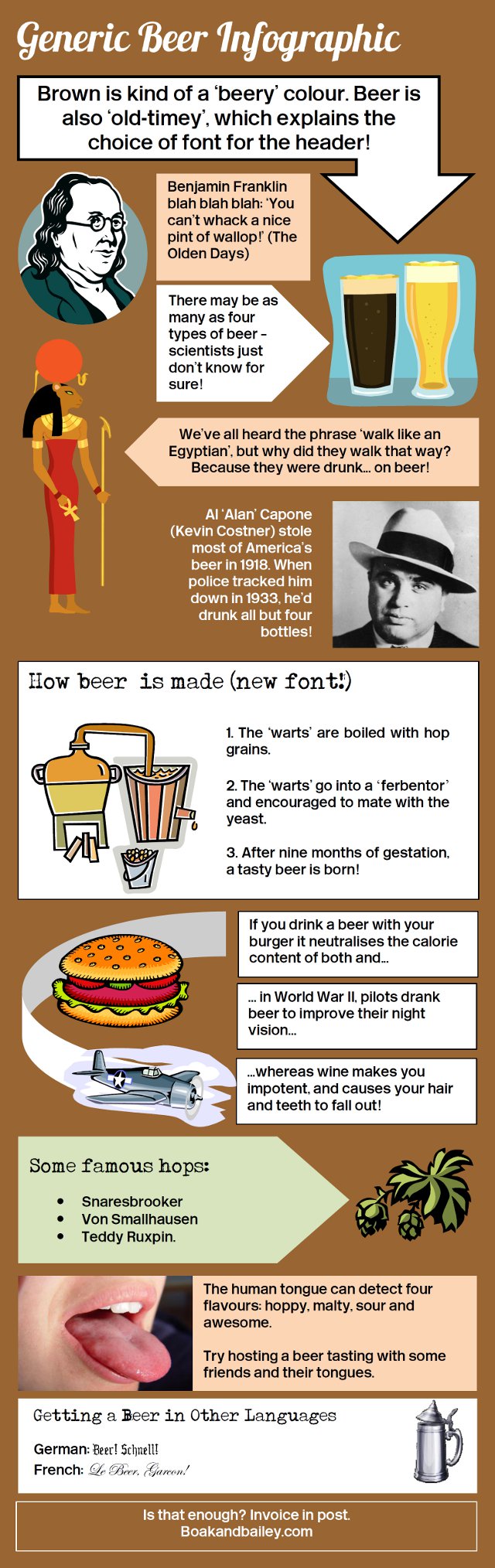
Generic Beer Infographic

Today’s infographic is perfect for Friday Frivolity, though I wish I’d known about it for April Fool’s Day. It was created by the UK beer bloggers Boak & Bailey, and suggests that not everyone is a fan of the infographic, and possibly not in favor of my project this year trying to round up as many of them as possible each day. Their Generic Beer Infographic is a hilarious take on many of the general infographics that have been created recently, and often get the information wrong.
Colombia Beer History
![]()
Today’s infographic shows Five Centuries of Beer in Colombia, created by Pulpo. I suspect that if I knew Spanish it would even be cooler.
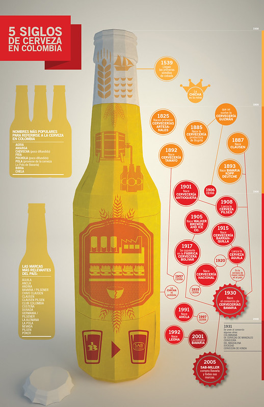
Click here to see the infographic full size.
Beer Style Chart: Beer Styles Compared
![]()
Today’s infographic is an amazing chart of beer styles, but not a static one. The view below is simply the starting point of the Beer Style Chart, from there you can manipulate it and compare styles in a myriad of different ways. This great resource was created by the folks from Strange Brew, a Canadian software company that makes a homebrewing program. There’s also a generated chart that shows difference in the styles.

Click here to go to the interactive page.
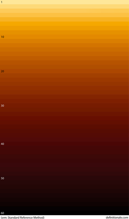
The Beer Color Spectrum

Today’s infographic is a simple rendering of The Beer Color Spectrum, created by Definition Ale, A Canadian beer blog written by Stephen Rich. It uses SRM.