
Wednesday’s ad is for Miller High Life, from 1944. In this ad, from the back of a baseball game program, a batter is arguing with two umpires. I’m sure he’s not going to get anywhere, since “There’s No Arguing About ….” it.


Wednesday’s ad is for Miller High Life, from 1944. In this ad, from the back of a baseball game program, a batter is arguing with two umpires. I’m sure he’s not going to get anywhere, since “There’s No Arguing About ….” it.
Tuesday’s ad is for Miller High Life, from 1942. In this ad, from the back of a baseball game program, a player swings, and it doesn’t matter if he makes contact. Either way, he gets beer since it’s a sure hit. I figured with just a few more games before the end of the season, that I’d got out this month with baseball ads.

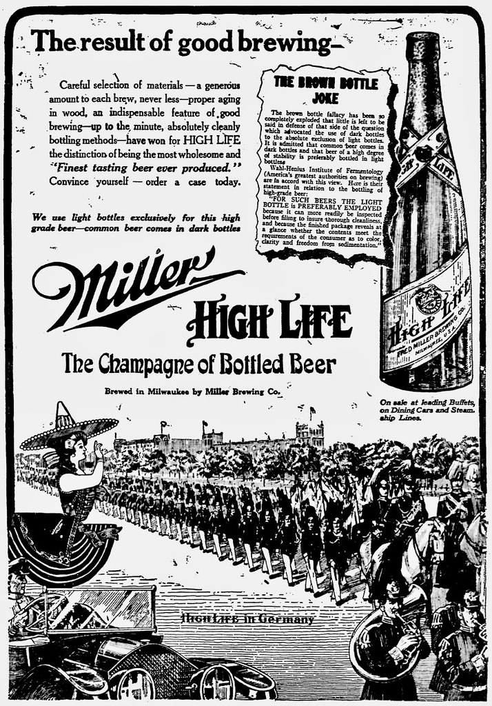
Monday’s ad is for Miller High Life, from 1913, published in the Telegraph Herald on July 2, 1913. In this curious ad, titled “The Result of Good Brewing—,” the scene is a parade of Germany soldiers. Though it’s hard to read, toward the bottom it reads “High Life in Germany,” while to the left the Miller Girl has been inserted into the illustration as if she’s watching the parade.
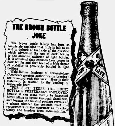
But even more curious about this ad is the inset box, “The Brown Bottle Joke,” where they try to explain why using a clear bottle is actually better than using brown, and they do so without even mentioning why brown is preferred or indeed anything about what effect light would have on the beer after bottling.
The brown bottle fallacy has been so completely exploded that little is left to be said in defense of that side of the question which advocated the use of dark bottles to the absolute exclusion of light bottles. It is admitted that common beer comes in dark bottles and that beer of a high degree of stability is preferably bottled in light bottles.
Wahl-Henius Institute of Fermentology (America’s greatest authorities on brewing) are in accord with this view. Here is their statement in relation to the bottling of high-grade beer:
“FOR SUCH BEERS THE LIGHT BOTTLE is PREFERABLY EMPLOYED because it can more readily be inspected before filling to insure thorough cleanliness and because the finished package reveals at a glance whether the contents meet the requirements of the consumer as to color, clarity and freedom from sedimentation.”
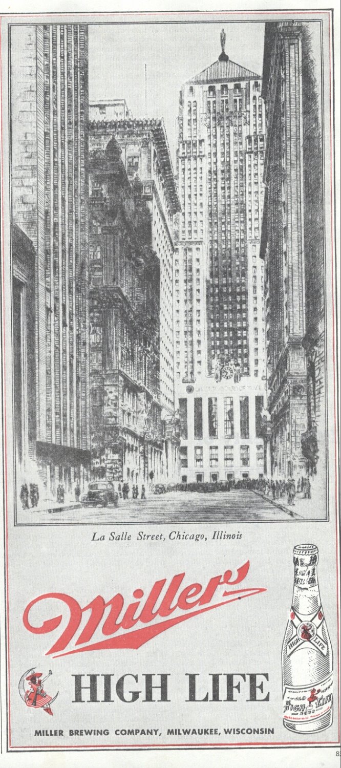
Sunday’s ad is for Miller High Life, from 1945. In this ad, it’s very simple, showing a detailed view of La Salle Street in Chicago, Illinois, with no text apart from the location and then the name of the beer below. I don’t know if this was part of a series showing other locations or if there’s some special significance to this street in 1945. This would have been toward the end of the Second World War, so perhaps that has something to do with, but in the end there are more questions than answers, but it’s still an oddly comforting ad.
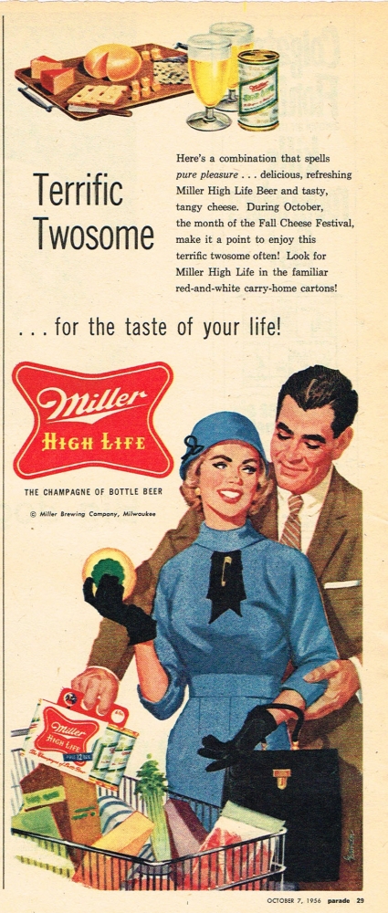
Saturday’s ad is for Miller High Life, from 1956. In this ad, a couple is grocery shopping — I just love their shopping outfits — as he’s putting a six-pack of Miller High Life in their cart. She’s holding up a half grapefruit? Or what is that? It looks like it has a yellow rind but a large green center. Is that the pairing alluded to by “Terrific Twosome.” Or is it simply the couple themselves?
Friday’s ad is for Miller High Life, from 1946. In this ad, set in a then-modern kitchen, a woman pulls steaming pies out of the oven, while a man pours himself a beer in anticipation.Seventy years later, those pies still look tasty. Whether Miller High Life would make a companion to them? That I’m none too sure about.

Thursday’s ad is for Miller High Life, from 1909. In this ad, a fat man is walking while swigging a bottle of Miller High Life. The tagline is “How Ish Dot For High Life Beer,” which seems to suggest he’s a German-American, especially with his outfit. Plus, this would have been before anti-German sentiment arose during World War I, so it would not yet have been a problem to portray. Or perhaps he’s simply drunk, and that how they think drunk people talk? But there’s no way an advertiser would show such an overweight person consuming their product for fear of people connecting the two. Especially not fat and drunk.

Wenesday’s ad is for Miller High Life, from around 1910. In this ad, it’s a gusher, with a ginormous bottle of Miller High Life providing a fountain of beer. Some people are swimming in it, and others are bringing buckets to fill with the beer. It looks like a popular spot. The artwork is a stylized cartoon, similar to some popular comic strips from that time period.

Tuesday’s ad is for Miller High Life, from 1960. In this ad, one of a series featuring a nearly black and white ad, with only the beer in color, and the same man engaged in various activities. This time, he’s playing pool, excuse me, billiards, while wearing a tuxedo. He’s eyeing his next shot, and holding a beer in his hand. This is the last one of this series of ads I was able to find. There may be others, but these are the only ones I found. I also discovered that they were all created by an Australian illustrator named John McCormick at Kling Studios in Chicago. McCormick created the ads using a technique known as scratchboard, which is “both a medium, and an illustrative technique using sharp knives and tools for etching into a thin layer of white China clay that is coated with black India ink.” Uncle Ron was an intern at the studio in 1954 and met McCormick while he was there, and tells the story in his Uncle Ron’s Blog. Unfortunately it’s the only information I could find at all about McCormick’s amazing art.

And while I couldn’t find an image of the entire ad larger then the one above, I did find a larger detail of part of the ad centering on the man in black.

Monday’s ad is for Miller High Life, from 1960. In this ad, one of a series featuring a nearly black and white ad, with only the beer in color, and the same man engaged in various activities. This time, his activity seems a lot more passive, as he’s sitting on the floor in his smoking jacket, beer in hand of course, listening to his newfangled Hi-Fi stereo. He’s even left one of the records lying directly on the carpet, which is never a good idea. That’s how you get scratches.

And here’s another version with a little more definition and color, but it’s a lot smaller.
