Brookston Beer Bulletin

Jay R. Brooks on Beer

  • Home
  • About
  • Editorial
  • Birthdays
  • Art & Beer

Socialize

  • Dribbble
  • Email
  • Facebook
  • Flickr
  • GitHub
  • Instagram
  • LinkedIn
  • Pinterest
  • RSS
  • Twitter
  • YouTube

Powered by Genesis

Worldwide Alcohol Consumption Cartogram

October 15, 2013 By Jay Brooks

world-map
Today’s infographic is a type of map known as a cartogram, which takes a standard map and distorts the land masses based on a particular data point. It was created by World Mapper, a website that’s done close to 700 cartograms showing a variety of data in this way.

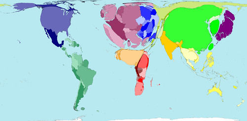
Here’s the standard map, showing each country based on their land mass. Actually, a Mercator projection is the one most of us are familiar with, but that map distorts the size of land which shows the round Earth as a flat map that’s drawn as if you took the globe apart and laid it down, making the land closest to the North and South poles look much bigger than they are in reality. The standard map for World Mapper is known as a Gall–Peters projection , which shows the land masses much closer to their actual size.
cartogram-1-land
Click here to see the map full size.

What a cartogram does is take their standard map and distort the land masses of nations on purpose, to show the differences in the data more clearly by how much it’s been distorted from the original. For example, here’s the same map, but distorted to show the world by population.
cartogram-2-population
Click here to see the map full size.

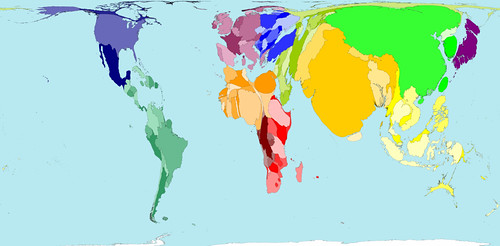
So here’s the same map again, but this time distorted to show absolute alcohol consumption, based on data from 2001.
cartogram-3-alcohol
Click here to see the map full size.

Here’s some more information on the alcohol consumption map.

The average Western European drinks over a third more alcohol than the average person living in any other region. The lowest alcohol consumption per person is found in Southern Asia, where on average people drink less than a third of the average consumption elsewhere.

In some territories there is practically no alcohol consumption. Many Middle Eastern and Northern African territories are not visible on the map for that reason. In contrast, China, the United States and the Russian Federation have the largest areas on the map, because the most alcohol is consumed there by large populations.

If you’re curious about the debate surrounding different map projections, take a peak at the Gall-Peters – Mercator projection Debate, a closer look at the Gall-Peters projection at the Power of Cartography, and a good overview of different projections at One world, many faces: A brief look at map projections.

Filed Under: Beers, Just For Fun, Related Pleasures Tagged With: Infographics, International, Statistics

New Survey Shows Big Beer Brands Aren’t Reaching Women

October 15, 2013 By Jay Brooks

women
A new survey of women by Insights in Marketing found that while women control 80% of all purchasing decisions, the large beer companies are not doing a good job of reaching them. According to the results, only 6% of women thought ABI is doing a good job reaching them, while 5% liked Coors’ approach and a mere 2% had anything positive to say about Miller’s methods. The survey included 1300 women, and 200 men, across a wide demographic, and asked how they thought top national brands, in a variety of consumer goods, were doing in “effectively marketing their products and services.”

For all products, they found that 49%, or just less than half, thought they did a good job, suggesting that marketing and advertising in general, across the board, could be doing a better job reaching women, but that beer companies are doing a particularly bad job. All three brands surveyed — Bud, Miller & Coors — ranked in the bottom half for all women. Anybody surprised by that result?

bottom-brands-2012

The survey also found some slight differences between generations. For example, Baby Boomers seem to like Miller and Coor’s just fine, but not Budweiser. Gen X thinks Coor’s and Bud are doing great, but Miller, not so much. Millenials didn’t respond well to any of the beer brands, with Miller coming out on top, at just below the middle for all brands (beer and non-beer).
Young blond woman with glass of beer

Filed Under: Beers, News, Related Pleasures Tagged With: Statistics, Women

The Legal Drinking Age Around The World

October 14, 2013 By Jay Brooks

world-map-3
Today’s infographic is a world map, showing the Legal Drinking Age Around the World. The darker the color, the higher the age at which you’re legally allowed to drink alcohol. Notice that America is one of the darkest regions on the map. Sheesh, sometimes we’re backwards.

drinking-age-around-the-world
Click here to see the map full size.

Filed Under: Just For Fun, Politics & Law, Related Pleasures Tagged With: Infographics, Statistics

Who Exports Beer?

October 13, 2013 By Jay Brooks

world-map
Today’s infographic is an interesting treemap created by the Observatory of Economic Complexity, a collaboration between M.I.T. and Harvard. This one, contrasting yesterday’s, shows the amount of beer exported by the nations of the world, with the size of their relative amount of exporting shown by the size of the rectangle.

who-exports-beer
Click here to see the treemap full size.

Filed Under: Beers, Breweries, Just For Fun, Related Pleasures Tagged With: Business, Economics, Infographics, International, Statistics

Who Imports Beer?

October 12, 2013 By Jay Brooks

world-map
Today’s infographic is an interesting treemap created by the Observatory of Economic Complexity, a collaboration between M.I.T. and Harvard. This one shows the amount of beer imported by the nations of the world, with the size of their relative amount of importing shown by the size of the rectangle.

who-imports-beer
Click here to see the treemap full size.

Filed Under: Beers, Breweries, Food & Beer, Related Pleasures Tagged With: Business, Economics, Infographics, International, Statistics

GABF 1982 Vs. 2011

October 10, 2013 By Jay Brooks

gabf-2011
Today’s infographic, on the first day of this year’s Great American Beer Festival, is a comparison of statistics from GABF in 1982 vs. 2011, two years ago on the festival’s 30th anniversary. It was created by Joey McDaniel, one-half of the Bay Area blog Wet Your Whistles.

gabf-1982-2011

Filed Under: Beers, Breweries, Just For Fun Tagged With: GABF, History, Infographics, Statistics

How Much Does The Government Make From Alcohol?

October 8, 2013 By Jay Brooks

tax
Today’s infographic shows How Much Does The Government Make From Alcohol? It was created by Inuit, the makers of Turbo Tax. It “illustrates how much money individuals are being taxed to consume alcohol, and subsequently how much the Federal and State governments are generating in tax revenue. There is also a breakdown of how different types of alcohols are taxed in the various states, as well as international comparisons — to put thing in perspective.”

how-much-money
Click here to see the infographic full size.

Filed Under: Breweries, Just For Fun, Politics & Law Tagged With: Government, Infographics, Statistics, Taxes

Beer From Around The World

October 7, 2013 By Jay Brooks

earth-2
Today’s infographic, entitled Beer From Around The World, created for Legal Info 360. On their website, the infographic is somewhat different, and is interactive. One interesting stat I hadn’t seen before is they state that there are 15,235,126 breweries in the world. With around 7.2 billion people in the world, that’s roughly one for every 473 people. Does that seem to high to anybody else?

Print
Click here to see the infographic full size.

Filed Under: Beers, Just For Fun Tagged With: Infographics, International, Language, Statistics

Everything You Wanted To Know About Oktoberfest

October 6, 2013 By Jay Brooks

oktoberfest-banner
Today’s infographic is our last about Oktoberfest this year, which ends today in Munich, Germany. This one is called Everything You Wanted To Know About Oktoberfest and was created by the beer app Beer Hunt.

everything-you-wanted-to-know-about-oktoberfest
CLick here to see the infographic full size.

Filed Under: Beers, Breweries, Events, Just For Fun Tagged With: Infographics, Oktoberfest, Statistics

Drinking Around The World

October 4, 2013 By Jay Brooks

world-map-3
Today’s infographic is entitled Drinking Around The World, and shows the Top 10 for toal alcohol, beer, wine and spirits.It was created by Recovery Connection.

top-10-alcohol-counsuming-countries
Click here to see the infographic full size.

Filed Under: Beers, Just For Fun, Related Pleasures Tagged With: Infographics, International, Statistics

« Previous Page
Next Page »

Find Something

Northern California Breweries

Please consider purchasing my latest book, California Breweries North, available from Amazon, or ask for it at your local bookstore.

Recent Comments

  • Ernie Dewing on Historic Beer Birthday: Charles William Bergner 
  • Steve 'Pudgy' De Rose on Historic Beer Birthday: Jacob Schmidt
  • Jay Brooks on Beer Birthday: Bill Owens
  • Steve 'Pudgy' De Rose on Beer Birthday: Charles Finkel
  • Steve 'Pudgy' De Rose on Beer Birthday: Bill Owens

Recent Posts

  • Beer In Ads #5203: Robert Portner’s Bock Beer February 15, 2026
  • Beer Birthday: Daniel Satterthwaite February 15, 2026
  • Beer In Ads #5202: Here’s To You Our Valentine Fidelio Bock Beer February 14, 2026
  • Historic Beer Birthday: Benedict Frank Haberle February 14, 2026
  • Beer Birthday: Chuck Silva February 14, 2026

BBB Archives

Feedback

Head Quarter
This site is hosted and maintained by H25Q.dev. Any questions or comments for the webmaster can be directed here.