Brookston Beer Bulletin

Jay R. Brooks on Beer

  • Home
  • About
  • Editorial
  • Birthdays
  • Art & Beer

Socialize

  • Dribbble
  • Email
  • Facebook
  • Flickr
  • GitHub
  • Instagram
  • LinkedIn
  • Pinterest
  • RSS
  • Twitter
  • YouTube

Powered by Genesis

Beer in Art #12: Mieko Anekawa’s Beer! Beer! Beer!

January 25, 2009 By Jay Brooks

Today’s painting is by a Japanese artist, Mieko Anekawa, who grew up in Kyoto but now lives in New York City. This painting is called Beer! Beer! Beer!. It’s an acrylic on canvas and measures 11″x14.” Apart from the fact that she won’t sell the painting, that’s about all I know about it.
 

The choices she made for the panels are interesting to me. The first is, naturally, a can of Kirin from her native Japan. The only other Japanese beer is Hitachino Nest Beer. Two others are imported, but the majority are American craft beers. Only the can of Genesee isn’t. Of the dozen panels, seven are beer bottles, two are cans, one is a full pint glass, one is a growler and the only non-beer panel is of a bag of Utz potato chips. Sadly, the chips appear to be the “Red Hot” flavor, whereas I’m a purist when it comes to potato chips — only potatoes fried in lard (or oil) with salt added for me. As a hardcore chips geek, I can’t abide flavored chips at all.


A Self-Portrait

From the biography at her website:

She began her studies in Graphic and Product communication design in Kyoto, Japan, at Seika University, and later photography in Osaka. She moved to New York in the winter of 2004 to seek more creative opportunities and to experience a different, unique approach to art. She started working for the Japanese artist HIROKI OTSUKA, as well as the artist MALCOS, in various painting and sculpting projects. She was hired in 2005 by the New York-based graphic design company Berrymatch, LLC and Nooka, Inc., a high fashion designer watch company owned by Berrymatch, doing graphic and product design, corporate identity design, and advertisement. She began to work for Adoah, LLC in 2008 designing modern fashion rugs and carpets. In her latest work she is doing illustration of movie frames and image boards, website design, graphic and logo design for the upcoming independent movie “Uwaki” by Devin Haqq. However, her passion remains for painting.

Also at the website is her statement as an artist:

Being an artist doesn’t always mean making a pretty piece. Art should be able to give people a powerful impression, a full frontal impact. And in my opinion, what gives people that great impression is color contrast and dynamic composition.

My hometown is Osaka, Japan. Osaka has lots of excitement and people there love bright, powerful colors. There is a strong feeling of energy when you go through the streets. Our city is insanely using crazy colors for anything. People wear bright colors, stores are decorated in high tones, and there is color everywhere in advertisements and magazines. It is a beautiful place. While I grew up there, I observed and absorbed that energy, and I think it comes through in my art. It was my inspiration for the animal series with the bright checkered background and color contrast. It’s a representation of me and my life. I think I can give people some of that excitement, that energy, with my art.

After I moved to NY, I was doing a lot of graphic design and layouts of typography for part of corporate identity designs. I found beauty in the straightforward, uncomplicated images of logos and typography. I wanted to include that beauty of simple objects in my paintings. My goal was to combine 2-dimensional, flat objects without depth or shadow gradation with more realistic 3-dimensional images to create contrast.

There isn’t much more information about Mieko Anekawa, except for an exhibition at New York’s ICO Art & Music Gallery, a nice article in a student newspaper — The Pendulum — from Elon University, and her Facebook page. You can see a lot of her work, though, at her own website.


Filed Under: Art & Beer

Beer in Art #11: Juan Gris’ Glass Of Beer and Playing Cards

January 18, 2009 By Jay Brooks

art-beer
Today’s work of art is by a Spanish painter, who painted as Juan Gris, though he real name was more of a mouthful: José Victoriano González-Pérez. Gris was a contemporary of Pablo Picasso and was also one of artists to found Cubism, though people like Picasso and Georges Braque are more well-known. Though born in Madrid, Gris spent worked most of his life in France, and was a friend of Henri Matisse, Braque and others. Most Cubists painted using a monochromatic palette, but Gris — possibly because of his friendship with Matisse — went in a slightly different direction, preferring bold, varied colors. His style of Cubism became known as synthetic cubism. His use of color is evident in today’s painting, Glass of Beer and Playing Cards, painted in 1913. The painting is in Ohio, at the Columbus Museum of Art.

Gris_glass-of-beer

Christine Poggi had this to say about the painting in her book, In Defiance of Painting: Cubism, Futurism, and the Invention of Collage:

Gris organized Glass of Beer and Playing Cards according to a dominating pattern of vertical strips. … A coherently silhouetted beer mug might be established by shifting the vertical band that constitutes the right side of the mug upward so that the white outline becomes contiguous with the outline of the fully modeled form of the mug to its left. But this realignment would in turn disalign the continuity between the blue curvature on the orange wallpaper and the edge of the sand to the right, both forms constituting a view from above of the beer’s foam. Changes or transformations in the appearance of an object seem to occur in a number of directions: they follow the alternating rhythm of vertical bands but also the contrapuntal system of horizontal bands. Occasionally there is also a sense of transformations occurring in depth, as if Gris had peeled away the surface of certain vertical bands to reveal an alternate mode of representation or point of view beneath.

There is a little more information about Juan Gris at Wikipedia and more biographical stuff at the Art Archive. You can see over 100 of his works at the Athenaeum and also there are many links at ArtCyclopedia.

Filed Under: Art & Beer Tagged With: Spain

Beer in Art #10: Robert Carter’s Illustrations

January 11, 2009 By Jay Brooks

These are pretty cool. I love finding a new artist I didn’t previously know about. While searching for a newer Beer Advocate logo to use for Todd’s birthday post (see below), I happened upon this painting by Robert Carter. It’s called Beer Advocate and features their old logo on the woman’s shirt. She’s in black and white but the beer and the patriotic background are in bright colors. Looking at other works by Carter, this effect seems to me one he often employs. I don’t know who Robert Carter is but Thumbtack Press has a dozen of his works online for sale, and for $30 you can buy an 11″ x 13.75″ print of Beer Advocate.

According to Wikipedia, he’s a Canadian illustrator living in Ontario. He also has more of his work at his own Cracked Hat website. He’s also done other beer-themed illustrations, including at least one more for Beer Advocate. That one, entitled Beer – A Beacon of Light in the Dark Ages, is below.

If you’re wondering what the difference is between a fine artist and an illustrator, there’s really not much. There are art snobs who look down on “illustration” as an inferior type of art, but they’re elitist idiots. The only real difference between the two is purpose. Art can exist solely for its own sake, for aesthetic reasons. You’ve probably heard the phrase “art for art’s sake.” Illustration, on the other hand, is made specifically to illustrate something else, whether text from a book, and advertisement, or whatever. In it’s earliest meaning, it meant to illuminate or was used to create enlightenment. The definition of what makes something “art” is, of course, somewhat tricky. You’ll likely get as many answers as the number of people you ask. But there’s a nice, workable explanation of the two in How to Grow as an Illustrator by Michael Fleishman.

“Art just is,” Bob Selby [illustrator and teacher] states unequivocally. “A sculpture is. A painting is. There can be no question that these things exist as works of art. Without getting into further qualitative judgment, a work of art is a work of art — it is not a truck or a loaf of bread — it is art.”

Illustration, on the other hand, does not require any such philosophical decisions. An illustration must recognize one certain requirement: Something must be in the condition of illustrating; it is being used to shed light. “There is action,” Shelby says. “In order to have illustration, something must be acting upon something else. Tthere’s no more to it than that, really.”

Still with us here? Ultimately, this act of shedding light that we call “illustration” is a process Selby calls “symbolization.” We are enlightened — that is, we can know something — because illustrations function symbolically to shed light on something else,” Selby explains. “Drawings, for instance, can be tailored precisely to symbolize and, thereby, to highlight, clarify, amplify, complement, or explain something else.”

Many famous artists either began their careers as illustrators or did both types of work simultaneously, like Winslow Homer and Edward Hopper. Personally, I’m a huge fan of great illustration. Some of my favorite books as a kid had amazing illustrations by Arthur Rackham, Howard Pyle and N.C. Wyeth. As a comic book geek (I used to manage a comic book shop) I tend to think graphically and in a sense comic books represent the purest form of illustration. When books were handmade they were illuminated with amazing doodles and other artwork. These early books are considered priceless. It was only technology that made text king and relegated illustration to children’s works. When the printing press exploded publishing graphics were not able to be included. Even once the technology was developed, it was prohibitively expensive and was used only sparingly. In effect, the technology has caught up in recent decades but the bias persists that serious works do not include illustrations. I think that’s complete nonsense, but, as usual, I’m in the minority here. I don’t now how anyone can read Art Spiegelman’s Maus: A Survivor’s Tale or the Neil Gaiman series Sandman and continue to hold that prejudice, but people I’ve found have a hard time letting go of their cherished beliefs even in the fact of contrary evidence. Anyway, I’ll climb down off my soapbox.

Another beer-themed illustration Robert Carter did is a portrait of Eric Molson for the magazine Canadian Business.

From Wikipedia:

Robert Carter is an award winning Illustrator. Born in St. Albans England he moved to Ontario Canada at an early age. He graduated from Sheridan College School of Art and Design in 2002. Robert combines a strong foundation in portraiture with a unique sense of visual and conceptual problem solving to create striking, vibrant and textured illustrations and portraits with subjects ranging from realistic to the surreal.

There’s not much else about Carter out there, though there is a nice interview online at Design Inspiration, a website for professional and aspiring illustrators.


Filed Under: Art & Beer

Beer in Art #9: John Brack’s The Bar

January 4, 2009 By Jay Brooks

While the name John Brack is not often heard outside his native Australia, down under he’s one of the most well-known fine artists. As one of the Antipodeans — a group of seven modern artists who “asserted the importance of figurative art, and protested against abstract expressionism” — he made a name for himself in the local Melbourne art scene in the mid-1950s.

Today’s painting is known as The Bar, and was painted in 1954.

It was in the news somewhat recently, when in 2006 it sold for $3.12 million dollars, setting a new record for the highest price paid for a work of art from Australia. It was purchased privately, so it won’t be available for public viewing, as the Victoria Museum had hoped. They own three of Brack’s works, including his famous Collins Street 5 p.m., which is widely considered to be the companion of The Bar. Both paintings are mentioned in the Wikipedia entry:

Brack’s early conventional style evolved into one of simplified, almost stark, shapes and areas of deliberately drab colour, often featuring large areas of brown. He made an initial mark in the 1950s with works on then contemporary Australian culture, such as the iconic Collins Street, 5 pm (1955), a view of rush hour in post-war Melbourne. Set in a bleak palette of browns and greys, it was a comment on the conformity of everyday life, with all figures looking almost identical. A related painting The Bar (1954) was modeled on Manet’s A Bar at the Folies-Bergère, and satirized the Six o’clock swill, a social ritual arising from the early closing of Australian bars. Most of these early paintings and drawings were unmistakably satirical comments against the Australian Dream, either being set in the newly expanding post-war suburbia or taking the life of those who lived there as their subject matter.

In 2007, another Brack Painting — The Old Time (looking like a scene out of the hilarious Australian film Strictly Ballroom) — broke that record, selling for $3.3 million.

There is a little more information about John Brack at Wikipedia, and also some more of his works at the ArtCyclopedia.


Filed Under: Art & Beer

Beer in Art #8: Pieter Claesz’ Still Lifes With Beer

December 28, 2008 By Jay Brooks

Today’s works of art, like last week, also date from the 17th Century and are a trio of still lifes depicting several ordinary objects from daily life, including beer. They’re also by a relatively obscure artist, Pieter Claesz. He was a Dutch still life painter who painted most of his life in Haarlem, though he was born in Westphalia in what today is part of Germany.

The title of the first of today’s painting is Still Life with Overturned Jug, Glass of Beer, and Food, an oil on canvas painted in 1635. In his time, Claesz was considered one of the premiere painters of still life. A few years ago, when the National Gallery in Washington, D.C., did a retrospective of Claesz’ works, they described his contributions like this:

Pieter Claesz, who lived and worked in Haarlem between 1621 and 1660, was one of the most important Dutch still-life painters of the 17th century. Claesz pioneered the development of monochrome table-top still lifes (the so-called monochrome banketjes), quietly restrained works imbued with an extraordinary sense of naturalism. … Claesz reveled in capturing the effects of light and the different textures of objects through his varied handling of paint. He also included objects infused with symbolic implications, indicating that the viewer should reflect upon worldly transience and spiritual truths.

Several years later, in 1649, he painted Still Life With Drinking Vessels, which today is in London’s National Gallery.

The wineglass at the left is a ‘roemer’, and in the centre is an octagonal ‘pas-glas’, containing beer. The porcelain bowl is an example of Chinese export ware which can be dated to the Wanli period (1573 – 1619). The metal objects were most likely made of silver and pewter. Although the arrangement evokes an impression of simplicity and modesty, a contemporary viewer would have immediately recognised the costliness of the different objects.

The final painting, Still Life With Herring, was painted in 1636, and hangs in the Museum Boijmans Van Beuningen, in Rotterdam. There’s little information about the painting itself, other than “The stylistic phases and fluctuations in aesthetics through which the Dutch landscape passed had their direct counterpart in still-life. The silvery tone which dominates in this Still-life by Claesz, muting the colours and subtly adjusting the objects to each other, directly relates to the tonal direction landscape took after 1630.” It appears, however, that the glass on the table may be filled with beer.

There is a little more information about Pieter Claesz at Wikipedia, and also some more of his works at the Web Gallery of Art and ArtCyclopedia.


Filed Under: Art & Beer

Beer in Art #7: Gabriel Metsu’s The Old Drinker

December 21, 2008 By Jay Brooks

Today’s work of art is dates from the 17th Century and depicts an elderly gentlemen enjoying his vices, both beer and tobacco. It’s by a relatively obscure artist, Gabriël Metsu. He was a Dutch painter who lived most of his life in Leiden, and his father was also a painter.

The title of today’s painting is The Old Drinker, which is at the Rijksmuseum in Amsterdam. The museum describes the painting like this:

On this minuscule panel, measuring just 22 x 19.5 cm, Gabriël Metsu painted with minute detail this everyday scene of an old man with his Gouda pipe. Gouda pipes are white and have a long, slender stem and a small bowl. They were mass produced from around 1617 in the Gouda area, where white pipe clay (terra alba) was readily available. Copper moulds were used to model the clay, which was subsequently fired in the kilns of local potters. Pipes manufactured in other cities usually had shorter stems, but long stems were popular because they cooled the smoke better. However, they were difficult to produce, and the pipe-makers of Gouda were the only manufacturers with the necessary expertise. and his pewter jar leaning on against a beer barrel. The old drinker looks rather the worse for wear; he sags rather than sits on the chair as he peers through his watery eyes, his chin unshaven, his collar open and his cap askew. Metsu presents the man with a direct honesty and realism that is not in fact harsh; the smile and the friendly eyes of the old drinker lend a certain sympathetic quality.

In more general terms they later discuss the symbolism in the painting.

In the seventeenth century, there was a belief that smoking and drinking in excess accelerated the aging process. Paintings of ‘old drinkers’ are often a reference to this idea. This work is perhaps a warning to avoid excessive indulgence in alcohol and tobacco.

There is a little more information about Gabriel Metsu at Wikipedia, and also some more of his works at the Web Gallery of Art and his official website.


Filed Under: Art & Beer

Beer in Art #6: Charles Spencelayh’s Good Health

December 14, 2008 By Jay Brooks

Most works of art are locked in museums, completely out of reach for ordinary people. But once in a while, they do become available at auction. Case in point is today’s work, entitled Good Health by English artist Charles Spencelayh.

The painting is currently at auction at Artnet Online Auctions. The price of the work is 50,000 British Pounds, or around $73,970 U.S. Dollars. Of course, when I say “ordinary people,” I mean ones with 75 Grand to blow on a painting.

 
While Charles Spencelayh is not a household name in art, he appears to have been well known in his day and Queen Mary loved his work. Here’s what little biographical information there is about him, from Wikipedia:

Charles Spencelayh (October 27, 1865 – June 29, 1958) was an English painter of the Academic style. Born in Rochester, Kent, he first studied at the National Art Training School, South Kensington. He exhibited at the Paris Salon, but most of his exhibits were in Britain. Between 1892 and 1958, he exhibited more than 30 paintings at the Royal Academy, including ‘Why War’ (1939), which won the Royal Academy ‘Picture of the Year’ for 1939. He was also a founder member of the Royal Society of Miniature Painters. Many of his subjects were of domestic scenes, painted with an almost photographic detail, such as ‘The Laughing Parson’ (1935). and ‘His Daily Ration’ (1946). He also painted still life subjects including ‘Apples’ (1951). Spencelayh was a favourite of Queen Mary, who was an avid collector of his work. In 1924 he painted a miniature of King George V for Queen Mary’s dolls house.

Supposedly, he may have done a painting commissioned by the Bass Brewery for them to use in advertising entitled The Steward, depicting a steward opening a bottle of Bass. But so far I’ve been unable to find anything more about it or see what it looks like.

Five of his paintings are at the Tate in London and a few more are shown at the online Art Renewal Center and Bridgeman has quite a few. There are also some links at the ArtCyclopedia.

Filed Under: Art & Beer Tagged With: Bass, UK

Beer in Art #5: Leger’s Still Life With A Beer Mug

December 7, 2008 By Jay Brooks

art-beer
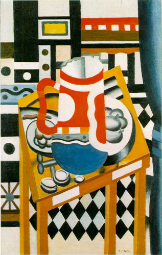
Today’s work of art (& beer) is decidedly more modern, with bold colors and an abstract vision. Still Life With A Beer Mug, by the French artist Fernand Léger, was painted around 1921. Léger is generally considered a cubist painter, like Pablo Picasso, who’s probably the most famous cubist. He was born in France and was originally trained as an architect. During World War I he served in the military and was gassed during the Battle of Verdun, which greatly effected his later art, which would include this work.

The painting, Still Life With A Beer Mug, is at the Tate Museum in London, and there’s a transcript describing every aspect of the painting, but there’s also a shorter summary there.

This vibrant, bold oil painting has a strong visual impact, largely because it is painted using predominantly black, white and the three primary colours – red, yellow and blue. Dominating the centre of the painting is an overly large German style beer mug with a handle seen in profile on the left. It dwarfs the small, square table on which it sits. The table has exaggeratedly long thin legs that disappear off the bottom of the canvas and it stands on a black and white chequered floor. Surrounding the beer mug are what appear to be two plates of fruit, some small pots of butter and an object that could be a cork-screw. The objects in this painting are quite hard to read, because Léger has radically simplified their forms, reducing them to simple shapes. He has also used several different viewpoints at once and filled every inch of the canvas with a riot of highly coloured, contrasting geometric patterns. Some of these seem to correspond to surfaces in the painting, like the chequered floor, but most seem to be used simply for bold decorative effect. Finally, running down the right hand side of the canvas is a blue curtain tied back half way down its length.

Leger_still-life-with-beer

Here is Waldemar Januszczak’s take on Still Life With A Beer Mug, from Techniques of the Great Masters of Art

“In Still Life with a Beer Mug,…the shaded modelling of the curtain, objects on the table and the interior view of the mug contrasts with the flatly painted geometric shapes and the patterned rendering of other forms. This illustrates Leger’s preoccupation with plastic contrasts, which he described as follows in 1923: ‘I group contrary values together: flat surfaces opposed to modelled surfaces; volumetric figures opposed to the flat facades of houses . . .; pure flat tones opposed to grey, modulated tones, or the reverse’. Leger did not want simply to copy a manufactured object, but felt that its clean, precise beauty should be accepted as a challenging starting point which would, if necessary, be distorted to achieve the final desired result.

Leger found his source material in what he described as ‘the lower-class environment, with its aspects of crudeness and harshness, of tragedy and comedy, always hyperactive’. Leger’s work can thus be seen as a response to a view of the world as being in flux and opposition on which, through its being rendered in art, order is imposed through the methodical preparation and execution of the work. The canvas of Still Life with a Beer Mug was divided into 24 squares, some of which can still be seen on the canvas. Leger’s rather aggressive statements about his work should not obscure the fact that Still Life with a Beer Mug is an outstanding example of sensitive and subtle handling of the oil painting medium. Leger took vast pains to achieve exactly the result he wanted. In this work slight adjustments were made in the final paint layer even after the work had been photographed at the Galerie Simon in Paris.

“Still Life with a Beer Mug shows an extremely subtle handling of oils. The strong color contrasts show a range of carefully worked tomes. The black tones are played against white. The warm colors, vermilion, cadmium orange and yellow, are played against the cool tints and shades of Prussian blue, and these intense areas are relieved by the delicate interaction of almost creamy washes of pale lemon yellow and pale blue-green in the diamond pattern below the table. The picture retains the fine but emphatic canvas pattern which shows through the ground. Indeed, the ground itself makes up much of the white background.”

For more about Fernand Léger, Wikipedia is a good place to start. There are also tons of links at the ArtCyclopedia.


Filed Under: Art & Beer

Beer in Art #4: Van Gogh’s Beer Tankards

November 30, 2008 By Jay Brooks

art-beer
Vincent Van Gogh is justly famous for his later works, where he used bold swaths of color to create amazing paintings that (though not in his lifetime) shattered the art world. Paintings like Starry Night, Sunflowers and Wheat Field with Crows. Most of his most well-known works stem from the last few years of his life, which ended in July of 1890.

But before that, his work was darker, less colorful and he created three paintings with a mug or bottle of beer, between 1881-85, before he moved to Paris the following year and all hell broke loose, color-wise. The painting I like best of these is Beer Tankards, which was done between September and October of 1885 when Van Gogh was in Nuenen (in the northern part of The Netherlands). It’s currently one of the works at the Van Gogh Museum in Amsterdam.

VanGogh-beer-tankards-1885

Beer Tankards was done a few months after his father passed away in March and these works were dark, such as The Potato Eaters, one of his first major works. Though it’s nearly monochromatic, I like the composition of it, the way he’s seemingly haphazardly strewn the three tankards on what presumably a wooden table. Their positioning is, of course, quite deliberate.

Van-Gogh_Still-Life-Beer

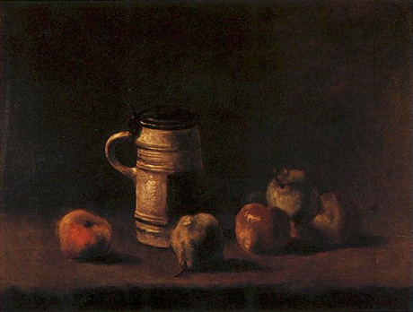
The first time Van Gogh used a beer mug with four years earlier, in 1881’s Still Life with Beer Mug and Fruit. During this time the artist depicted “only the meager and homely possessions of the very poor: their basic foodstuffs, their rough earthenware crockery and thick bottles of beer set out clumsily on plain tables against dark backgrounds.” That’s Naomi E. Maurer’s description in her book, The Pursuit of Spiritual Wisdom.

Van-Gogh_Still-Life-Beer2

He revisited the same thing three years later, in 1884 (a year before Beer Tankards) when he painted Still Life with Pottery, Beer Glass and Bottle. This one’s probably the least known, and for me it’s easy to see why. It seems too crowded and composition suffers as a result. Also, it’s very rough, not just impressionistic but less polished or finished.

In the last year of his life, Van Gogh returned once more to painting drinking, though as Rick Lyke points out, he was copying “a woodblock print by Honore Daumier titled “Physiology of the Drinker, The Four Ages.” The painting depicts a youth and three men gathered around a table, tankards in hand, with a pitcher at the ready for refills.” The painting is at the Art Institute of Chicago.

Van-Gogh_the-drinkers

For more about Vincent Van Gogh, Wikipedia is a good place to start, though there’s even more at the Vincent Van Gogh Gallery. There are also tons of links at the ArtCyclopedia.

Filed Under: Art & Beer Tagged With: The Netherlands

Traditional Anchor Christmas Ale Day

November 24, 2008 By Jay Brooks

Every year since 1975 the brewers at Anchor Brewery have brewed a distinctive and unique Christmas Ale, which is now available from early November to mid-January.

From Anchor’s website:

The Ale’s recipe is different every year—as is the tree on the label—but the intent with which we offer it remains the same: joy and celebration of the newness of life. Since ancient times, trees have symbolized the winter solstice when the earth, with its seasons, appears born anew.

Until recently, Anchor’s Christmas Ale was not released until the Monday before Thanksgiving each year. A few years ago they bowed to pressure from their distributors, who wanted to have it earlier to compete against all of the other holiday beers that are released much earlier. So while I can’t argue it’s a bad thing to have this wonderful beer both earlier and for a longer period of time each year, I do actually miss it coming later on a very specific date. There was something I really liked about having to wait for it — admittedly vague and unspecific, but the feeling was there all the same. And there was something I admired about their stubbornly refusing to release it until they were damn well ready. I think it added something intangible to the beer’s mystique, making it more special somehow.

I realize I sound like a sentimental fool, but beer (and many other things) used to be ruled by the seasons and their availability was something that created anticipation and deep satisfactions, too. To me fruit is a great example. Wait, hear me out. There was a time when you couldn’t get almost every fruit year round, but now thanks to agreements with growers in the Southern Hemisphere, we can get most of them all year long. But the very fact that they’re around all the time makes them less desirable. How much better did a strawberry taste when you couldn’t eat one all winter and they suddenly appeared each spring?

Of course, I don’t really think Anchor’s Christmas Ale will lose much — or any — of its specialness by being released a couple weeks sooner each year. I know I still wait eagerly to try the new one each year. But I really think there is something to building up demand and the perceived value that artificial scarcity brings. And there are beers that have suffered for going from a seasonal to a year-round beer. Mendocino’s Eye of the Hawk comes to mind. Back in the early 1980s they only brewed it three times a year (for the 4th of July, their annual anniversary and Oktoberfest). They released the strong ale in 22 oz. bottles in limited quantities and it sold out quickly like clockwork every time it was released. That went on for years until around 1999, when they made it available all the time and in unlimited quantities. Sales fell and although it sold steadily, we sold more in three bursts than when it was always there. Let’s also not forget that seasonals are now the number one craft category at mainstream outlets like grocery and liquor stores. It’s clear people like picking up something different. I don’t think we’ll see popular everyday beers going away, but it should be remembered that limited and seasonal releases can have their own cache and sell better in direct proportion to the difficulty in obtaining them.

Today I’m celebrating “Anchor Christmas Ale Day” and picking up some more today, I’ll drink some tonight, and also save some for my Thanksgiving Day meal on Thursday. This holiday will continue to be the Monday before Thanksgiving, to honor the idea that some things are worth waiting for.

But back to Anchor’s “Our Special Ale.”

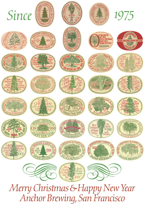
Each year our Christmas Ale gets a unique label and a unique recipe for the Ale itself. Although our recipes must remain a secret, many enthusiasts save a few bottles from year to year—stored in a cool dark place—to taste later and compare with other vintages. Properly refrigerated, the beer remains intriguing and drinkable for years, with different nuances slowly emerging as the flavor mellows slightly.

Over the years, there have been 34 different labels and each year Anchor prints a beautiful poster with all of the past labels plus the current years’ label.

Anchor-Xmas-poster08

Filed Under: Art & Beer, Beers, Editorial, Reviews Tagged With: California, Northern California, San Francisco

« Previous Page
Next Page »

Find Something

Northern California Breweries

Please consider purchasing my latest book, California Breweries North, available from Amazon, or ask for it at your local bookstore.

Recent Comments

  • Bob Paolino on Beer Birthday: Grant Johnston
  • Gambrinus on Historic Beer Birthday: A.J. Houghton
  • Ernie Dewing on Historic Beer Birthday: Charles William Bergner 
  • Steve 'Pudgy' De Rose on Historic Beer Birthday: Jacob Schmidt
  • Jay Brooks on Beer Birthday: Bill Owens

Recent Posts

  • Beer In Ads #5308: Wissembourg Heute Bock! August 1, 2026
  • Historic Beer Birthday: Henry Hess August 1, 2026
  • Historic Beer Birthday: Frederick Gettelman Jr. August 1, 2026
  • Beer In Ads #5307: Heute Bock Double Goats July 31, 2026
  • Historic Beer Birthday: Rita Daigle July 31, 2026

BBB Archives

Feedback

Head Quarter
This site is hosted and maintained by H25Q.dev. Any questions or comments for the webmaster can be directed here.