

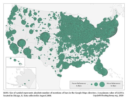
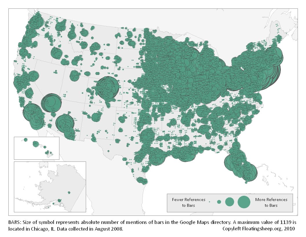
Today’s infographic is part two of three, created by Floating Sheep in 2010, using data collected in 2008. It’s from a post entitled the Beer Belly of America. The second map shows the “absolute mentions of bars in Google Maps directory.” Essentially it shows the location of every bar in America, and where the concentration of them is throughout the country.
The Beer Belly Of America, Part 1
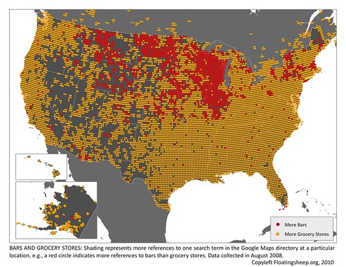
Today’s infographic is part one of three, created by Floating Sheep in 2010, using data collected in 2008. It’s from a post entitled the Beer Belly of America. The first map shows geographic references to bars vs. grocery stores, and where (in red) the bars are mentioned more frequently (and then they compared census data, which corroborated their findings).
Click here to see the map full size.
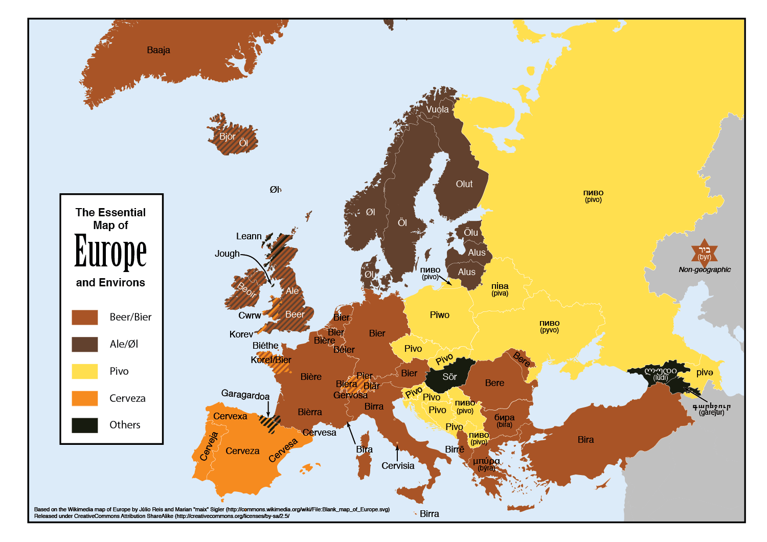
The Essential Map Of Europe & Environs
![]()
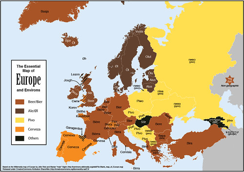
Today’s infographic was sent to me last night by my good friend Maureen Ogle, author of Ambitious Brew, and the soon-to-be-published In Meat We Trust. She knows of my love of language and especially beer words. I have my own growing collection of the word Beer in Other Languages, but Feòrag NicBhrìde of Scotland created the Essential Map of Europe and Environs, which is essentially a map showing the various ways in which Europeans refer to beer, helpfully divided by language types or origins.
Hop Flavour Spectrum
![]()
Today’s infographic is a Hop Flavour Spectrum, created by an Australian company HPA. They describe their Hop Flavour Spectrum as follows:
The Hop Flavour Spectrum has been created through years of research, experimentation and conversations with brewers, and by tasting a few beers along the way. It’s what we believe, and we want to build the spectrum with what you think too. Our hop varieties are divided into four flavour profiles: fruit, floral, spice and resin. This allows brewers to compare varieties and get an understanding of how each hop may impact the flavour of beer.
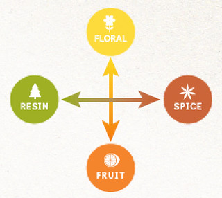
Then they took that scheme and placed the hops that their company carries on the spectrum, depending on each hops’ characteristics. Beverage World, in describing it, “The Hop Flavour Spectrum goes beyond the limitations of chemical analysis to provide an effective tool for comparing varieties and understanding how each hop may impact the flavor of beer.” You can click on each variety listed to see additinoal information about it. It would be cool to see even more varieties added to the spectrum.
CLick here to see the original interactive chart.
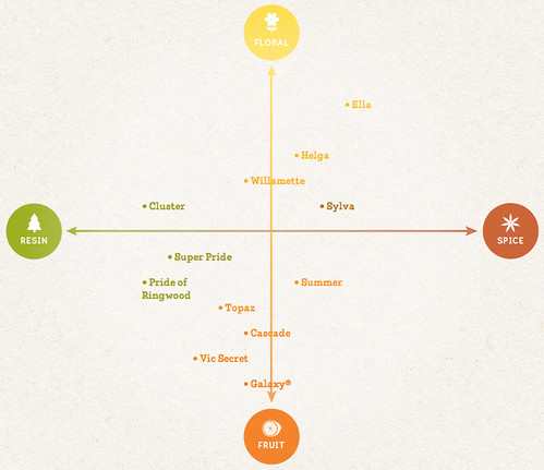
The Science Of Getting Drunk
![]()
Today’s infographic is entitled the Science of Getting Drunk, and shows what happens inside your body when you drink alcohol, how it affects the brain, identify different levels of drunkeness and also what it takes to get there. It was created by Best Colleges Online.
Click here to see the infographic full size.
The Geography Of Bars

Today’s infographic comes from an Atlantic article on The Geography of Bars and Restaurants. The map uses data from the 2012 census and county business patterns. According to their data, New Orleans has the most bars per households, and San Francisco ranked 8th, with 6 bars for every 10,000 people. It’s also hard to see because the map is relatively small, but there’s a high-density bar area in Northern California in what I believe is Mendocino County.
And while I was mostly interested in the bars, the restaurant data is quite interesting, as well. San Francisco ranked #1 for restaurants per household, with 39.3 per 10,000 residents. That’s roughly one restaurant for every 255 persons.
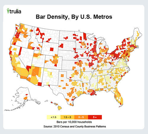
Click here to see the map full size (and sorry that’s as big as it gets).
A Beer Tour Of America

Today’s infographic is entitled A Beer Tour Of America, showing their choices for the top ten brewery tours you should take. It was created by Travel Insurance, which describes itself as a “comprehensive online resource for travelers and people looking for more information on travel insurance.”
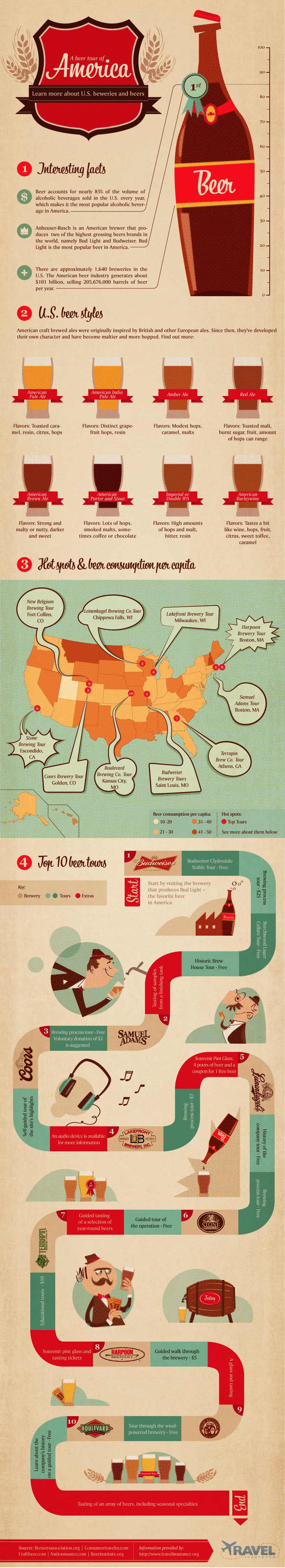
Click here to see the infographic full size.
July 4 Infographic
![]()
Today’s bonus infographic, since this is the only day I can really use it, is about all things “4th of July.” It was created by DegreeSearch.org, and includes a mention o beer as one of the historical factoids in the infographic.
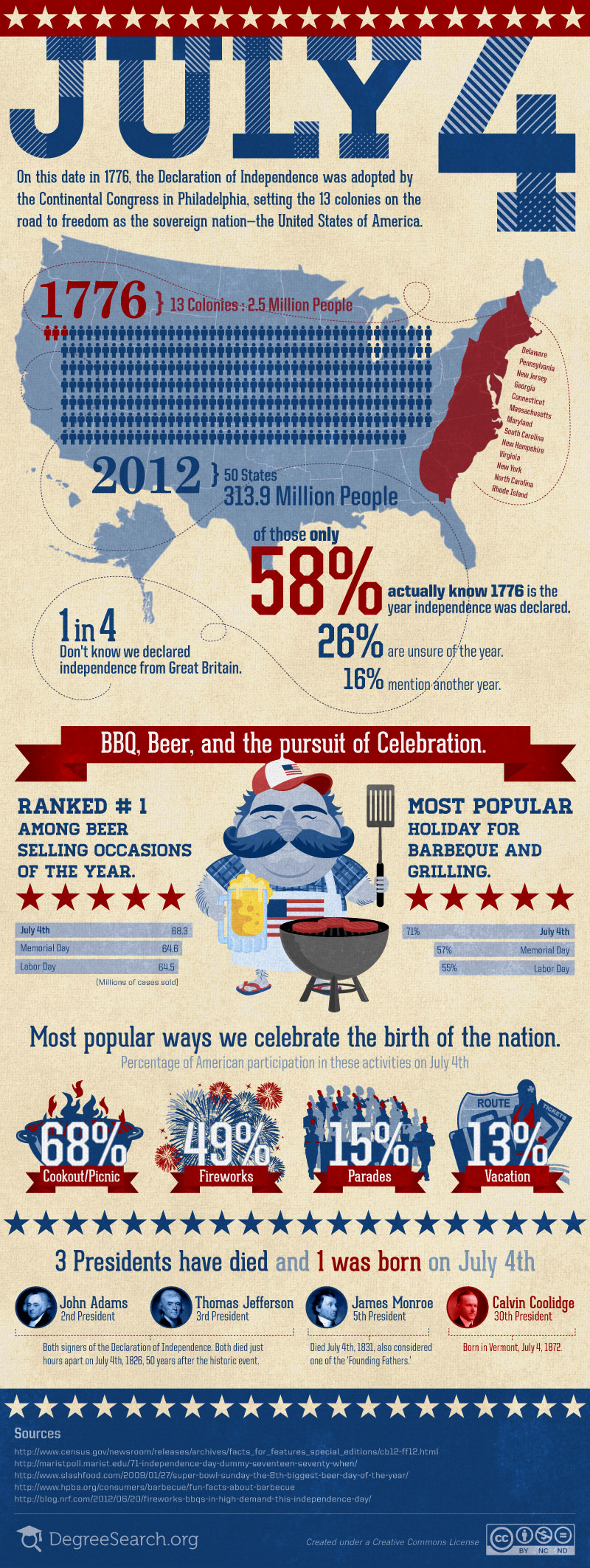
Click here to see the infographic full size.
Presidential Drinks Of Choice
![]()
Today’s infographic, in honor of Independence Day, is entitled Presidential Drugs of Choice, showing each out U.S. Presidents favorite alcohol, tobacco or other pleasures. It was originally part of a Kickstarter campaign by Turncoat Wine. It shows each president and then lists their preferences, of which a dozen list beer as one of their favorites.
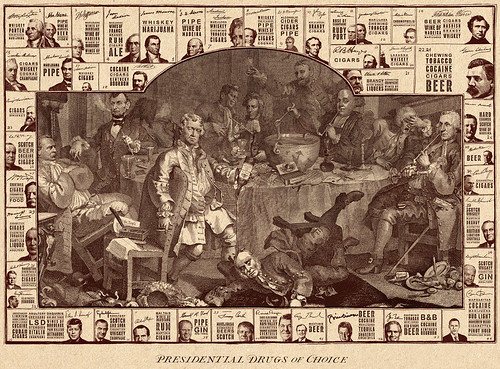
Click here to see the poster full size.
The Alcohol Industry

Today’s infographic is about the Alcohol Industry, and whether or not it’s recession-proof. It was created by Total DUI’s Check Points blog. I’m not sure what their angle was, but they pretty much came to the same conclusion most analysts did, which is that it’s more recession-resistant than recession-proof.
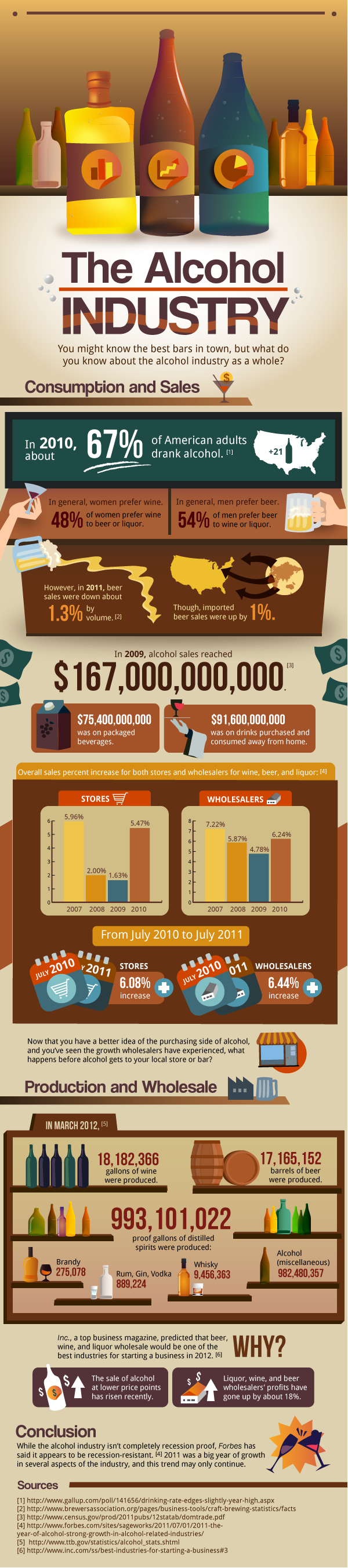
Click here to see the infographic full size.