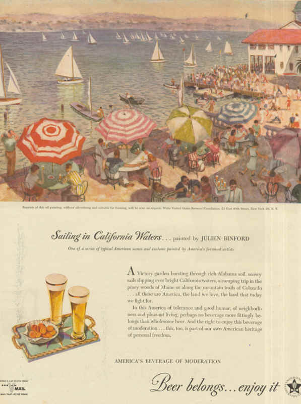
Wednesday’s ad is another one from the United Brewers Industrial Foundation, from 1945. This was the year before the “Beer Belongs” series began. These were similar, and used the “Beer Belongs” tagline, but were unnumbered stand-alones. They each featured a painting by a well-known artist or illustrator of the day, along with many of the elements that would later appear in the “Home Life in America” series. In this ad, the painting is called “Sailing in California Waters,” by artist Julien Binford, who did at least one additional ad in this series.
Archives for October 8, 2014
Why Slugs Love Beer
I learned this trick from my great aunt, who used to put dishes of stale beer out to attract and kill various pests, including slugs. I knew it worked it, but I don’t think I ever quite knew why. According to a short article in the September issue of Mental Floss, Why Do Slugs Love Beer?, the answer is that the “sweet smell of yeast attracts slugs to beer like moths to a flame.” Quoting Ian Bedford, head of the John Innes Centre’s Entomology Facility in Great Britain, “A lot of slug species feed on decaying plant material,” adding that “beer resembles overripe fruits, which burst with naturally fermenting yeasts that slugs can’t resist.”
Misusing Data
As I’ve written time and time again, lying with statistics may not be the oldest profession, but it’s got to be pretty close. Alright, I may be exaggerating slightly. Modern propaganda and the P.R. machine got going around the time of the First World War, with many of the profession’s leading lights coming out of that time period — Edward Bernays, Walter Lippmann, Ivy Lee. But it’s a powerful tool of the propagandist today, especially the numerous prohibitionist groups and anti-alcohol organizations. So when I saw Think you drink a lot? This chart will tell you last month on the Washington Post’s Wonkblog, I noted it with suspicion and made a note to look at it closer when I had the time. What got my spidey senses tingling was the idea that “the top 10 percent of drinkers account for well over half of the alcohol consumed in any given year.” Here’s the chart the article ran, showing the data for that conclusion.
Although it shows the common Pareto Principle, it just didn’t ring true. That many people can’t, and don’t, drink that heavily. I knew there had to be another explanation for this data. And there is. Trevor Butterworth, writing for Forbes, did the heavy lifting on this one with his wonderful expose, When Data Journalism Goes Wrong. It turns out that when you drill down the data, looking at its source and analysis, things begin to unravel. Apparently the results of the original poll had the data manipulated by nearly doubling them to account for a perceived problem with under-reporting. To put that another way, the data was “fixed.” One of the problems with that (there are many, many, I’d say) is that people looking for data to support an agenda tend to seize on such manipulated data and pass it on, using it in their propaganda, and the mainstream media tends to fall for it uncritically, rarely looking at where the original information came from or how it was gathered. Happily, Butterworth does a good job of demonstrating where it all went wrong, and I urge you to read his entire When Data Journalism Goes Wrong. And a h/t to Maureen Ogle for sending me this. She knows me all too well.