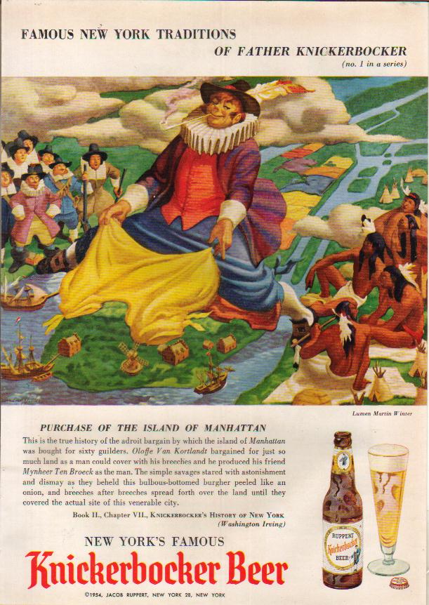
Saturday’s ad is for Michelob, probably from the 1970s, which was the last decade anyone might have mistook Michelob for “one of those foreign beers.” Period.

Saturday’s ad is for Michelob, probably from the 1970s, which was the last decade anyone might have mistook Michelob for “one of those foreign beers.” Period.
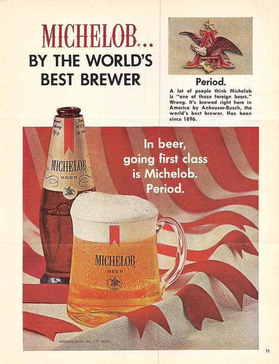
Friday’s ad is for Sapporo, probably from the early part of the 20th century. It shows a female bartender in a green dress with a red belt serving a bottle of Sapporo. I can’t read Japanese Kanji so I don’t know what it says, but it’s a cool ad and you can see why they obviously made a poster out of it.
Thursday’s ad is for Genesee beer, from the 1950s. The ad shows a hard-working farmer taking a break with a cool glass of beer, with beaded sweat dripping down his forehead. It’s quite a good illustration, but I don’t know who the artist is, sad to say. It also makes me glad I’m not a farmer. I’m way too lazy.

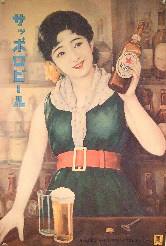
Wednesday’s ad is a German beer poster by famed Swiss illustrator Herbert Leupin. This is maybe the seventh or eighth work by him that I’ve featured over the years. The text on the poster, “gibt kraft und nervenruhe,” is translated by Google as “gives strength and nerve rest.” I’m sure there’s a more idiomatic and elegant translation, but you get the idea. It may be a companion poster to Beer In Ads #1158: Spendet Freude Und Harmonie, which translates as “gives pleasure and harmony.” In that one, the male glass is smiling, whereas in today’s ad it’s more of a frown. I wonder if that’s a reflection of the beer in the glass?
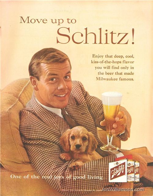
Tuesday’s ad is for Schlitz, from 1960. Good to know advertisers back then were as shameless as today. It’s fifty shades of brown, with an attractive brown-haired male model in a brown suit and tie, sitting in a tan chair while holding a beer and a brown puppy. I wonder who they were targeting with the ad?
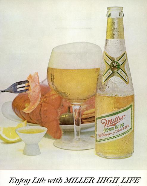
Monday’s ad is for Miller High Life, from 1963. The ad is fairly simple, just a glass of beer and a half-emptied bottle of High Life next to it, with a plate of food behind it, and slightly out of focus. Is that lobster? It feels like the ad may have been cut off, like there should be more below the headline, but maybe not, it was done in the minimalist 1960s.
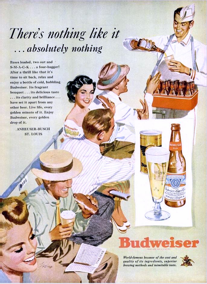
Sunday’s ad is for Budweiser, from 1949. The ad illustrates a scene at a baseball game, with a uniformed beer vendor — how does he keep that hat on his head? — is pouring a bottle of Budweiser into a paper cup, while they watch the game, eat hot dogs and order more beer. Seems like a pretty good day.
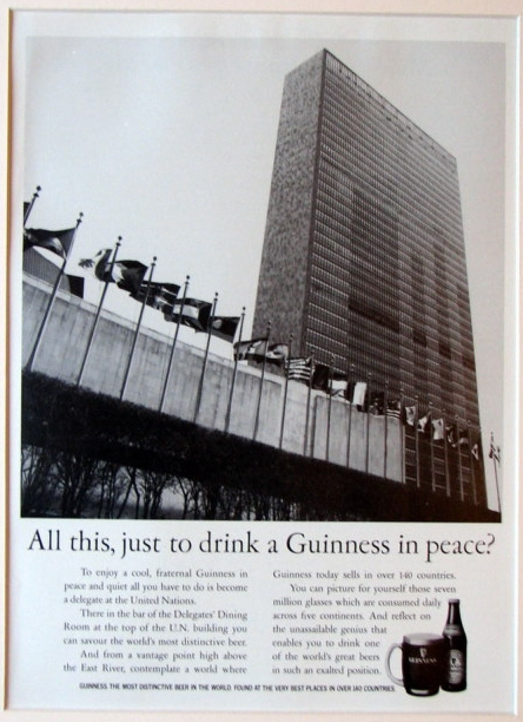
Saturday’s ad is another one for Guinness, this one from 1986. The ad shows the United Nations building in New York, with the odd tagline “All This, Just To Drink A Guinness In Peace?” Apparently that’s because the Delegates’s Dining Room on the top floor serves Guinness, though I still don’t think it makes a great deal of sense.
Friday’s ad is for Guinness, from 1957. The ad shows two young couples having a picnic within spitting distance of Stonehenge which I imagine was as impossible in 1957 as it is today. Maybe I’m wrong, but I can’t believe they’d let anyone get so close to such a national treasure. I love the wild abandon with which the one dude is eating a chicken leg. I know the other guy is sporting an ascot, but is the chicken man wearing one, too, or did he tuck his tie in his shirt? And the dresses that the women are wearing are pretty fly, too, particularly the grey skirt with the jugs. But a picnic by Stonehenge? It’s true. “Life is worth living after a Guinness.”

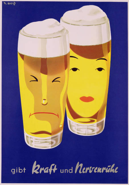
Thursday’s ad is for Knickerbocker Beer, from 1954. The beer was brewed by Jacob Ruppert. The illustration by Lumen Martin Winter shows a fanciful origin story for the Purchase of the Island of Manhattan, as told in the text. Isn’t that how the kids are wearing their pants these days? Wow, everything old really is new again.