Our 22nd Guinness poster by John Gilroy features another zoo setting, this one with a new Gnu to the zoo, who knew that “Guinness is good for you,” using a nice group of homonyms.
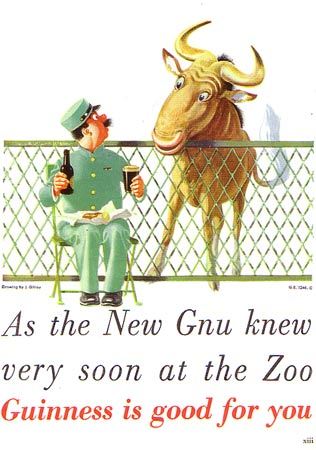

Our 22nd Guinness poster by John Gilroy features another zoo setting, this one with a new Gnu to the zoo, who knew that “Guinness is good for you,” using a nice group of homonyms.

As my Philadelphia theme comes to an end, as does my time at Philly Beer Week, Friday’s ad is for Gretz Beer, never a big force in Philadelphia market, but by 1957 were still hanging on as the smallest brewery left in Philly. You can read below what they were trying to do with their “small car series” of ads, but the exchange between the two men in the Fiat feels forced. It doesn’t feel like a natural conversation, it screams adspeak.
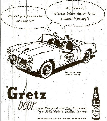
According to Rusty Cans:
The Gretz car series was issued starting in late 1957 by the Gretz Brewing Company in Philadelphia. The smallest of the last four breweries in Philadelphia, Gretz decided to make its small size a selling point by comparing its beer to a sports car. Small cars were better, they argued, and so was a beer from a small brewery! As part of the promotion Gretz bought 11 of the latest sport cars and painted them yellow and black to match the Gretz label colors, with a Gretz logo on the sides. The cars were introduced at the Army-Navy Game in Philadelphia at the end of November 1957 (Navy won 14-0).
And here’s another:
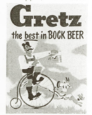
It’s for their bock using the iconic brewery character from 1951.
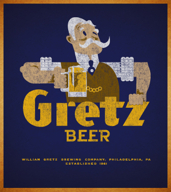
I love this image of the Gretz guy, and in fact have a t-shirt of it I got from Yesterbeer. I also say an original tray with the same image behind the bar at the Kite & Key last night.
Continuing my Philadelphia theme for Philly Beer Week, Thursday’s ad is old one, from 1873. The brewery is Bergner & Engel’s, which used to be located on 32nd and Thompson. I just love these old posters showing off the brewery at its best that were common in the latter half of the 19th century.
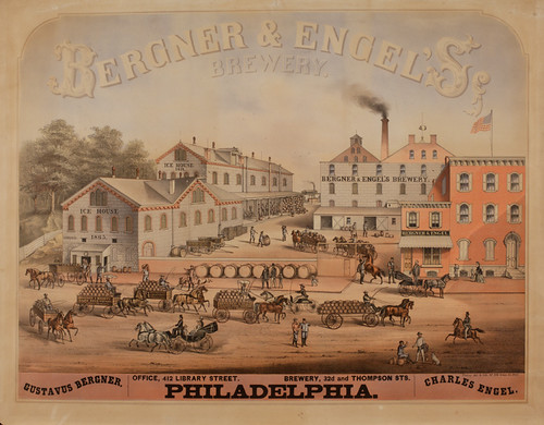
Here’s a description of the poster from the Library Company of Philadelphia:
Since the erection of the first brewery in Philadelphia circa 1683, beer making has been a near steady Philadelphia industry. Following the introduction of lager beer to the Philadelphia market in the mid-19th century, German-American brewers dominated the field. The firm of Bergner & Engel, formed in 1870 between longtime brewers Gustave Bergner and Charles Engel, symbolized the best of the best of that era’s nearly one hundred, mostly German-American run breweries. Operating from a plant built for Bergner in 1858 at 32nd and Thompson streets, the brewery served as the forerunner in the establishment of the industrial neighborhood known as Brewerytown.
This circa 1875 print, a chromolithograph by German-born lithographer Charles P. Tholey, evokes the vitality of the brewing industry and documents the eye-catching imagery of advertising for the city during the 19th century. The advertisement conveys the expanse of the Bergner & Engel plant that included ice houses, a brew room, fermenting and cooling rooms, store rooms, offices, and dwellings. The numerous factory wagons loaded with kegs of beer to be delivered, the visible construction dates of the ice houses, and the several returned and cleaned barrels demonstrate the success of the company. To catch and keep the viewer’s eye, Tholey also employed subtle details such as the excited dogs, the probable job seeker soliciting a worker on break, and one of the proprietors, Bergner, conversing with an employee in front of his office.
Unlike advertisements of today, the product for sale does not serve as the focus of the print. Rather, the factory comprises the image. Competition for consumers was not based on the quality of the good, but the quality of the establishment in which the product was produced. Regarding the circulation of such prints, rather than posting them publicly in stations, on buildings, or fences, businesses probably enclosed the advertisements with product shipments sent to their distributors throughout the country. Enterprises such as Bergner & Engel anticipated that their retailers would display the prints in the public spaces of their establishments to promote their products to a broader base of consumers.
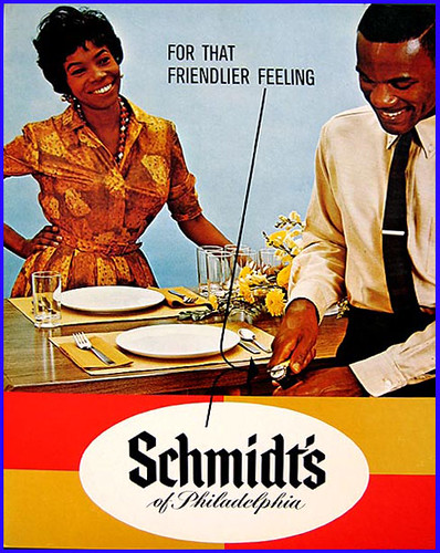
Continuing my Philadelphia theme for Philly Beer Week, Wednesday’s ad is for Schmidt’s. Again, I’m not sure, but my guess is it’s from sometime in the 1970s. I’m not sure about those lines and arrows at all, or what the slogan “For That Friendlier Feeling” has to do with the man opening the bottle.
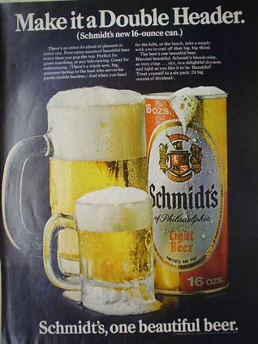
Continuing my Philadelphia theme for Philly Beer Week, Tuesday’s ad is for Schmidt’s. I’m not sure, but my guess is it’s from the mid-1960s. I love how the foam is spilling out from everywhere, both mugs and the can, too.
All this week I’ll be featuring ads from Philadelphia breweries since I’ll be there most of the week for Philly Beer Week. Monday’s ad is for Ortlieb. The ad is from 1959 and shows a couple loading beer onto their boat, with this deliciously goofy tagline. “It’s the he-man brew — that the gals love too!” The logo at the bottom also includes this curious slogan, “Ortlieb’s, the wet beer.” Hilarious.


I found today’s work of art wandering around the National Gallery of Art in D.C. this afternoon, taking a day to recover from SAVOR before heading to Philly Beer Week. The second artwork that I featured in this series was by the same artist, Jasper Johns, a sculpture of two Ballantine Ale cans bronzed over, called Painted Bronze. This work, entitled Field Painting, was completed about four years after Painted Bronze, in 1964.
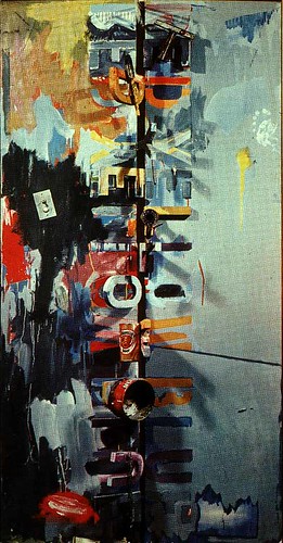
It may be difficult to see, but the work includes many elements Johns used in his art, including a can of Ballantine Ale. You can see it more clearly in the detail below.
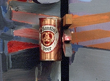
Here’s what the National Gallery has to say about Field Painting.
Field Painting, for example, pivots references both to art-making and Johns’ own career. The primary colors red, yellow, and blue are spelled out in letters hinged perpendicularly to the canvas, where they also appear in stencil-like doubles. Attached to them are various studio tools. The Savarin coffee tin and Ballantine beer can both allude to Johns’ studio paraphernalia and to his appropriation of them as motifs in his work. Passages of smeared and dripped paint, a footprint, light switch, and a neon “R” collude with other visual codes to multiply the possibility of associations.
Actually, the best way to see this painting is from an angle, on the side, where its three dimensions are more obvious.
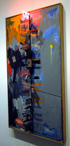
To learn more about Jasper Johns, Wikipedia has a good overview of Jasper johns, as does Answers.com. Also, the overview at Area of Design includes a few of his representative works throughout his career.
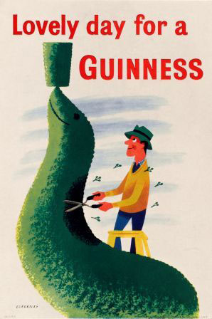
Our 21st Guinness poster by John Gilroy features a man trimming a hedge of a seal balancing a pint of Guinness on his nose, like had been featured in earlier Guinness adverts. But he’s paying such close attention to watching the pint, that’s he’s not watching what he’s doing with the clippers and is cutting a hole into the seal back. The slogan for this one is “Lovely day for a Guinness.”
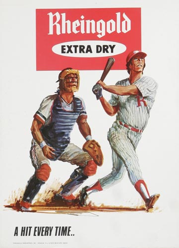
Thursday’s ad is for Rheingold, from the 1960s. It’s a baseball themed ad and features the slogan “A Hit Every Time.” I know it’s a New York beer, but the uniform colors and the large red “R” makes me think of my old hometown team, the Reading Phillies.
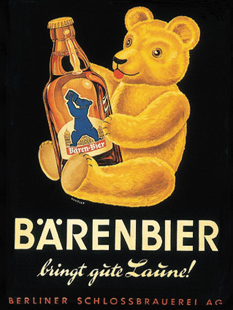
Wednesday’s ad is for a German brewery, Berliner Schlossbrauerei, and their brand Bärenbier, or Bear Beer. The slogan, “bringt gute Laúne!,” translates as “brings a good mood.” Ah, I miss the days when you could use a teddy bear in an …. what, there never was such a time in America, was there?