
Monday’s ad is for an unknown beer, created by Paul Gusset in 1956. Since today is the summer solstice, the poster reminded me of summer itself. Happy summer.
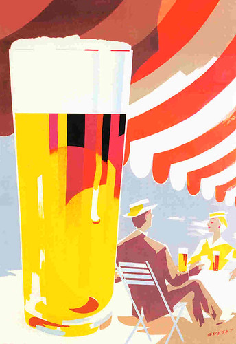

Monday’s ad is for an unknown beer, created by Paul Gusset in 1956. Since today is the summer solstice, the poster reminded me of summer itself. Happy summer.

Today’s work of art was painted as a mural at the Portsmouth Brewery in New Hampshire by local artist Gordon Carlisle. He painted The Jimmy La Panza Lounge in 2005 and it’s enamel on canvas.

The mural hangs above the stairs leading down to, yup you guessed it, The Jimmy La Panza Lounge, which is in the basement of the brewpub.
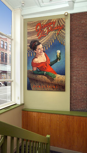
To learn more about Gordon Carlisle, there’s a biography on his website, where you can also see more of his artwork.

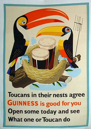
Our 23rd Guinness poster by John Gilroy features the toucans in their nest, but instead of eggs there are two pints of Guinness and the “Guinness is good for you” slogan followed by a bad pun: Open some today and see What one or Toucan do.” Plus it looks like a father and son pair, and Father’s Day is tomorrow.
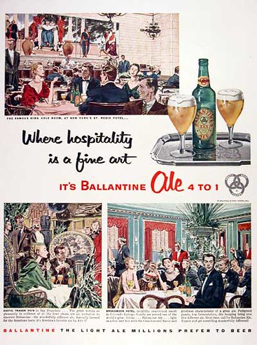
Friday’s ad is for Ballantine Ale, from 1954, with the slogan “Where hospitality is a fine art, It’s Ballantine Ale 4 to 1.” I love that they’re trying to position it as classy compared to lagers. Even the tagline at the bottom is priceless. “The light ale millions prefer to beer.” Lager is for the hoi polloi, ale is for connoisseurs. Nice.

Alright, not exactly fearful symmetry, but Asia Pacific Breweries, who owns the Tiger Beer brand, is sprucing up its bottles. They’ve hired two artists, Korean-American Rostarr (Romon Yang) and Singapore-based Tomas Goh, to create limited edition bottle designs. They each did one design apiece and collaborated on the third.
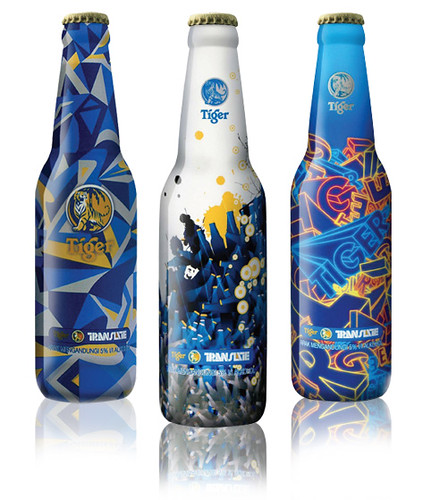
About the designs, known individually as Graphysics, Rise and Energy from the press release:
Internationally acclaimed Korean-American Rostarr´s design Graphysics is based on his signature cutting-edge graphics that fuses digital design and free painting. His design is a marriage of Graphics and Physics, creating a dynamic visual iconography.
Singapore-based Tomaz Goh´s design, Rise, on the other hand, reflects his thoughts on the state of the environment today. With the opinion that our world is fast deteriorating, the versatile Goh chose to use his design to urge mankind to “rise” against the threats of global deterioration of our environment and increase our recycling efforts.
The Energy design is inspired by the collective efforts of Asian artists such as Rostarr and Tomaz that are making an impact in the design world today.
Graphysics, Rise and Energy are exclusively designed to represent the spirit and philosophy of Tiger Beer — a brand with bold character and identity!
While I know it’s all about the beer inside, I still do enjoy the art of packaging and labels. And people do shop the labels and are swayed to make a purchase based on the packaging, so like it or not, it is an important component in a beer’s success.
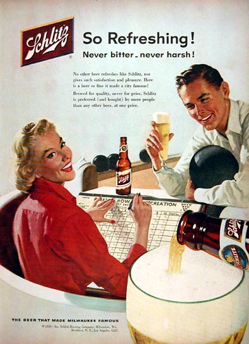
Thursday’s ad is for Schlitz, from 1956, when bowling was at the height of its popularity. Look how the dude is cradling his ball, I’ve never ever seen anyone hold their bowling ball like that. “So refreshing!”
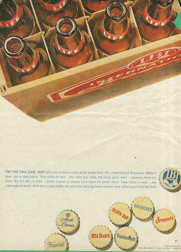
Wednesday’s ad is for IBI, or International Breweries Incorporation, a group of breweries that merged or were bought out in the Midwest beginning around 1955. The ad is from 1960, and shows the crowns, or bottle caps, for a number of their brands. I really like the ad visually, with the case of empty bottles suspended at the top of the ad and the crowns at the bottom. For the time, there’s an awful lot of white space in the middle, something that was fairly rare in 1950s advertising.
While there’s not much information on the web about IBI, I did find this very old beer can collecting website, that doesn’t appear to be currently maintained, that had the following information:
In 1955 a group of businessmen from Detroit bought out Iroquois Beverage Corporation to help form the International Breweries Incorporation, with combining plants in Frankenmuth, Findaly, Tampa and Covington. International continued the Iroquois “arrowhead” label from the Iroquois Beverage Corp., however, they did change the Frankenmuth label from the Black Label to the oval label that came in beer, ale, and bock, from the Buffalo, NY plant.
IBI quickly created their own look, some collectors call these the “TV Screen” cans, the IBI cans came in Iroquois, Frankenmuth, Silver Bar in matching red beer and green ale cans, the IBI Frankenmuth Bock, and the IBI Old Dutch Beer. While the Buffalo plant was the only IBI brewer to produce all the cans, Iroquois remained solely in Buffalo. All the cans came as flattops, the IBI Iroquois beer has been found as a zip top. The Buffalo plant, also used 2 can companies, Continental Can Co., and Kegline, this produced a color variation with the red Beers.
The IBI logo eventually was removed, as some of the other plants closed or were sold, and a similar looking “TV Screen” can was produced. Buffalo kept filling Frankenmuth in Beer and Ale and shipping to the Midwest and the southeast in flattop cans. There are 2 different designs with the Frankenmuths, a single label with a yellowish background, and a 2 label white background can, however, not sure which came first. And similar to the single label Frankenmuth came an Iroquois Beer, but in a white background. Those were the final flattop cans from IBI of Buffalo. The Ponce DeLeon Silver Bar beer and ales that are identical labels were only canned in Tampa The odd thing is that they had matching beer and ales for Frankenmuth, but only the beer for Iroquois on the post IBI label.
Now there is a post IBI Iroquois Ale, but this is the identical label to the IBI’s, the Indian head replaces the IBI logo.This can has only been found in a zip top, no flats as indicated by the BCU and came out around 62 or 63, and is a very tough can to find. IBI of Buffalo only would last a few more years and canned their Iroquois Indian Head beer and Tomahawk Ale in zip tops.
Along the way International of Buffalo bought some existing labels that many collectors might not be aware of. In 1958 or 59, International canned the Blackhawk Beer for only a year or so before being sold to a Cumberland plant. They also picked up the Stolz label from Tampa, and a few tough variations came from Buffalo. In 1962 the Buffalo plant bought a few labels from Cleveland-Sandusky Brewers, and bear the International of Buffalo d/b/a. Canned in Buffalo were Old Timers and Crystal Rock. G & B was also purchased, and collectors have bottle labels from Buffalo, but haven’t seen a can yet.
Locally, in 1959, International bought out the Phoenix Brewery of Buffalo. Phoenix had just put their beer in cans a year earlier, and a very short run of Phoenix Beer bearing the Phoenix Brewing mandatory was run, this is a tougher variation than the Phoenix from International of Buffalo. The Phoenix Brewery eventually became the Ale plant for International. International eventually went bankrupt in 1966 and a Terry Fox from New Jersey bought the plant and renamed it Iroquois Brewing Company. They continued to produce the Indian Head Beer and replacing the Tomahawk Ale was the Iroquois Draft Ale. Bavarians Select had a short stay and was canned in Buffalo. In 1969, Fox sold the plant to a group from Buffalo, and the name changed to Iroquois Brewery. They discontinued the Draft Ale, and the famous white Draft Beer was canned during this time. With the invasion of Cheaper Canadien Beers, and the growth of the big boys, Iroquois could no not keep up, and on May 5, 1971, Iroquois the once proud brewer of Buffalo shut its doors.
Another website, Kentucky Beer Cans, also shows a few of the IBI cans.
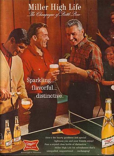
Tuesday’s ad is for Miller High Life, most likely from the late 1950s or 60s, when ping pong in paneled rec rooms was all the rage. And how about that tagline? “Sparkling … flavorful … distinctive.”
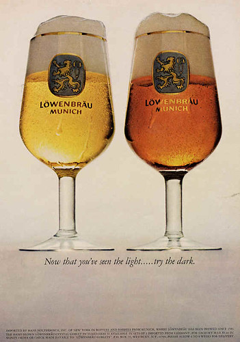
Monday’s ad is for Lowenbrau, a Munich brewery. Today is the day Munich was founded in 1158. It could be from the 1960s or 70s, but my money’s on the Seventies. Showing both kinds — country and western, alright light and dark — the ad features the tagline. “Now that you’ve seen the light …. try the dark.” But really, they’re actually trying to sell the glasses.
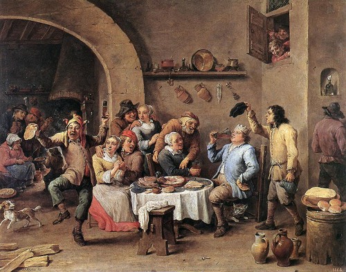
Today’s work of art is another piece I saw last week wandering around the National Gallery of Art in Washington, D.C, the day after SAVOR. It was painted in 1635 by David Teniers the Younger, a Flemish artist born in Antwerp. The painting is known as Peasants Celebrating Twelfth Night.

Teniers was known for his depictions of everyday life, usually showing peasants in a variety of settings. The Twelfth Night revelry shown here also include, of course, drinking beer.
Online, the National Gallery has several detail views available, including this one below of the drinking going on at the table.

He also painted a similar scene about Twelfth Night a few years later entitled Twelfth Night, The King Drinks.
To learn more about David Teniers, Wikipedia has a good overview and there’s also a more detailed biography at the National Gallery. You can see more of his work at the Web Museum, Olga’s Gallery and the National Gallery. There are also additional links at ArtCyclopedia.