
![]()
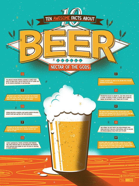
Today’s infographic is entitled 10 Awesome Facts About Beer and is currently a Kickstarter project with 18 days to go before it’s a reality. Sign up now and you can get a copy of this limited edition poster, probably in time for Christmas.
Winter Beer Pairing Primer From Dogfish Head

Here’s a fun little video from Dogfish Head about pairing winter beers with seasonal food.
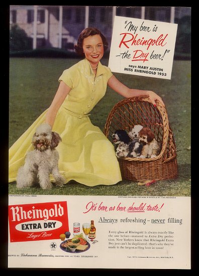
Beer In Ads #1021: A Basket Full Of Puppies

Friday’s ad is for Rheingold Beer, from 1953, and features Miss Rheingold from that year, Mary Austin. The ad shows Miss Rheingold on a lawn in front of what looks like a southern mansion (or even the White House? Nah) with a basket full of puppies, and poodles, no less. I’m sure this will fire up the ire of the poodle lovers of the world, but those are some ugly dogs. I’m not sure that scene makes me want a Rheingold beer.
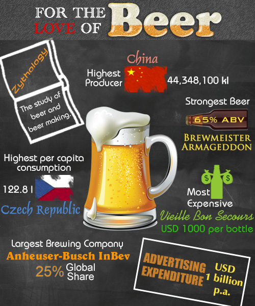
For The Love Of Beer Infographic
![]()
Today’s infographic is entitled “For the Love of Beer,” and comes from Buzzle, where they also created a large list of beer brands.
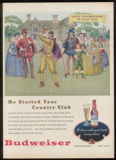
Beer In Ads #1020: He Started Your Country Club
Thursday’s ad is for Budweiser, also from 1948. It’s yet another of Bud’s “Great Contributions to Good Taste” series, this one suggesting that it was James VI of Scotland who made country clubs possible, because he changed the laws to allow golf (which had apparently been prohibited by earlier kings). Having been to countless wedding receptions at country clubs, I’m not entirely convinced that it was such a great contribution to good taste.
Hard Cider Uncorked

Today’s infographic takes a hard look at hard cider, beer’s sister beverage in many parts of the world. Hard Cider Uncorked was created by the Angry Orchard cider company.
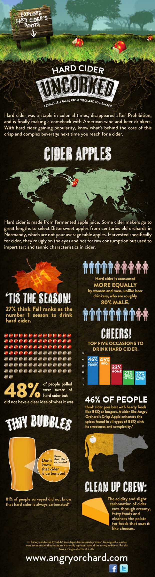
Click here to see the infographic full size.
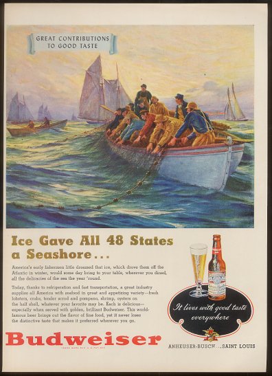
Beer In Ads #1019: Ice Gave All 48 States A Seashore …
Wednesday’s ad is for Budweiser, from 1948. Another of Bud’s “Great Contributions to Great Taste” series, this one extolling the virtues of seafood and cold, whether from ice or refrigeration.
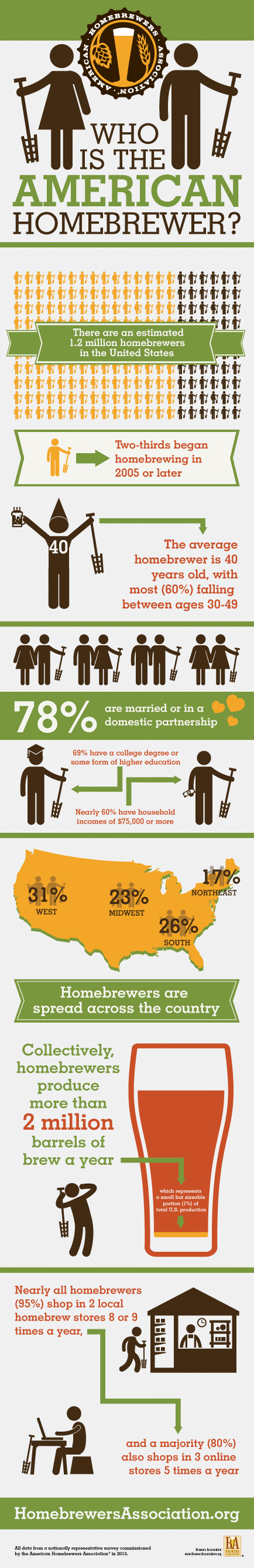
Who Is The American Homebrewer?

Today’s infographic is was released yesterday by the American Homebrewers Association, and is entitled Who is the American Homebrewer? The data used to answer that question came from their “first-ever survey of homebrewers nationwide, which [broke] down the demographics, brewing habits and shopping behaviors of American homebrewers.”
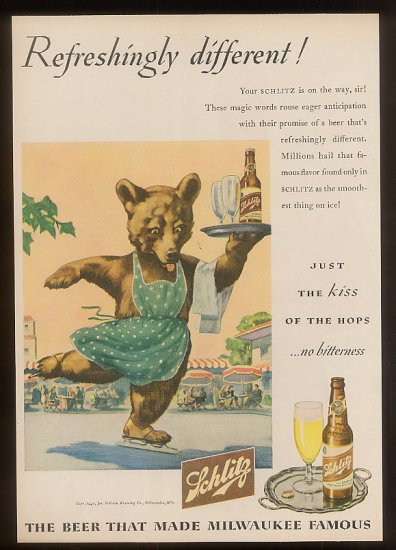
Beer In Ads #1018: Refreshingly Different!
Tuesday’s ad is for Schlitz, from 1948. The tagline reads, “Refreshingly Different!” And while it’s certainly different, I’m not quite sure how something can be refreshingly different. But if anything could, I suppose a bear waitress in a green polka-dot apron and ice skating to deliver a Schlitz with two glasses would definitely fit the bill.
What Is Yeast?

Today’s infographic is a generic look at yeast, part of the “kitchen curious infographic series” by the Doodle Cook.

Click here to see the infographic full size.